Graphic Design: The New Basics: Second Edition, Revised and Expanded (2015)
Diagram
In emphasizing evidential quality and beauty, I also want to move the practices of analytical design far away from the practices of propaganda, marketing, graphic design, and commercial art. Edward R. Tufte
A diagram is a graphic representation of a structure, situation, or process. Diagrams can depict the anatomy of a creature, the hierarchy of a corporation, or the flow of ideas. Diagrams allow us to see relationships that would not come forward in a straight list of numbers or a verbal description.
Many of the visual elements and phenomena described in this book—from point, line, and plane to scale, color, hierarchy, layers, and more—converge in the design of diagrams. In the realm of information graphics, the aesthetic role of these elements remains important, but something else occurs as well. Graphic marks and visual relationships take on specific meanings, coded within the diagram to depict numerical increments, relative size, temporal change, structural links, and other conditions.
The great theorist of information design is Edward R. Tufte, who has been publishing books on this subject since 1983. Tufte finds a certain kind of beauty in the visual display of data—a universal beauty grounded in the laws of nature and the mind’s ability to comprehend them.1
Tufte has called for removing the practice of information design from the distorting grasp of propaganda and graphic design. He argues that a chart or diagram should employ no metaphoric distractions or excessive flourishes (what he has called “chart junk”), but should stay within the realm of objective observation.
Tufte’s purist point of view is profound and compelling, but it may be overly restrictive. Information graphics do have a role to play in the realm of expressive and editorial graphics. The language of diagrams has yielded a rich and evocative repertoire within contemporary design. In editorial contexts, diagrams often function to illuminate and explain complex ideas. They can be clean and reductive or richly expressive, creating evocative pictures that reveal surprising relationships and impress the eye with the sublime density and grandeur of a body of data.
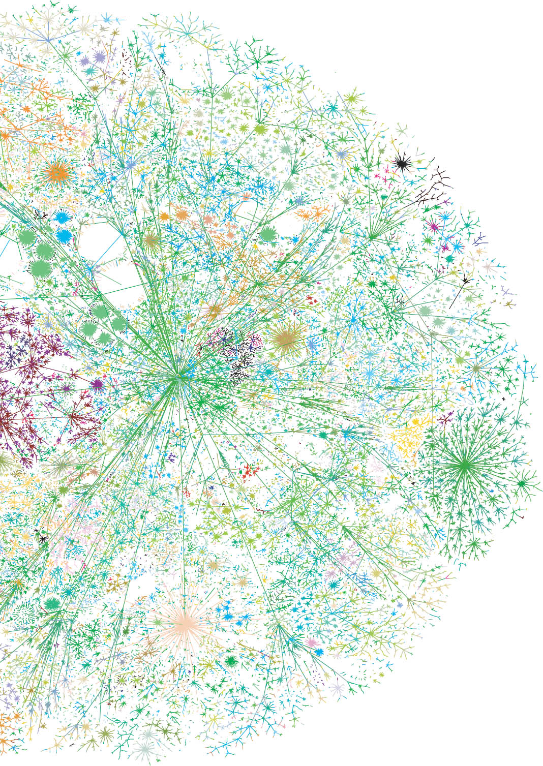
Many of the examples developed in this chapter are rigorous but not pure. Some pieces use diagrams to depict personal histories, a process that forces the designer to develop systematic ways to represent subjective experience. Such an approach is seen in the extravagant autobiographical diagram presented on the page opposite, by Marian Bantjes. Her map does not aim to convey evidence in a strictly scientific way, but rather uses analytical thinking to unleash a language that is both personal and universal, building complexity around basic structures.
Making Connections
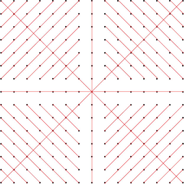
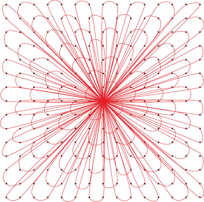
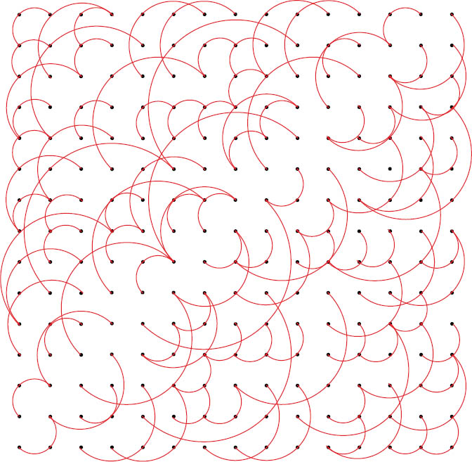
A network, also called a graph, is a set of connections among nodes or points.1 There are various ways to connect the nodes in a network, resulting in different kinds of organization. Centralized networks include pyramids and trees, where all power issues from a common point. A decentralized network has a spine with radiating elements, as in an interstate highway system. A distributed network has node-to-node relationships with no spine and no center. The Internet is a distributed network peppered with concentrated nodes of connectivity.
Networks are everywhere—not just in technology, but throughout nature and society. A food chain, a city plan, and the pathway of a disease are all networks that can be described graphically with points and lines.
Decentralized Network This snapshot of the World Wide Web (detail) shows the connections among servers. A relatively small number of hubs dominate global traffic. Courtesy Lumeta Corp. © 2005 Lumeta Corp.
Centralized Kelly Horigan
Centralized Lindsay Orlowski
Decentralized Lindsay Orlowski
Distributed Kelly Horigan
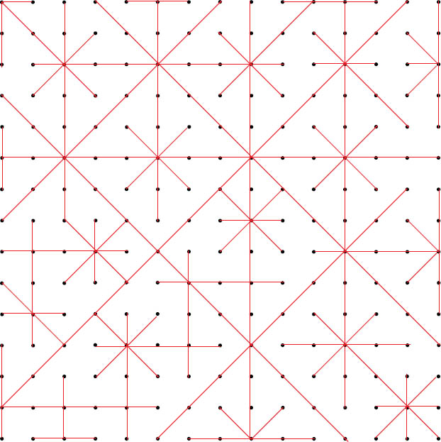
Designing Networks In this project, designers connect a grid of dots with lines, producing designs that reflect different types of networks: centralized, decentralized, and distributed. Graphic Design II. Ellen Lupton, faculty.
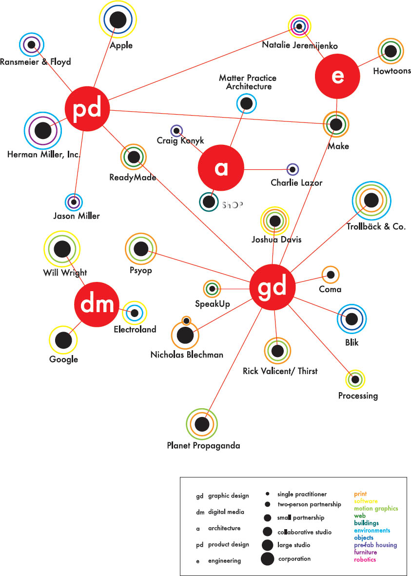
Overlapping Relationships People don’t fall into tidy categories. Any individual can have many identities: parent, child, professional, fan, taxpayer, and so on.
In the project shown here, students were given a list of designers and design firms who work in different fields (graphic design, architecture, and new media) and who produce different kinds of projects (buildings, websites, products, print, and so on). The list also ranked people according to the size of their firms (from single practitioners to large corporations). The design challenge was to represent these overlapping categories visually, using typography, scale, color, line, and other cues to indicate connections and differences.
Some of the solutions use dots of varying size to indicate scale or to mark points on a conceptual map. Others change the size of the typography to indicate the scale. Overlapping planes or crossing lines were used to indicate areas of overlap. This problem can be applied to any collection of objects, from a grocery list to categories of music or art. Graphic Design II. Ellen Lupton, faculty.
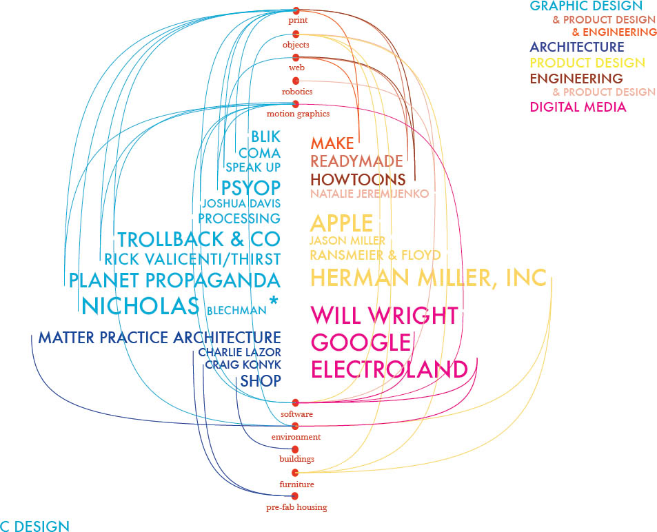
Alexandra Matzner
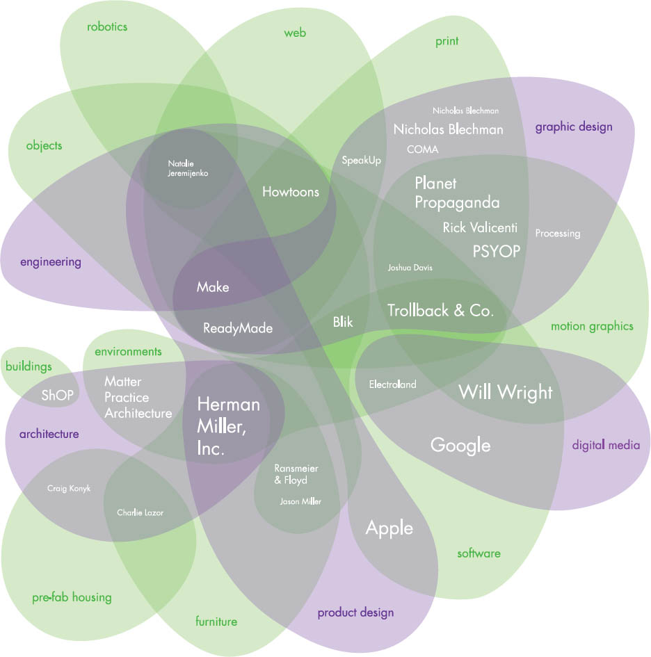
Lindsay Orlowski
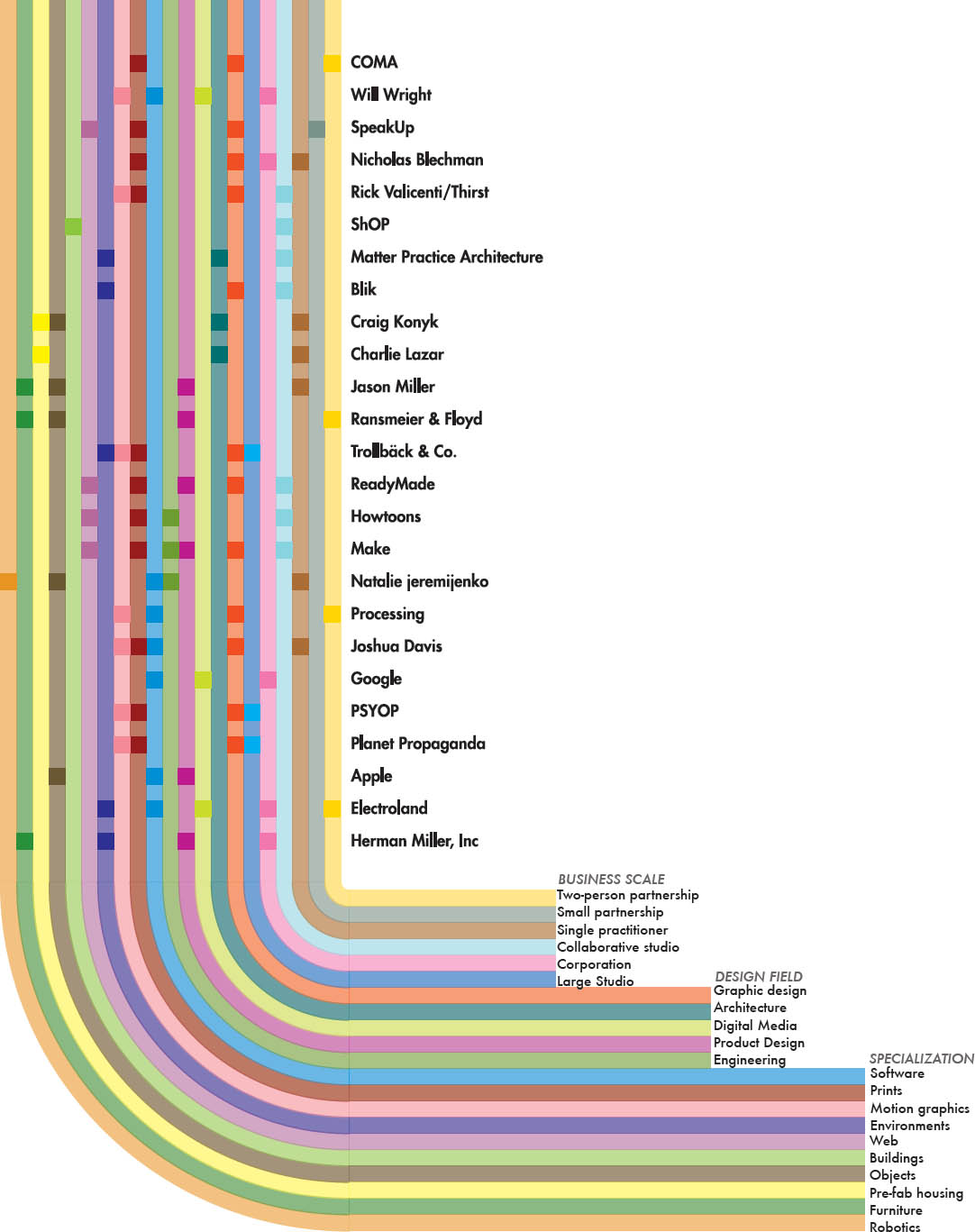
Yuta Sakane
Kelly Horigan
Big Content This ambitious project challenges designers to organize a diverse array of content (text and diagrams) within a long, compressed banner. Designers explore principles of grid, hierarchy, color, and flow in order to create effective layouts. Left to right: Nicolas Kubail Kalousdian, Bonnie Silverman, Shiraz Gallab, Typography II. Ellen Lupton, faculty.
Biodiagram In this project designers represent one facet of their lives according to a clear conceptual and visual framework. Form, color, and configuration must grow out of the hierarchy and nature of the content. Graduate Typography. Jennifer Cole Phillips, faculty.
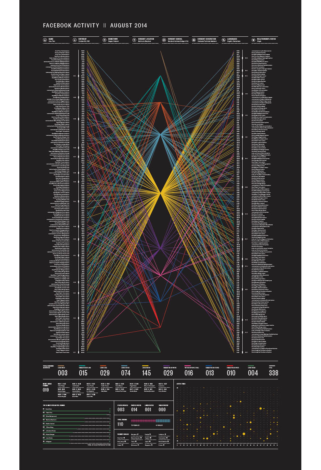
Social Network This diagram details a complex array of Facebook activity for the month of August. In charting data such as likes, posts, and shares, the designer creates a snapshot of his social network and proclivities. Winner of a design excellence award from Print Magazine. Hieu Tran.
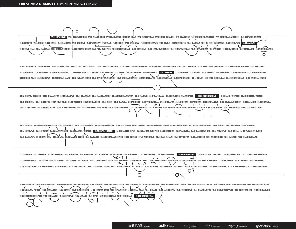
Train Tracking This diagram charts the seven shifting dialects encountered on a single train trip through India. The tiny type captures and records the towns traversed along the way, while the larger-level native changes by region. Hitesh Singhal.
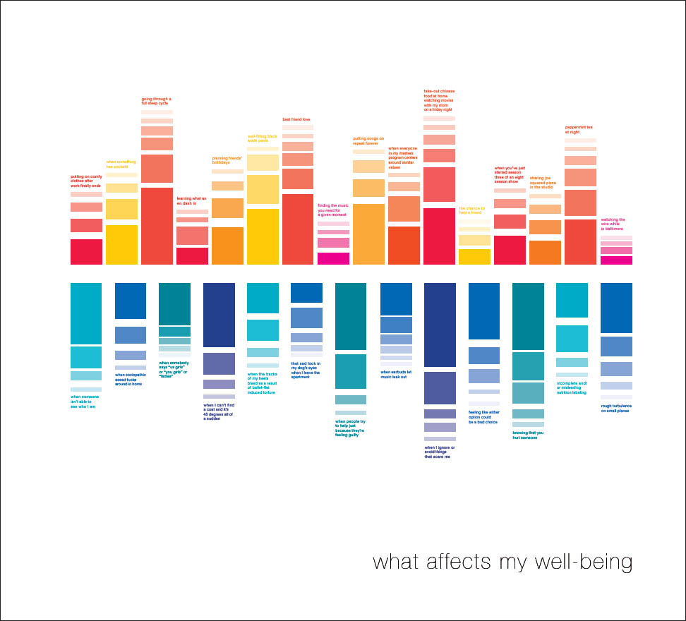
Mercurial Moods This simple diagram charts the upward and downward trajectory of the designer’s well-being based on specific forces that positively and negatively affect her world. Kajsa Nichols-Smith.
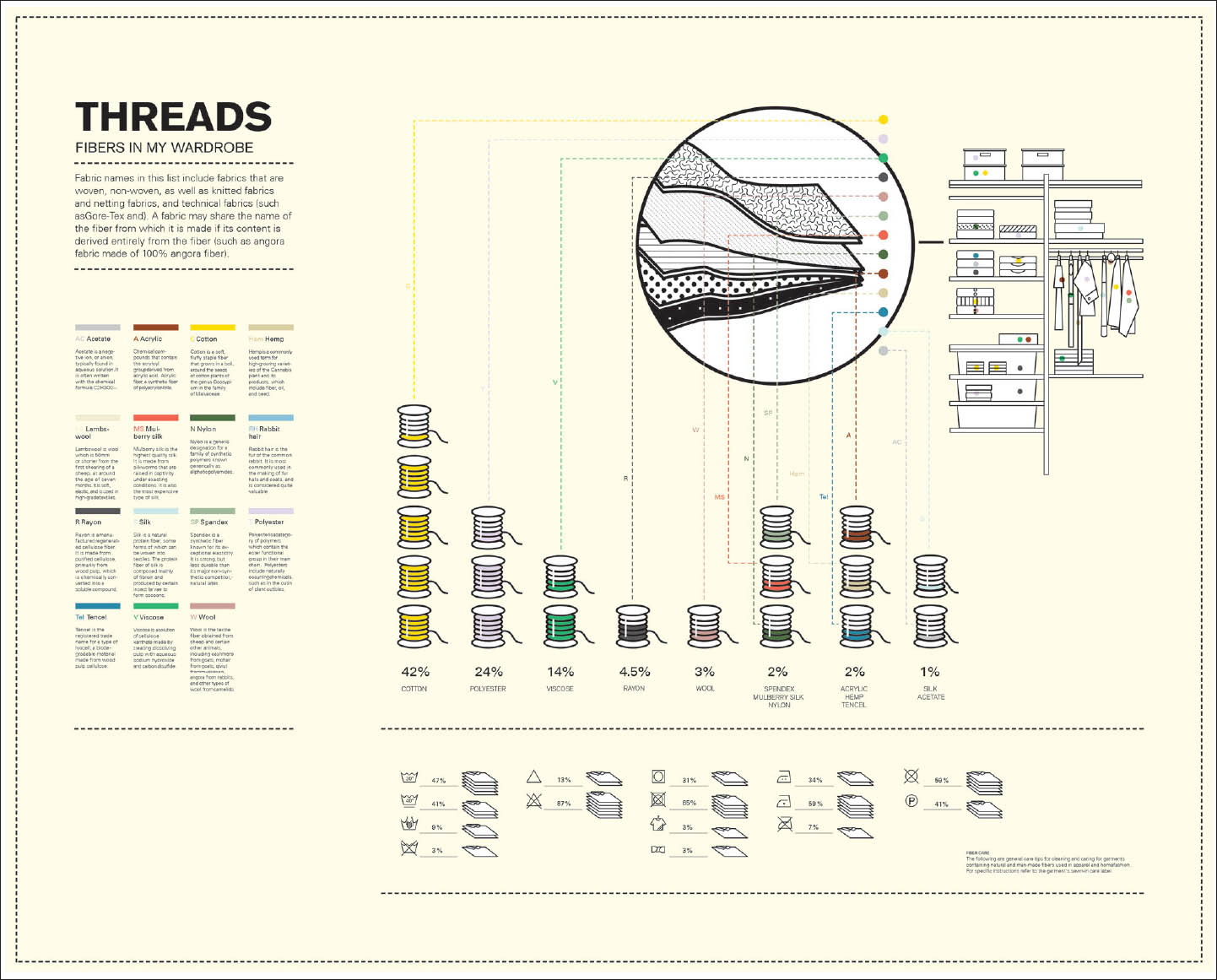
Fiber-enriched This intricate diagram dissects the fiber content of this designer’s wardrobe and analyzes it according to a carefully articulated system of criteria. Wenji Lu.
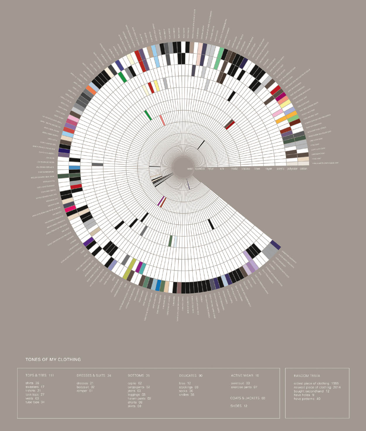
Color Snapshot A complex spectrum of color is mapped across every item in this designer’s wardrobe. Clothing type is further broken down and classified by category and quantity. Tiffany Small.
Visualizing Marathon Launched in 2010 by visualizing.org, these annual marathons began in New York City as on-site twenty-four-hour student competitions, expanded to other on-site venues in major cities around the world, and finally invited global remote participation. Participants work in teams to visually illuminate given themes.
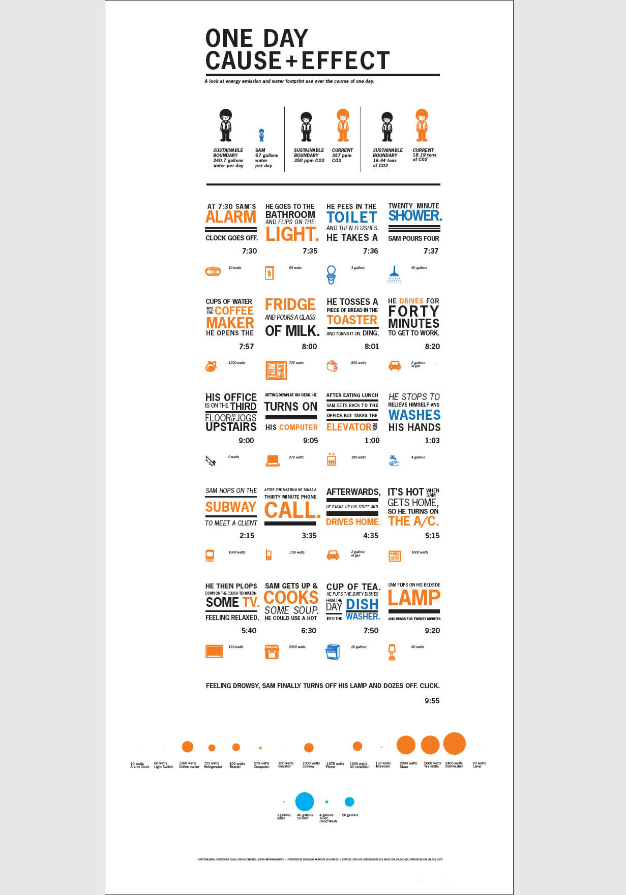
Cause + Effect Twenty teams from eight design schools were challenged to visualize the impact of humanity’s footprint on Spaceship Earth at the inaugural Visualizing Marathon: a 24-hour student data visualization competition. MICA sent fourteen students to New York City to compete in the event and swept the competition, winning first place and honorable mention.
MICA’s winning visualization, “One Day Cause + Effect,” was lauded for its personal narrative and striking design and received the Jury’s top score for “understanding”- the ability to help the reader better understand the impact of humanity’s footprint on Earth. Chris Clark, Christina Beard, Supisa Wattanasanasanee, Chris McCampbell.
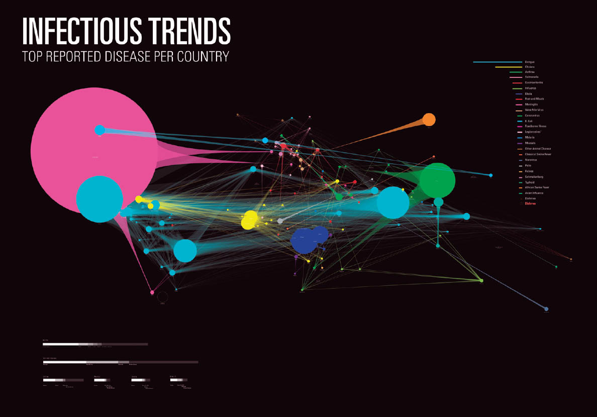
Infectious Trends This dynamic visualization charts the volume and network of global infectious diseases. Nicki Dlugash, Richard Blake, Qian Li.
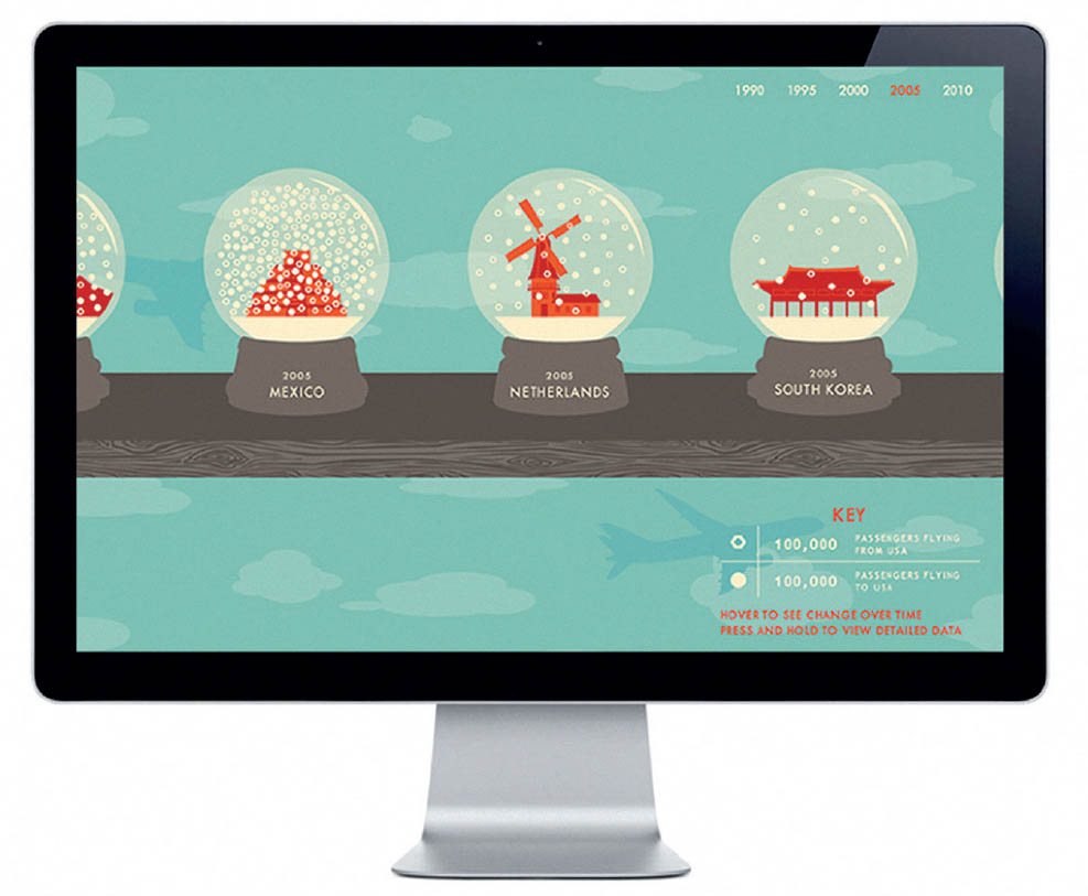
Around the Globe This interactive infographic uses snow globes to represent the amount of air traffic between the US and other countries over the past twenty years. Jackie Littman, Rob McConnell, Gabriela Hernandez, David Lam.
Diagrams for Product Design
Creating digital products for people to use requires an understanding of structure, user flows, and relationships. Before visual design can begin, interaction designers have to look at the role of products within broader product ecosystems and consider the architecture of information and the narrative of use. Designers employ a variety of graphical tools to express these situations, from Venn diagrams and matrix charts to decision flows and wireframes. Product Design Workshop. Tim Hoover and Jessica Karle, faculty.
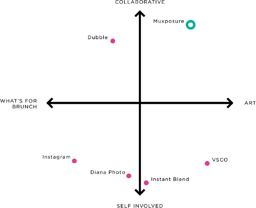
Matrix Diagram Each axis in a matrix diagram represents a pair of opposing ideas. The diagram shown here explores the competitive landscape around a double-exposure photography app. The y axis contrasts collaborative with individual practice, while the x axis contrasts serious endeavors with casual “brunch” photos. The designer placed his product in the upper right: it is both collaborative and artistic. Alex Jacque.
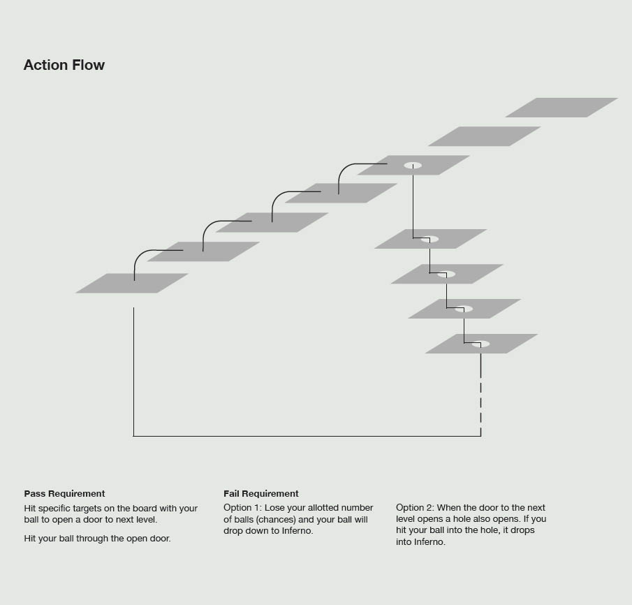
Game Play This diagram depicts the basic sequence of play in a game based on Dante’s Inferno. The player strives to move up through the levels of Purgatory towards the ultimate goal of Paradise. This simple linear progression is disrupted when the player is sent to the bottom and forced to climb back out of Inferno. Nate Gulledge.
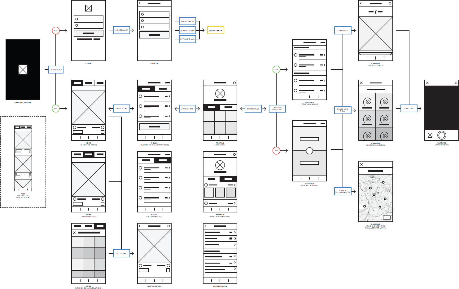
User Flow This sequence of wireframes for a photo app shows what happens when a user chooses different paths from the home screen. Many such paths are possible in a fully developed app. Alex Jacque.
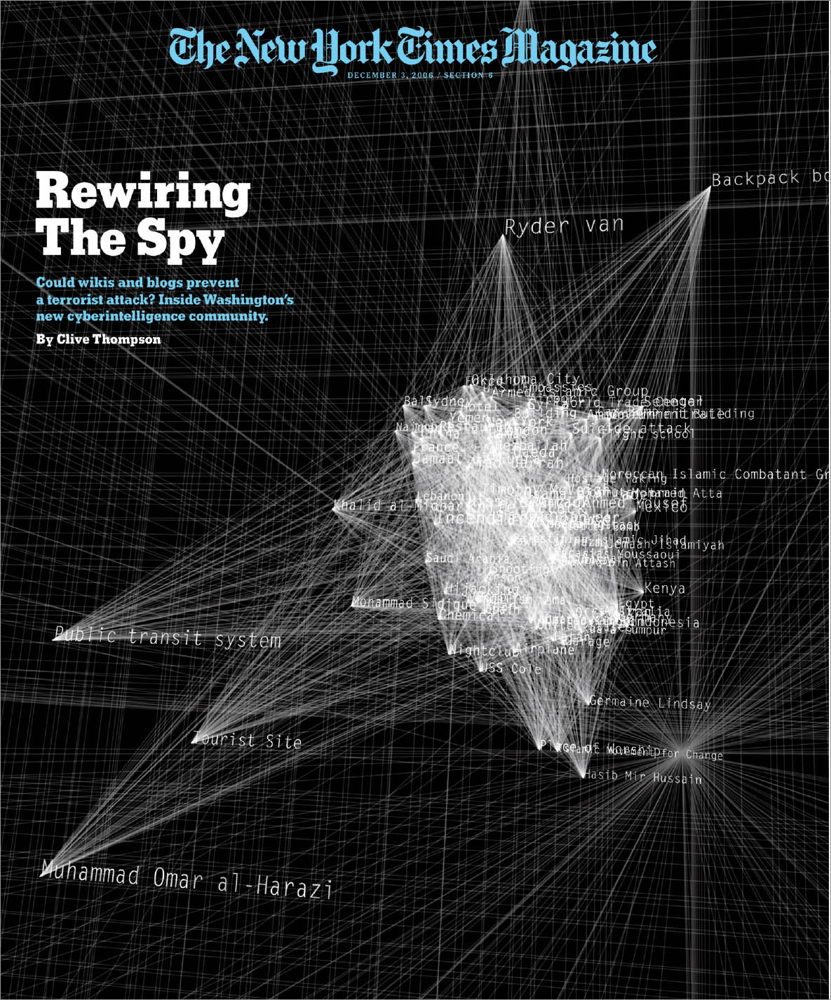
Underground Networks Created for the New York Times Magazine by media designer Lisa Strausfeld, this diagram visualizes complex relationships surrounding worldwide terrorist groups. Produced using the computer language Processing, Strausfeld’s diagram conveys the maddening difficulty involved in keeping track of countless potential links and dangers. Lisa Strausfeld, Pentagram.
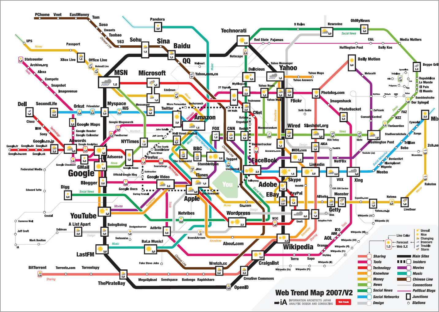
Charting Trends This seductive map selects and situates the world’s two hundred most popular websites and classifies them according to categories such as design, music, moneymaking, and much more. The graphic is reminiscent of the subway map used in Tokyo, where this piece was designed. Information Architects.
1. Edward R. Tufte, Beautiful Evidence (Cheshire, CT: Graphics Press, 2006).
1. On network theory, see Alexander Galloway and Eugene Thacker, “Protocol, Control and Networks,” Grey Room 12 (Fall 2004): 6-29. See also Christopher Alexander, “The City is Not a Tree,” in Joan Ockman, ed., Architecture Culture, 1943-1968: A Documentary Anthology (New York: Rizzoli, 1993), 379-88.
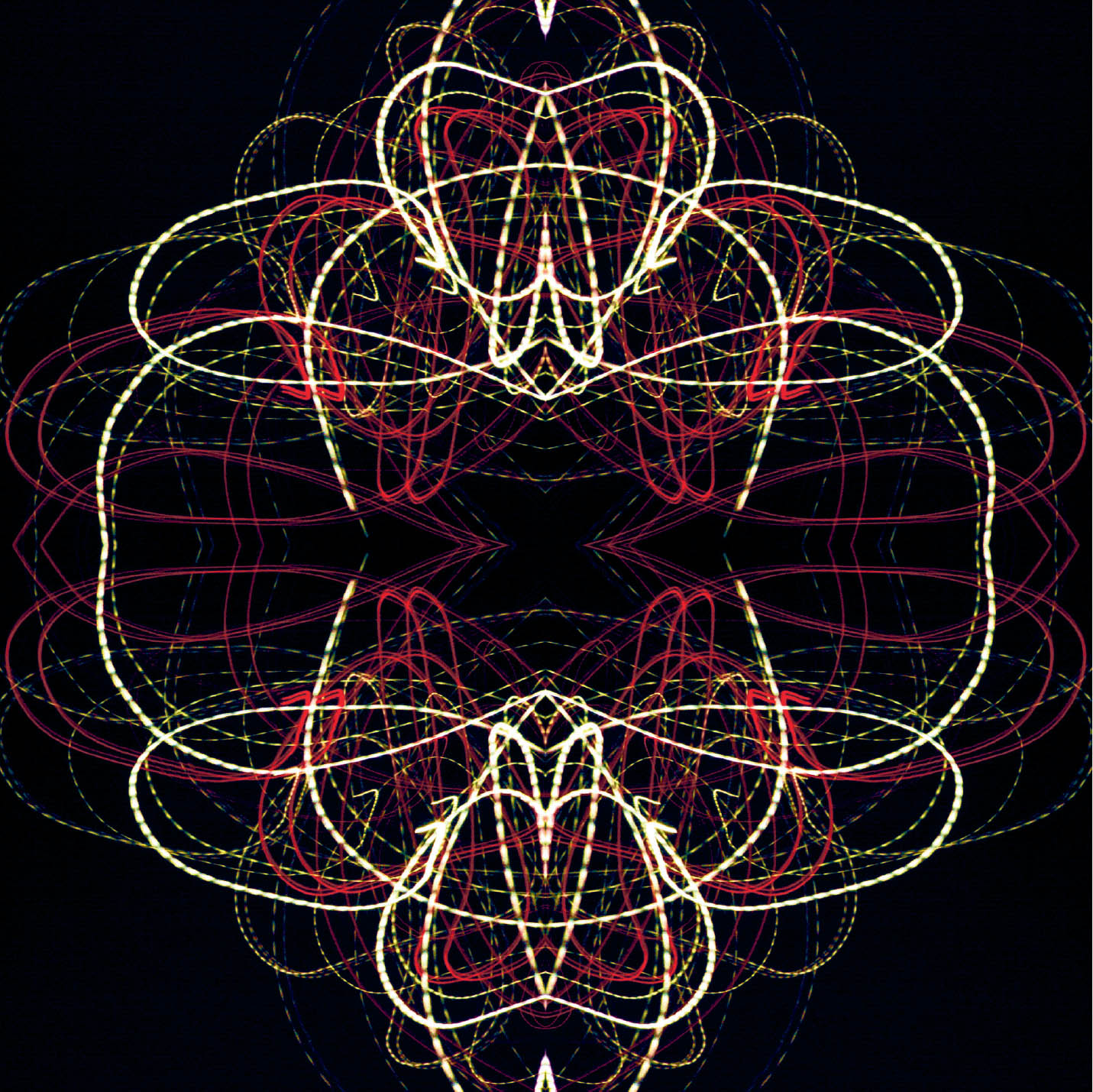
Long Exposure Photography A camera can capture a path of lights moving over time. The oscillations of AC currents are not visible to the eye, but, when recorded through a camera lens, the oscillations create a dashed line. DC currents generate smooth lines. Here, a single long-exposure photograph has been repeated and rotated to create a larger visual shape. Sarah Joy Jordahl Verville, MFA Studio.