Graphic Design: The New Basics: Second Edition, Revised and Expanded (2015)
Rhythm and Balance
I pay close attention to the variety of shapes and sizes, and place the objects so that the lines and edges create a rhythm that guides the viewer’s eye around the image and into the focal point. Sergei Forostovskii
Balance is a fundamental human condition: we require physical balance to stand upright and walk; we seek balance among the many facets of our personal and professional lives; the world struggles for balance of power. Indeed, balance is a prized commodity in our culture, and it is no surprise that our implicit, intuitive relationship with it has equipped us to sense balance—or imbalance—in the things we see, hear, smell, taste, and touch.
In design, balance acts as a catalyst for form—it anchors and activates elements in space. Do you ever notice your eye getting stuck in a particular place when looking at an unresolved design? This discord usually occurs because the proportion and placement of elements in relation to each other and to the negative space is off—too big, too tight, too flat, misaligned, and so on.
Relationships among elements on the page remind us of physical relationships. Visual balance occurs when the weight of one or more things is distributed evenly or proportionately in space. Like arranging furniture in a room, we move components around until the balance of form and space feels just right. Large objects are a counterpoint to smaller ones; dark objects to lighter ones.
A symmetrical design, which has the same elements on at least two sides along a common axis, is inherently stable. Yet balance need not be static. A tightrope walker achieves balance while traversing a precarious line in space, continually shifting her weight while staying in constant motion. Designers employ contrasting size, texture, value, color, and shape to offset or emphasize the weight of an object and achieve the acrobat’s dynamic sense of balance.
Rhythm is a strong, regular, repeated pattern: the beating of drums, the patter of rain, the falling of footsteps. Speech, music, and dance all employ rhythm to express form over time. Graphic designers use rhythm in the construction of static images as well as in books, magazines, and motion graphics that have duration and sequence. Although pattern design usually employs unbroken repetition, most forms of graphic design seek rhythms that are punctuated with change and variation. Book design, for example, seeks out a variety of scales and tonal values across its pages, while also preserving an underlying structural unity.
Balance and rhythm work together to create works of design that pulse with life, achieving both stability and surprise.
Symmetry and Asymmetry
Symmetry can be left to right, top to bottom, or both. Many natural organisms have a symmetrical form. The even weighting of arms and legs helps insure a creature’s safe mobility; a tree develops an even distribution of weight around its core to stand erect; and the arms of a starfish radiate from the center.
Symmetry is not the only way to achieve balance, however. Asymmetrical designs are generally more active than symmetrical ones, and designers achieve balance by placing contrasting elements in counterpoint to each other, yielding compositions that allow the eye to wander while achieving an overall stability.
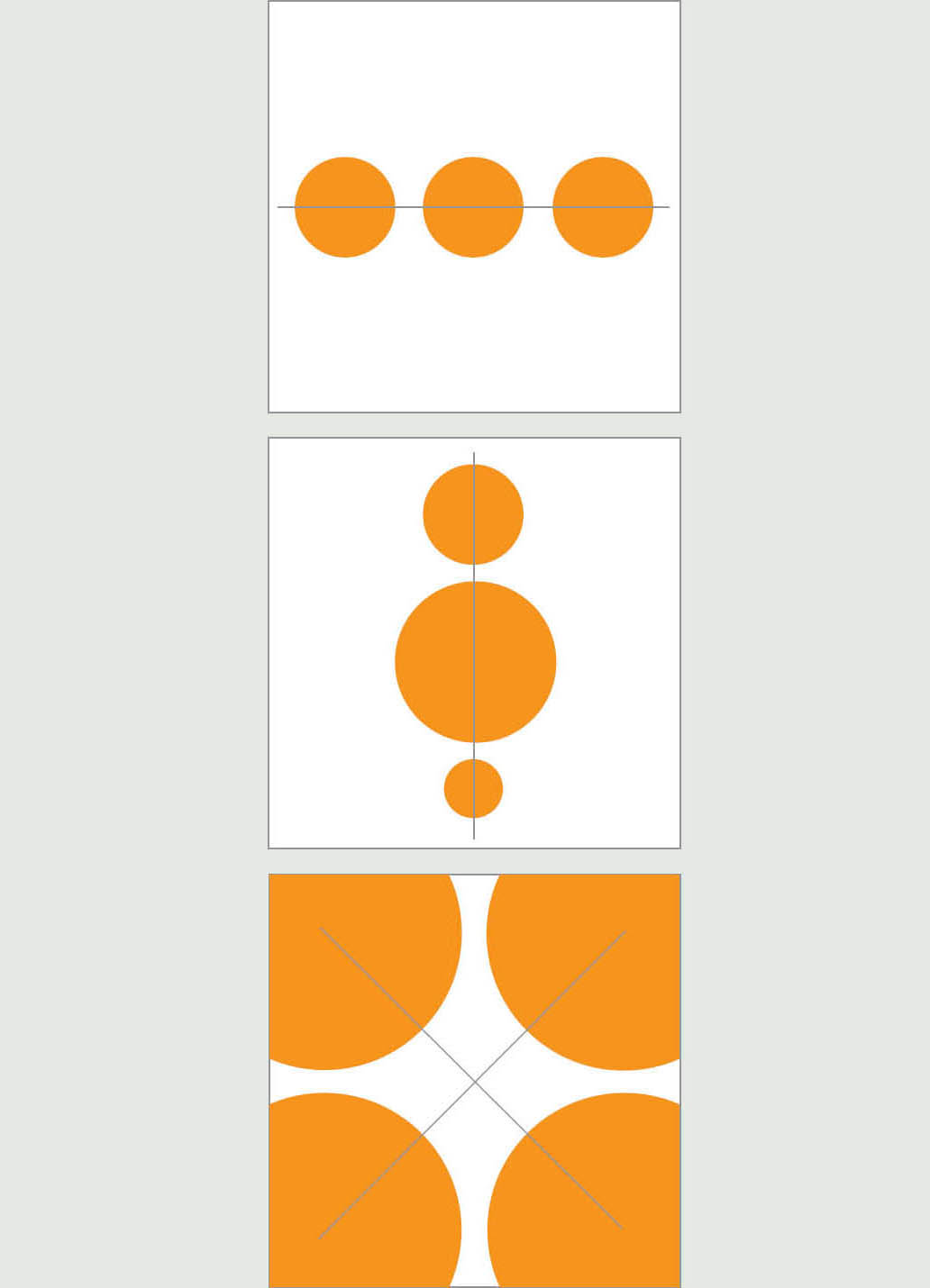
Symmetry The studies above demonstrate basic symmetrical balance. Elements are oriented along a common axis; the image mirrors from side to side along that axis. The configurations shown here are symmetrical from left to right and/or from top to bottom.
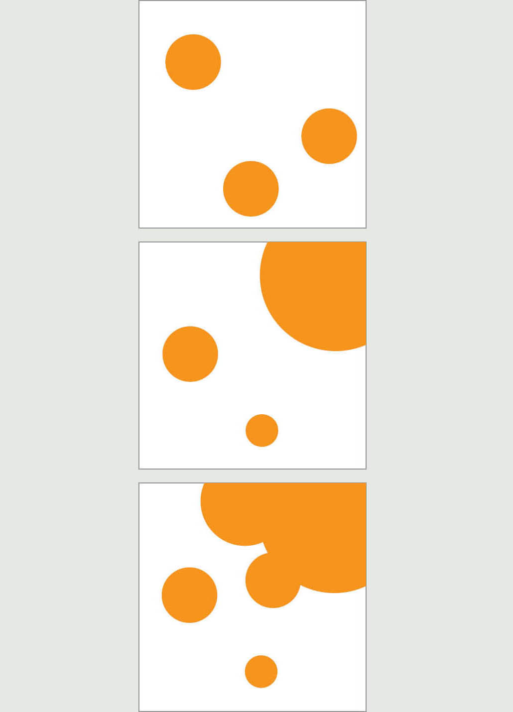
Asymmetry These studies use asymmetry to achieve compositional balance. Elements are placed organically, relying on the interaction of form and negative space and the proximity of elements to each other and to the edges of the field, yielding both tension and balance.
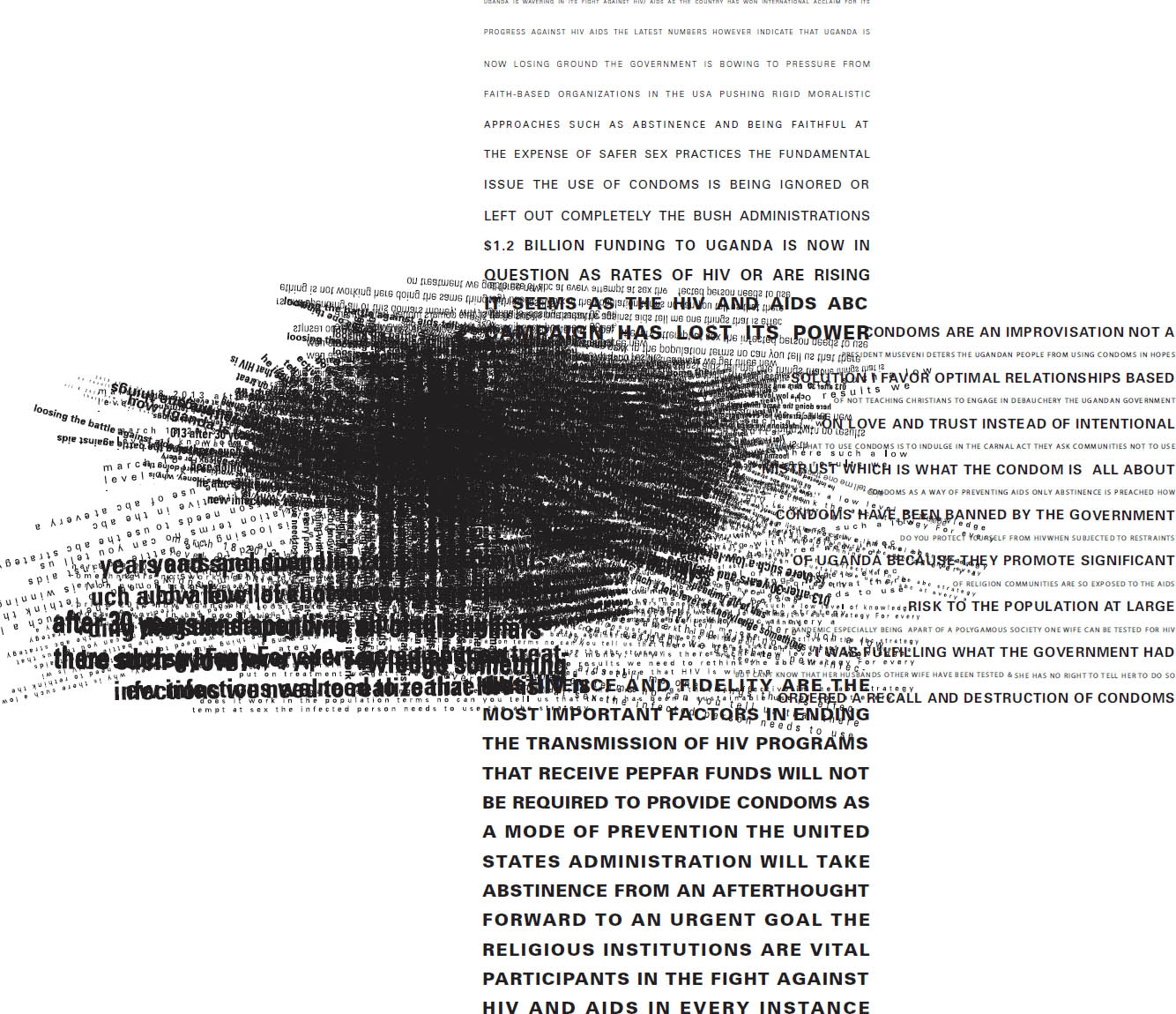
Disrupted Symmetry The designer has disrupted this symmetrical cross form to signify political unrest among factions in Uganda around the HIV/AIDS crisis. Narrative text lines alternate between clarity and obfuscation, ultimately erupting in chaos, yielding a dynamic counterpoint balance. Katrina Keane, MFA Studio.
Rhythm and Time
We are familiar with rhythm from the world of sound. In music, an underlying pattern changes in time. Layers of pattern occur simultaneously in music, supporting each other and providing aural contrast. In audio mixing, sounds are amplified or diminished to create a rhythm that shifts and evolves over the course of a piece.
Graphic designers employ similar structures visually. The repetition of elements such as circles, lines, and grids creates rhythm, while varying their size or intensity generates surprise. In animation, designers must orchestrate both audio and visual rhythms simultaneously.
Jason Okutake, MFA Studio
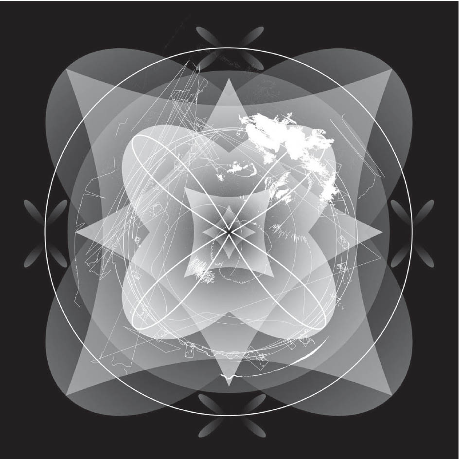
Manic Mandala The smooth, symmetrical shapes layered to build this mandala are interrupted by a discordant frenzy of sharp, irregular lines and masses. Wenji Lu, MFA Studio.
Repetition and Change
From the flowing contours of a farmer’s fields to a sea of shipping containers stacked tightly into rows, repetition is an endless feature of the human environment. Like melodic consonance and fervent discord in music, repetition and change awaken life’s visual juxtapositions. Beauty arises from the mix.
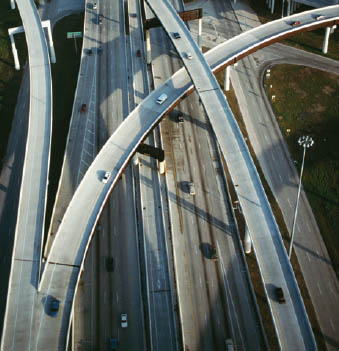
Highway Overpasses, Houston, Texas

Shipping Containers, Norfolk, Virginia
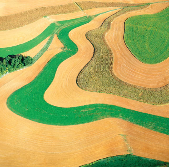
Contour Farming, Meyersville, Maryland
Observed Rhythm Aerial photographs are fascinating and surprising because we are not accustomed to seeing landscapes from above. The many patterns, textures, and colors embedded in both man-made and natural forms—revealed and concealed through light and shadow—yield intriguing rhythms. Cameron Davidson.
Rhythm and Pacing
Designers often work with content distributed across multiple pages. As in a single-page composition, 5an overall coherence. Imagery, typography, rules, color fields, and so on are placed with mindful intention to create focal points and to carry the viewer’s eye through the piece. An underlying grid helps bring order to a progression of pages. Keeping an element of surprise and variation is key to sustaining interest.
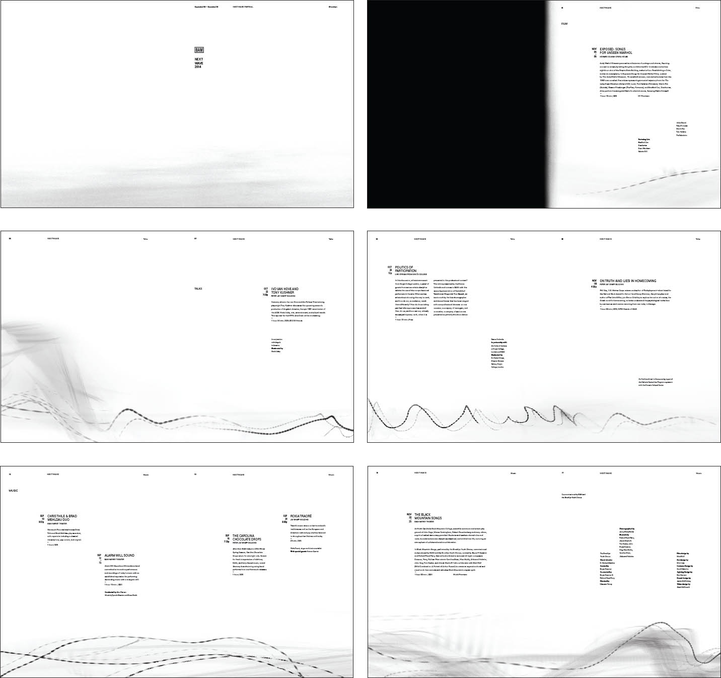
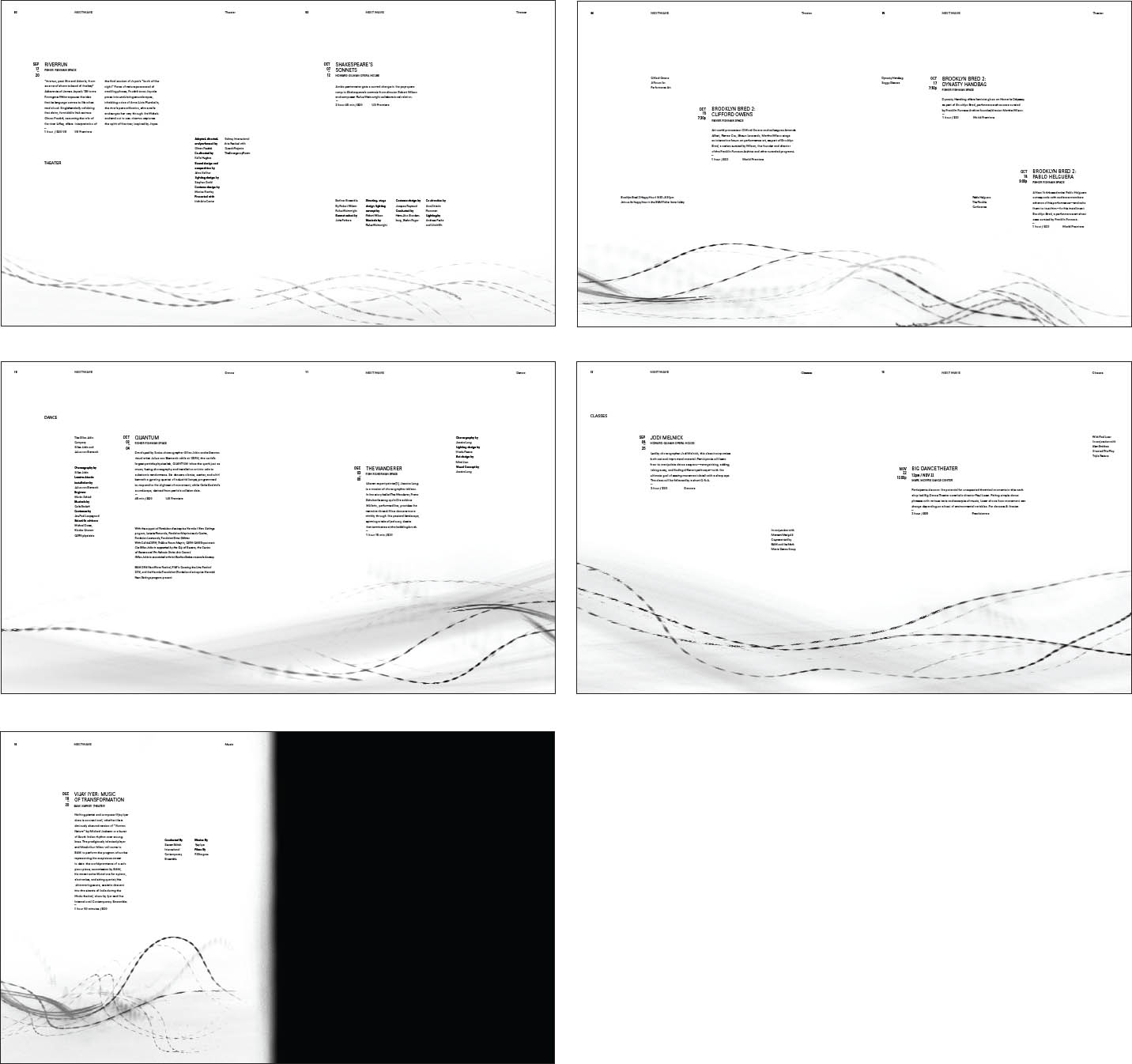
The Next Wave Festival This highly systematic project asks designers to create a program of events for the Brooklyn Academy of Music’s Next Wave Festival. Given the sophisticated, avant-garde nature of the venue, designers are encouraged to reach for fresh solutions that will balance a spirit of invention and expression with navigable order and clearly accessible information. This solution creates counterpoint contrast between the undulating and smoky wave forms and a rigorous grid system, hierarchy, and dynamic distribution within each spread and across the entire sequence. Kim Meistrell, Advanced Graphic Design I. Jennifer Cole Phillips, faculty.
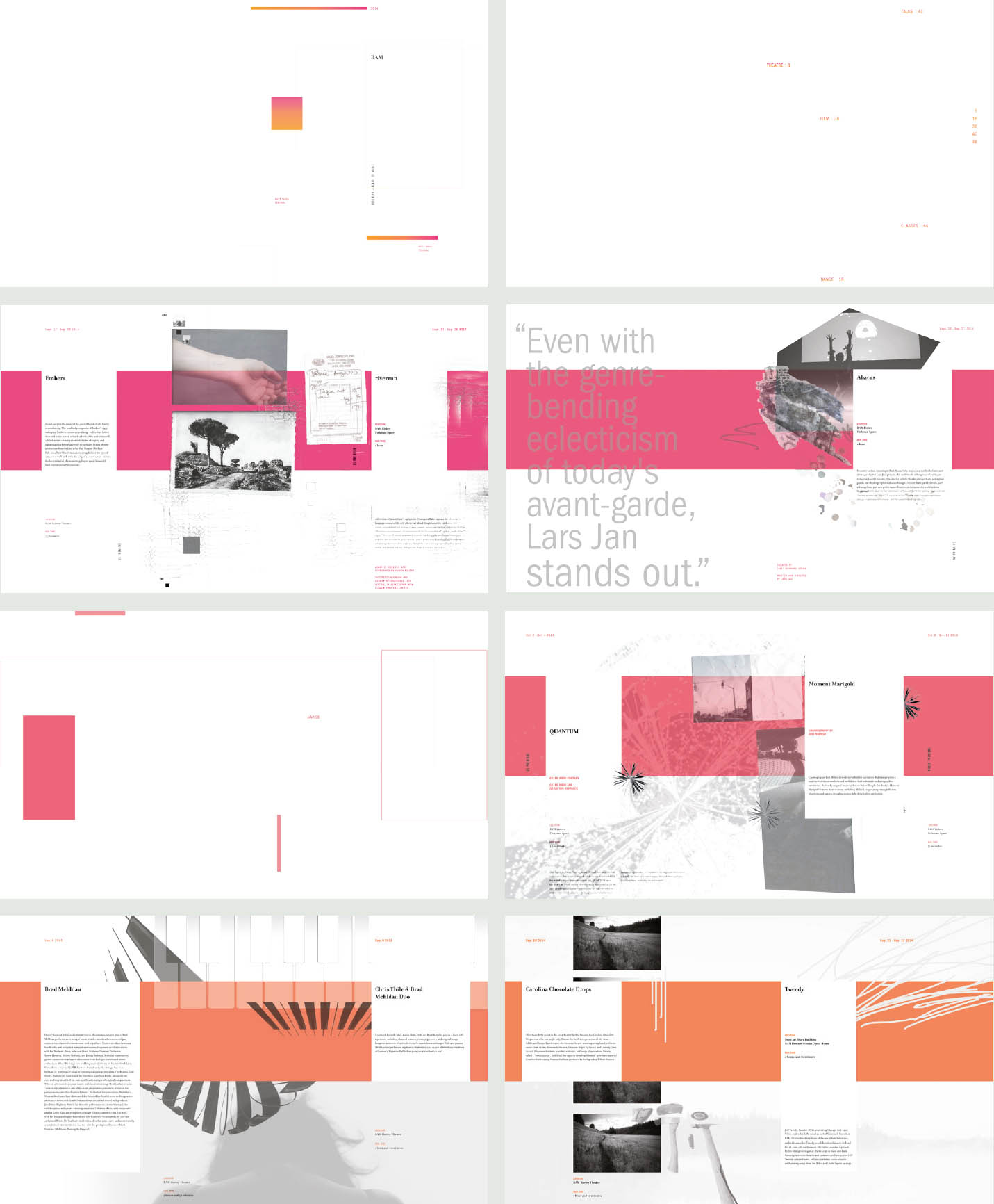
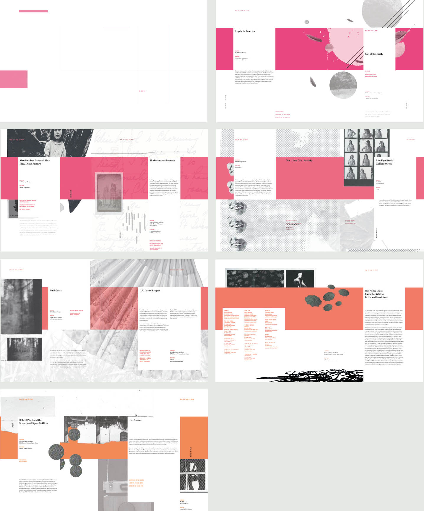
Ordered Improvisation The designer commands a complex and nuanced visual vocabulary, embedding a graceful balance of order and improvisation into compositions built with dynamic asymmetry across multiple spreads. Julia Rivera, Advanced Graphic Design I, Jennifer Cole Phillips, faculty.
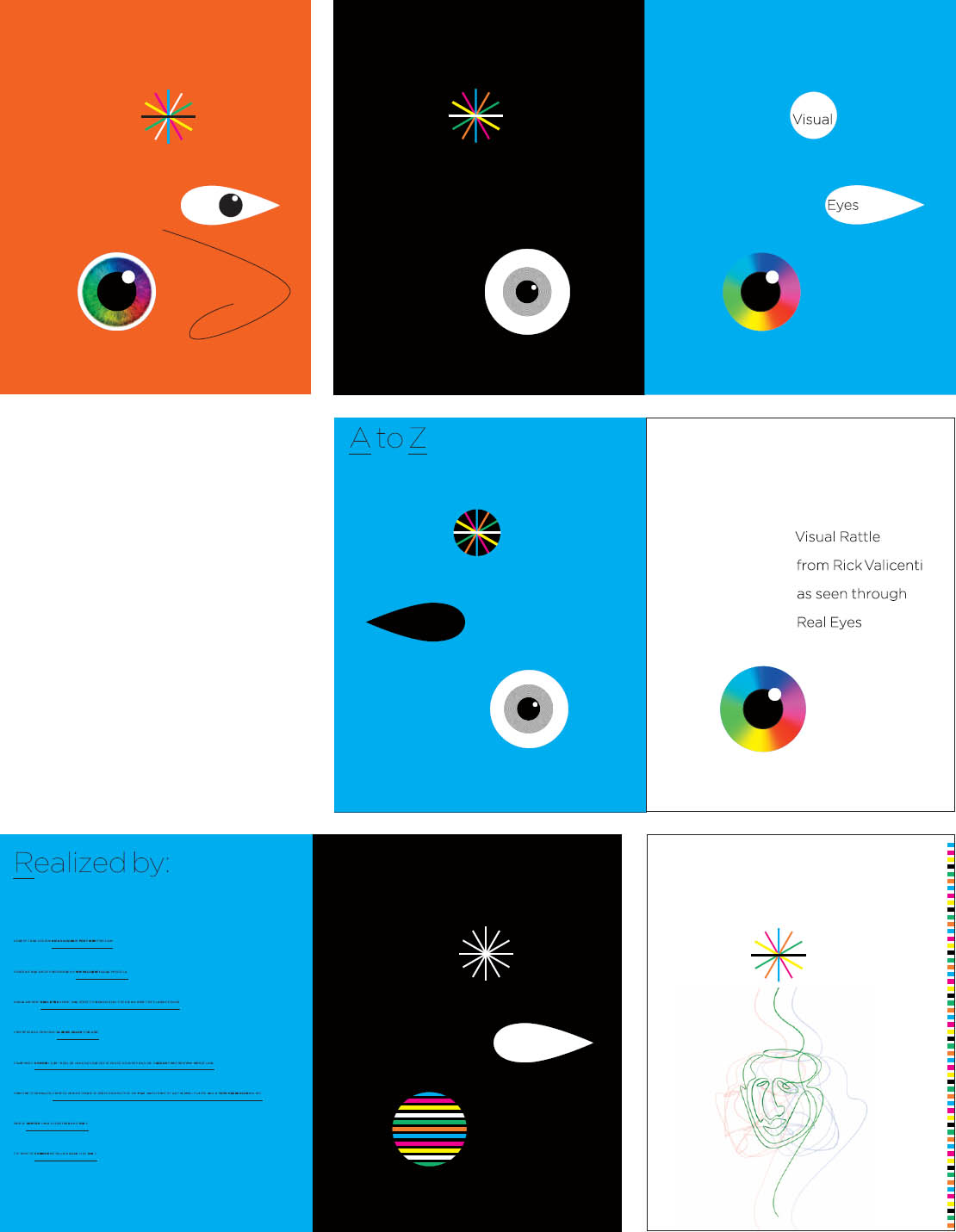
Graceful Entry These pages serve as the cover, lead-in, and close of a lavishly designed and illustrated alphabet book. The simple, well-balanced elements are introduced, then animated with color and context, and finally returned to abstraction, creating a playful and compelling progression that belies the complexity of the book’s interior. Rick Valicenti, Thirst.
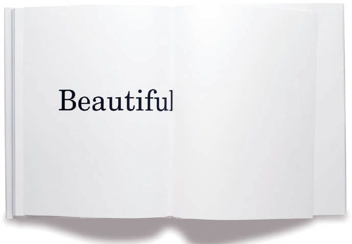
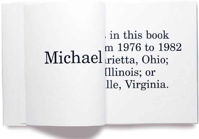
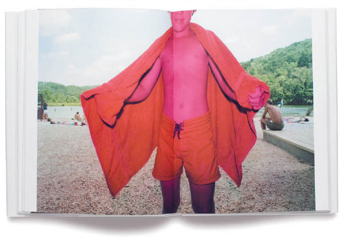
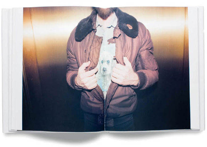
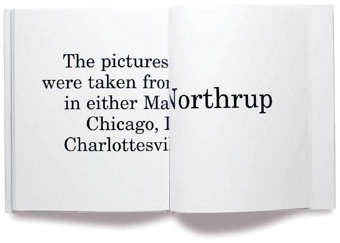
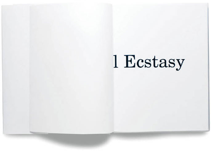
Spinal Orientation This collection of photographs by Michael Northrup includes many images with a prominent central feature. Designer Paul Sahre responded to this condition by splitting the title and other opening text matter between the front and back of the book, thus creating surprise for and increased interaction with the reader. Paul Sahre, Office of Paul Sahre. Book photographed by Dan Meyers.
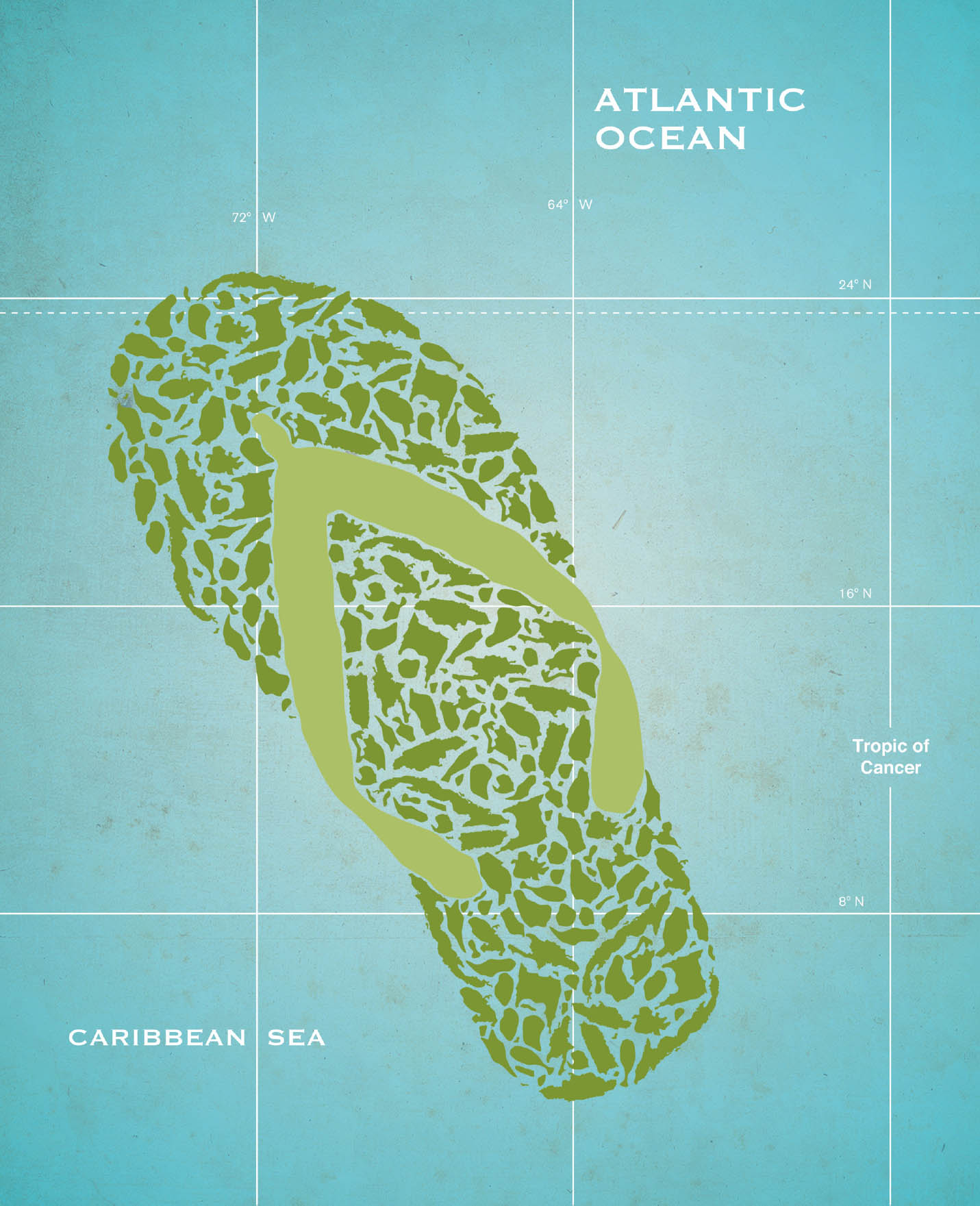
Big Picture from Small Parts This design represents Caribbean culture as the colloquy of numerous small islands. The meaning of the image comes directly from the contrast in scale. Robert Lewis, MFA Studio.