Graphic Design: The New Basics: Second Edition, Revised and Expanded (2015)
Texture
If you touch something (it is likely) someone will feel it. If you feel something (it is likely) someone will be touched. Rick Valicenti
Texture is the tactile grain of surfaces and substances. Textures in our environment help us understand the nature of things: rose bushes have sharp thorns to protect the delicate flowers they surround; smooth, paved roads signal safe passage; thick fog casts a veil on our view.
The textures of design elements similarly correspond to their visual function. An elegant, smoothly patterned surface might adorn the built interior or printed brochure of a day spa; a snaggle of barbed wire could stand as a metaphor for violence or incarceration.
In design, texture is both physical and virtual. Textures include the literal surface employed in the making of a printed piece or physical object as well as the optical appearance of that surface. Paper can be rough or smooth, fabric can be nubby or fine, and packaging material can be glossy or matte. Physical textures affect how a piece feels to the hand, but they also affect how it looks. A smooth or glossy surface, for example, reflects light differently than a soft or pebbly one.
Many of the textures that designers manipulate are not physically experienced by the viewer at all, but exist as optical effect and representation. Texture adds detail to an image, providing an overall surface quality as well as rewarding the eye when viewed up close.
Whether setting type or depicting a tree, the designer uses texture to establish a mood, reinforce a point of view, or convey a sense of physical presence. A body of text set in Garamond italic will have a delicately irregular appearance, while a text set in Univers roman will appear optically smooth with even tonality. Likewise, a smoothly drawn vector illustration will have a different feel from an image taken with a camera or created with code.
As in life, the beauty of texture in design often lies in its poignant juxtaposition or contrast: prickly/soft, sticky/dry, fuzzy/smooth, and so on. By placing one texture in relation to its opposite, or a smart counterpart, the designer can amplify the unique formal properties of each one.
This chapter presents a wide spectrum of textures generated by hand, camera, computer, and code. They are abstract and concrete, and they have been captured, configured, sliced, built, and brushed. They were chosen to remind us that texture has a genuine, visceral, wholly seductive capacity to reel us in and hold us.
Concrete Texture
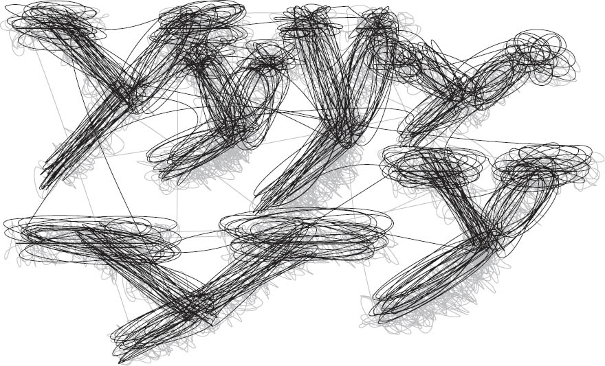
The physical quality resulting from repeated slicing, burning, marking, and extracting creates concrete textural surfaces with robust appeal. The studies to the right grew out of a studio exercise where the computer was prohibited in the initial stages of concept and formal development. Turbulence (below), an alphabet by Rick Valicenti, similarly evokes a raw physicality. The alphabet began with vigorous hand-drawn, looping scribbles that were then translated into code.

Surface Manipulation The textural physicality of these type studies artfully reflects the active processes featured in the words. The crisscrossing lines of an artist’s cutting board resemble an urban street grid. Jonnie Hallman, Graphic Design I. Bernard Canniffe, faculty.
Physical and Virtual Texture
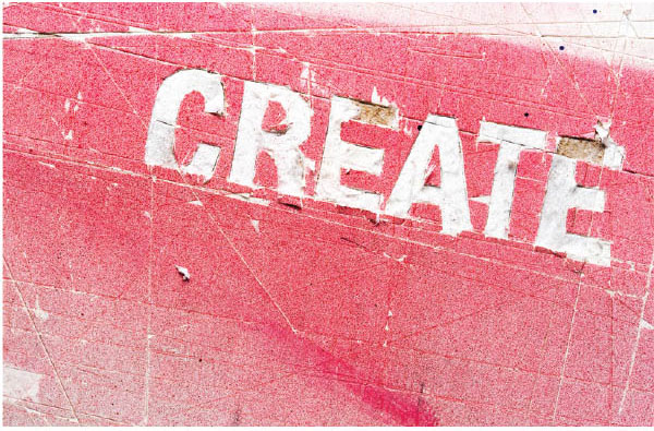
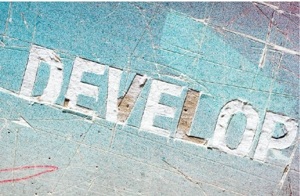
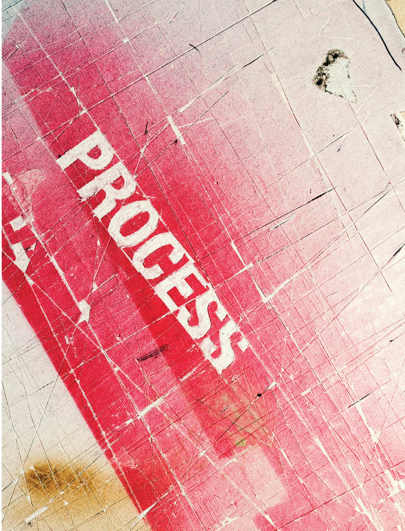
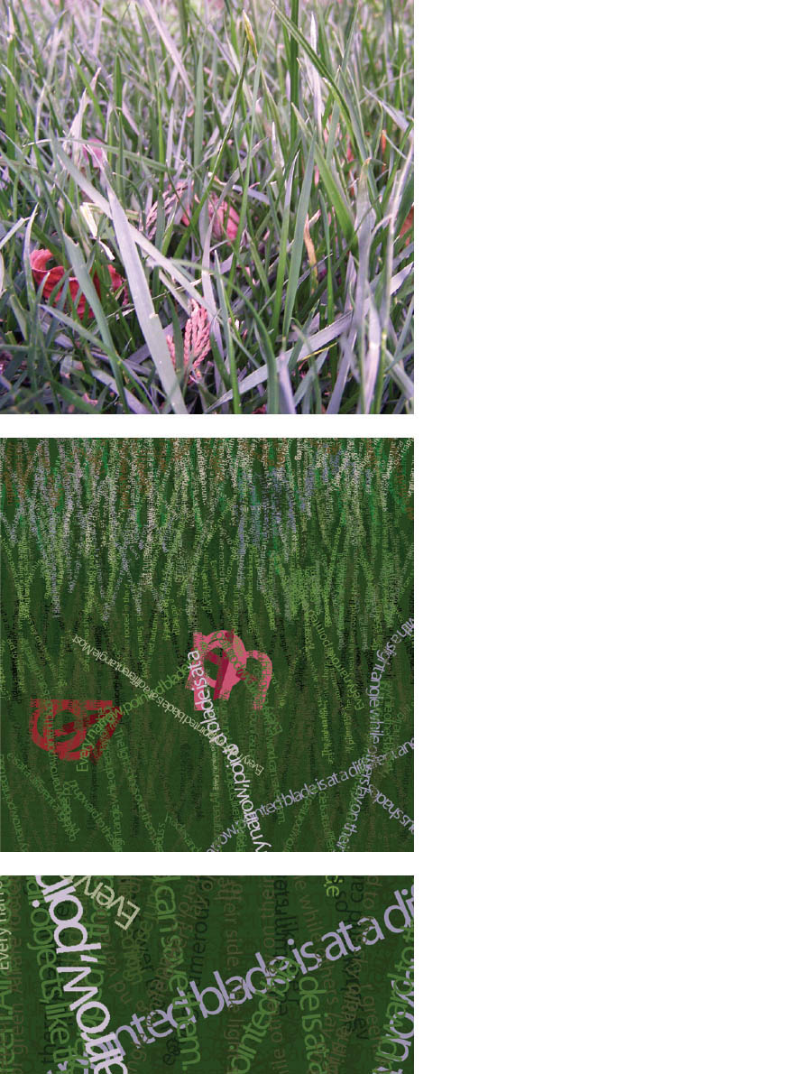
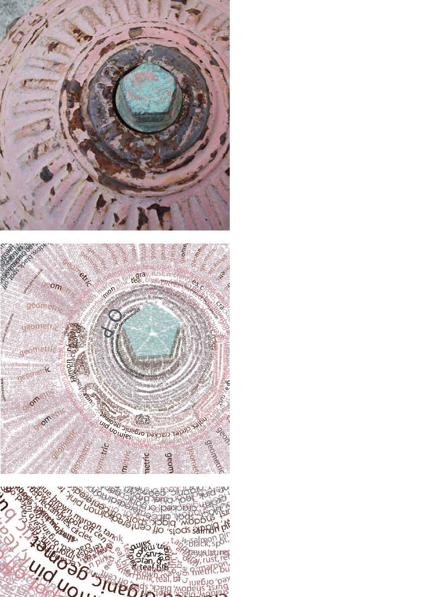
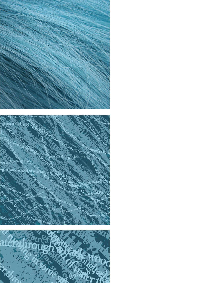
This exercise builds connections between physical and virtual texture (the feel and look of surfaces). Designers used digital cameras to capture compelling textures from the environment. Next, they wrote descriptive paragraphs about each of the textures, focusing on their images’ formal characteristics.
Using these descriptive texts as content, the designers re-created the textures typographically in Adobe Illustrator, employing repetition, scale, layers, and color. Typeface selection was open, but scale distortion was not permitted. Graphic Design I. Mike Weikert, faculty.
Grey Haas
Hayley Griffin
Tim Mason

Code-Driven Texture The Swiss typographer Emil Ruder once claimed that vital and individual typographic rhythms are alien to machines. The code-driven letterforms shown here prove otherwise. Generated in the computer language Processing, these forms are effervescent, organic, and, indeed, vital. Yeohyun Ahn, MFA Studio.
Five Squares Ten Inches All typefaces have an innate optical texture that results from the accumulation of attributes such as serifs, slope, stroke width, and proportion. Those attributes interact on the page with the size, tracking, leading, and paragraph style selected by the designer, yielding an overall texture.
In this exercise, designers composed five justified squares of type inside a ten-inch frame. Variation of type style, texture, and value were achieved by combining contrasting characteristics such as old style italic serifs, uniformly weighted sans serifs, geometric slab serifs, and so on. Light to dark value (typographic color) was controlled through the combination of stroke width, letterspacing, and paragraph leading.
Finally, students manipulated the scale and placement of the squares to achieve compositional balance, tension, and depth. Squares were permitted to bleed off the edges, reinforcing the illusion of amplification and recession. Typography I. Jennifer Cole Phillips, faculty.
Julie Diewald
Anna Eshelman
Anna Eshelman

HyunSoo Lim
Ellen Kling
Julie Diewald
Wenji Lu
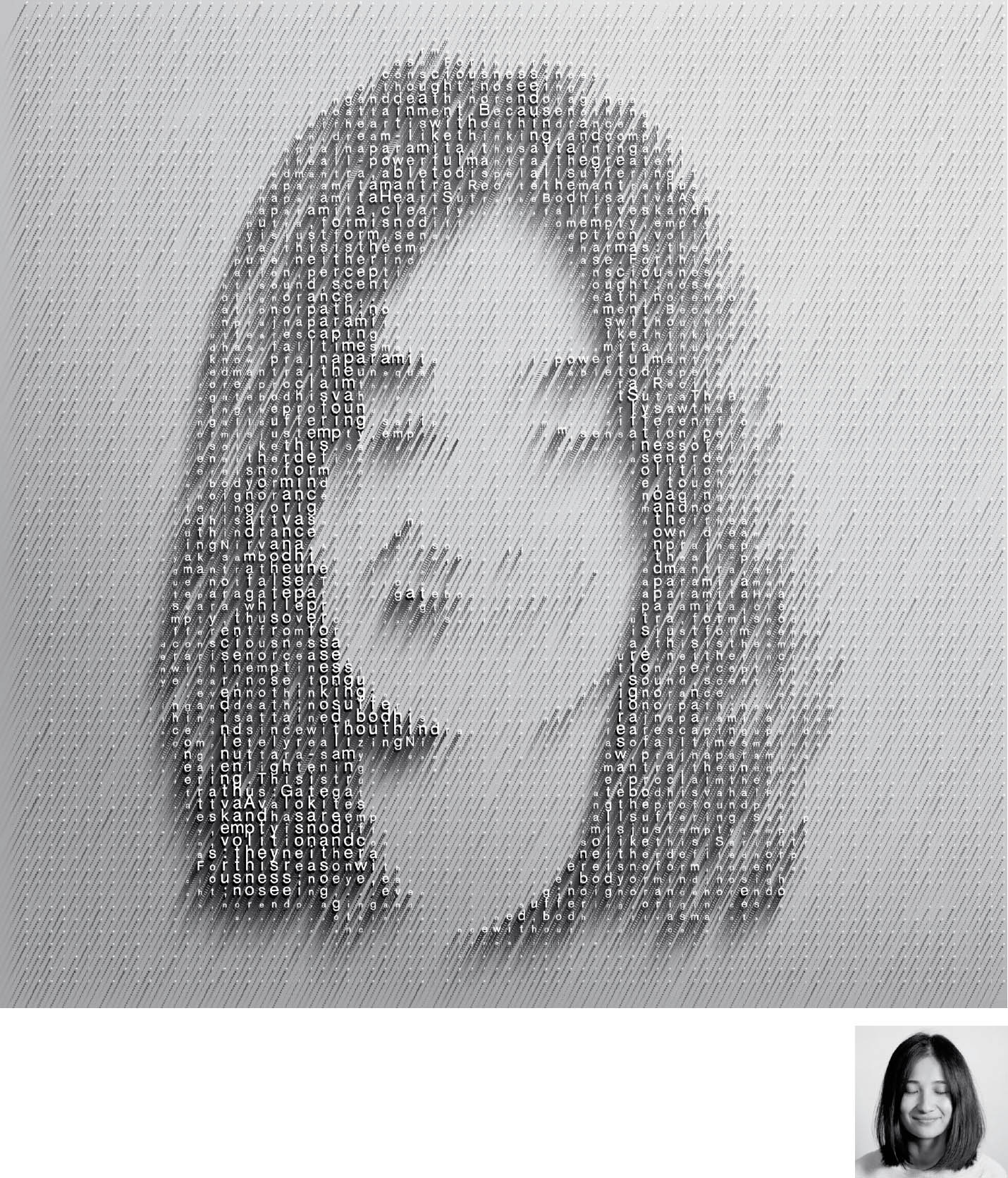
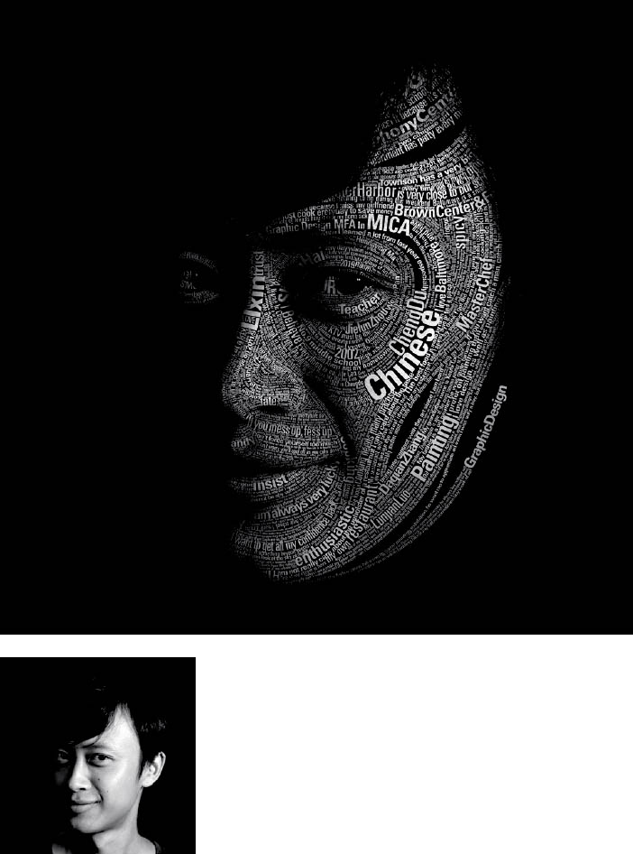
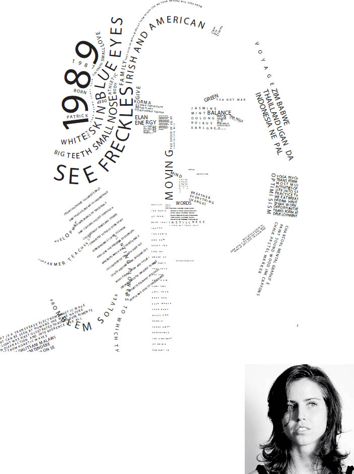
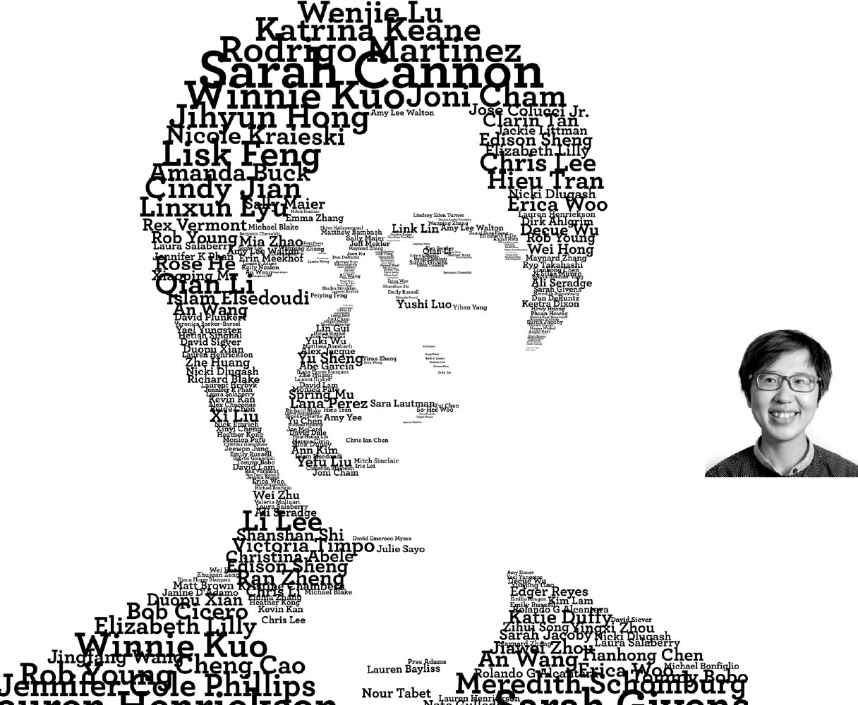
Typographic Portraits This exploration of typographic texture begins with a basic black-and-white photograph. Designers translate the tonal and textural qualities using only typographic variables, such as weight, style, size, alignment, and spacing, to approximate their own likeness. Solutions range from tightly articulated to loosely expressive and are built from words mined from the students’ biographies. Graduate Typography. Jennifer Cole Phillips, faculty.
Yushi Luo
Katrina Keane
Lolo Zhang
Textural Harmony and Contrast
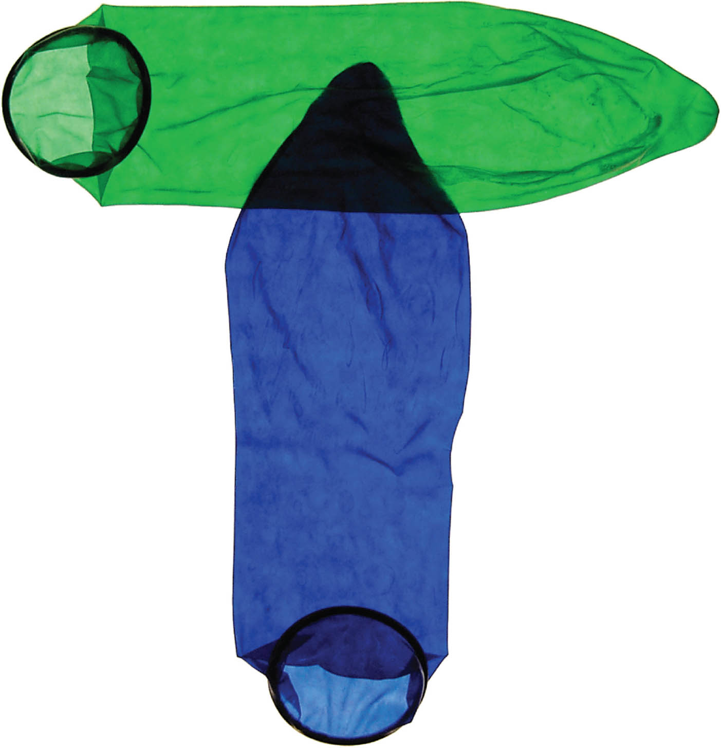
Surface details can have harmonic or contrasting characteristics, yielding distinct visual effects. Some textures have a high degree of contrast and are built from relatively large elements; others are low contrast and have a fine, delicate grain. A rubbery, baggy condom contrasts with the soft, bruised skin of a banana. Letterforms can be made with sweeping, gooey brush forms or with crisp strips of paper, each technique imbuing the page with a particular physical quality.
Satoru Nihei
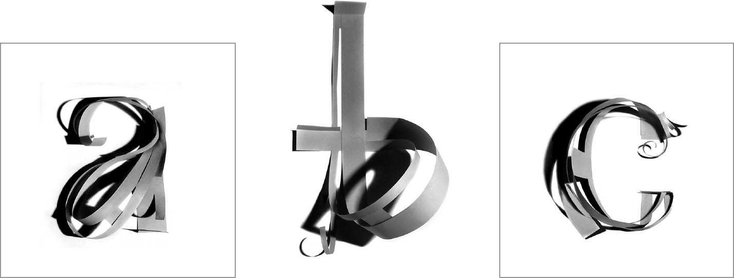
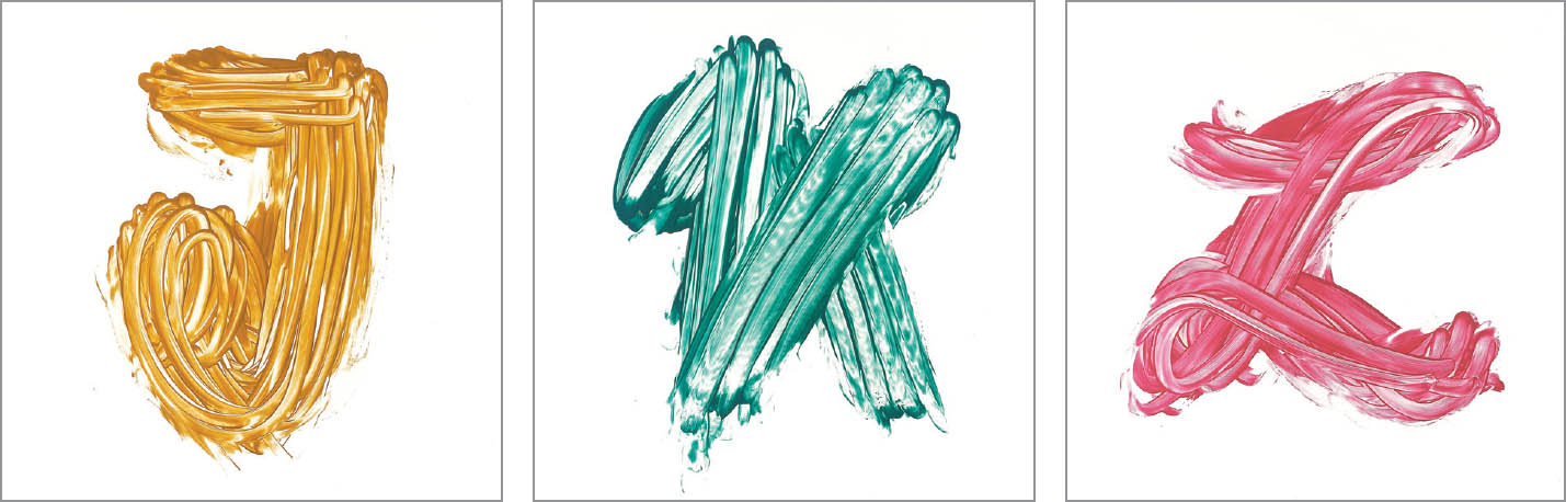
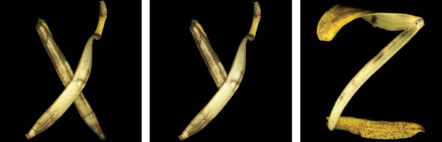
Alphabetic Texture These alphabets are from a diverse collection created for Rick Valicenti’s Playground experiment, where letters are constructed from physical objects and processes. Designers top to bottom: Michelle Bowers, Rick Valicenti, Jenn Stucker.
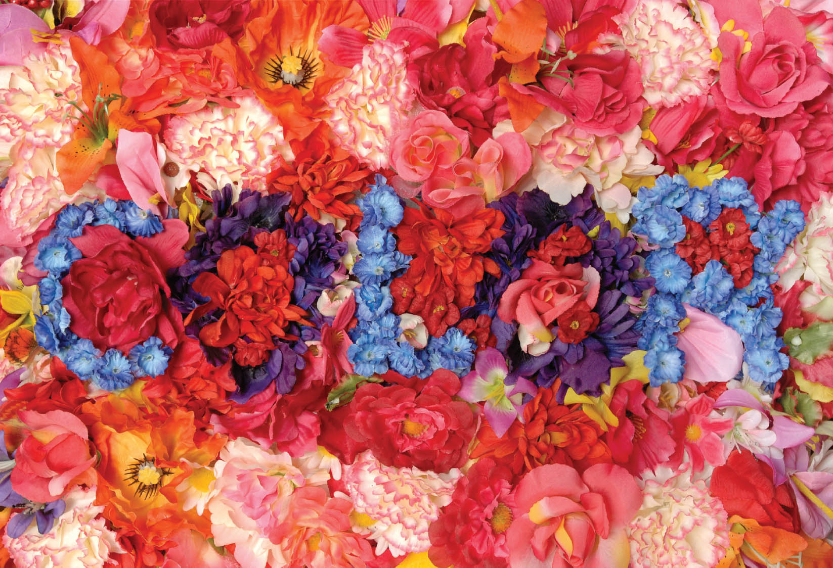
Attract Strong color contrasts add visual energy to this dense physical montage made from flowers. Blue and purple stand out against pink, orange, and red. Nancy Froehlich and Zvezdana Rogic.