Graphic Design: The New Basics: Second Edition, Revised and Expanded (2015)
Modularity
Two eight-stud LEGO bricks can be combined in twenty-four ways. Three eight-stud LEGO bricks can be combined in 1,060 ways. Six eight-stud LEGO bricks can be combined in 102,981,500 ways. With eight bricks the possibilities are virtually endless. The Ultimate LEGO Book
Every design problem is completed within a set of constraints or limitations. These limits can be as broad as “design a logo,” as generic as “print on standard letter paper,” or as narrow as “arrange six circles in a square space.” Working within the constraints of a problem is part of the fun and challenge of design.
Modularity is a special kind of constraint. A module is a fixed element used within a larger system or structure. For example, a pixel is a module that builds a digital image. A pixel is so small, we rarely stop to notice it, but when designers create pixel-based typefaces, they use a grid of pixels to invent letterforms that are consistent from one to the next while giving each one a distinctive shape.
A nine-by-nine grid of pixels can yield an infinite number of different typefaces. Likewise, a tiny handful of LEGO bricks contains an astonishing number of possible combinations.1 The endless variety of forms occurs, however, within the strict parameters of the system, which permits just one basic kind of connection.
Building materials—from bricks to lumber to plumbing parts— are manufactured in standard sizes. By working with ready-made materials, an architect helps control construction costs while also streamlining the design process.
Designers are constantly making decisions about size, color, placement, proportion, relationships, and materials as well as about subject matter, style, and imagery. Sometimes, the decision-making process can be so overwhelming, it’s hard to know how to begin and when to stop. When a few factors are determined in advance, the designer is free to think about other parts of the problem. A well-defined constraint can free up the thought process by taking some decisions off the table. In creating a page of typography, for example, a designer can choose to work within the constraints of one or two type families, and then explore different combinations of size, weight, and placement within that family of elements.
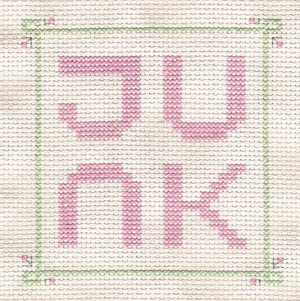
The book you are reading is organized around a typographic grid whose basic module is a square. By accepting the square unit as a given, we were able to mix and match images while creating a feeling of continuity across the book. The square units vary in size, however (keeping the layouts from getting dull), and some pictures stretch across more than one module (or ignore the grid altogether). Rules are helpful, but it’s fun to break them.
Working with Constraints
In the projects shown here, graphic designers have used modular elements to produce unpredictable results. Try looking at familiar systems from a fresh angle. Given the constraints of any system, how can you play with the rules to make something new?
A child’s set of alphabet blocks looks a certain way, for example, because the blocks are made from perfect cubes. But what if alphabet blocks were made from rectangles instead of cubes? The oddly proportioned faces of the blocks at left provided a framework for designing new letterforms in response to the constraints provided by the blocks of wood.
Standard materials such as laser paper are often used in generic ways. A standard sheet of office paper can be very dull indeed. Yet with creative thinking, an ordinary piece of paper can be used for dramatic effect. The temporary signage program shown on the opposite page employs economical processes and everyday materials to produce graphics at a lavish scale— at a very low cost.
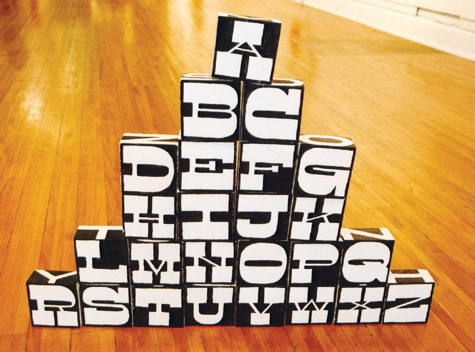
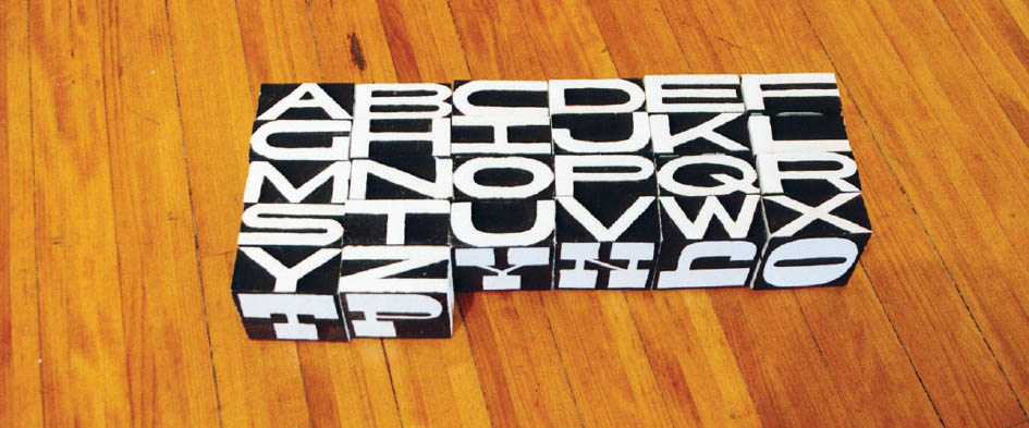
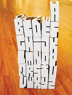
Alphabet Blocks These rectangular wooden blocks have a different alphabet painted on each side. Nolen Strals and Bruce Willen, Post Typography.
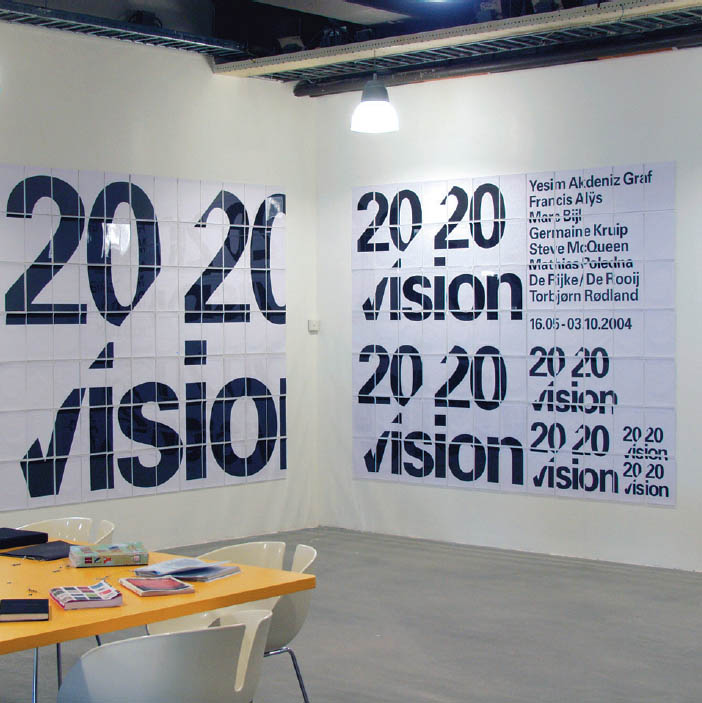
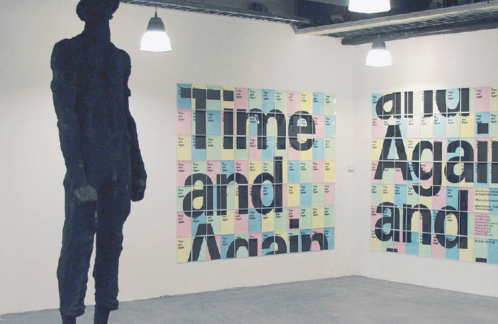
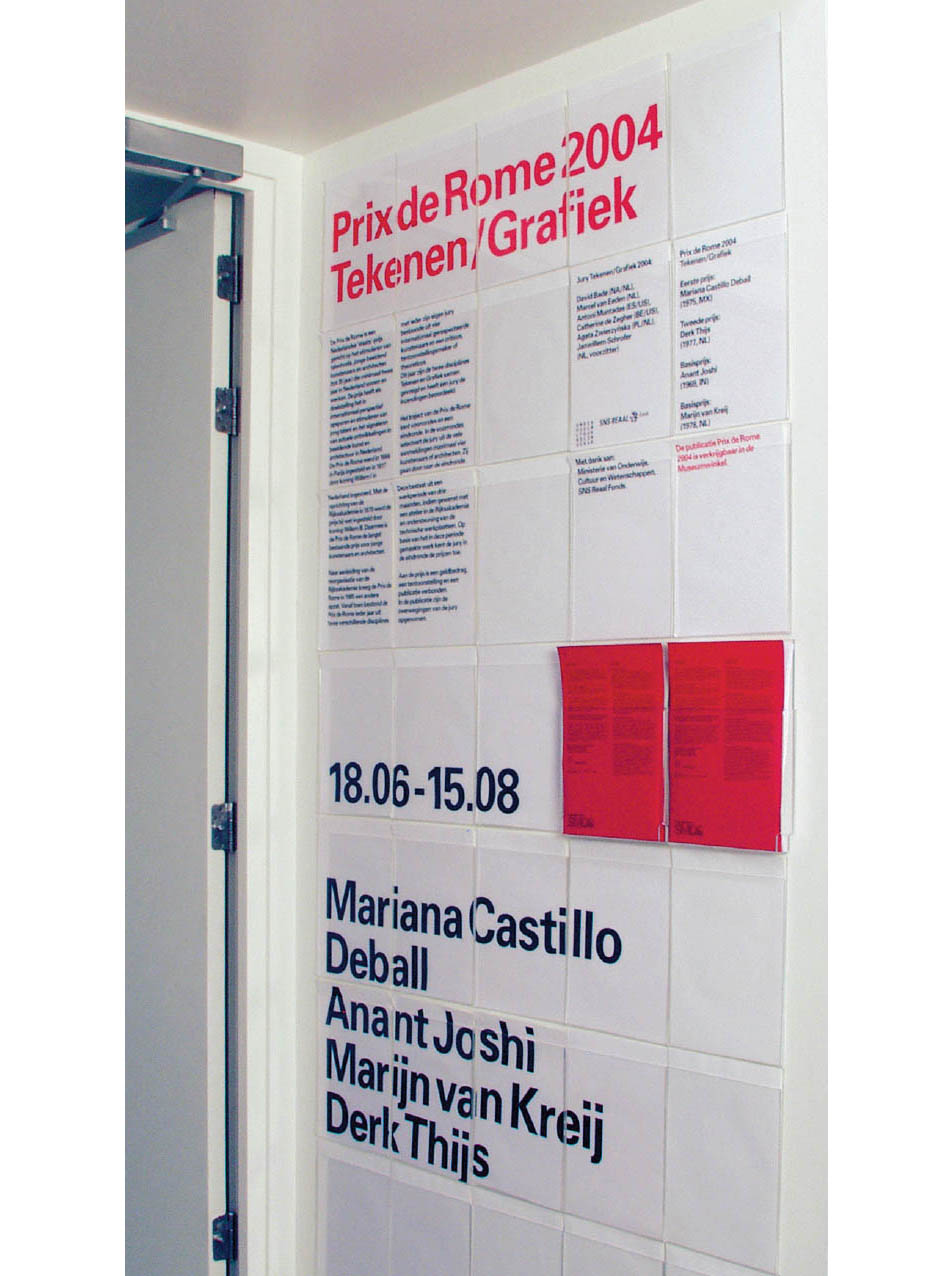
Stedlijk Museum CS Signage System This sign system was created for the temporary headquarters of a major museum in the Netherlands. The basic module is a plastic document holder, into which standard sheets of A4 letter paper are inserted. Large-scale graphics are tiled across multiple plastic envelopes. Experimental Jetset.
Kristen Bennett
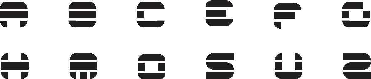
Clean and Dirty Systems Working with a nine-by-nine-square grid of circles, students created four letterforms with common characteristics such as weight, proportion, and density. Designers then introduced decay, degradation, distortion, randomness, or physicality into the design. The underlying structure becomes an armature for new and unexpected processes. Designers employed digital techniques, such as applying a filter to the source image or systematically varying the elements, as well as using physical processes such as painting, stitching, or assembling. Typography I. Ellen Lupton, faculty.
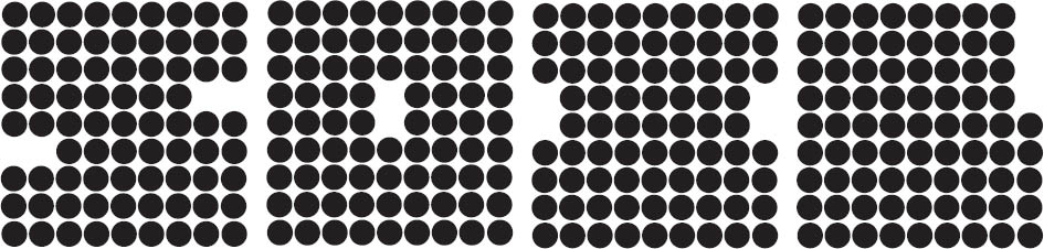
Emily Goldfarb
Nicolette Cornelius
Austin Roesberg
Andy Bonner
Zachary Richter
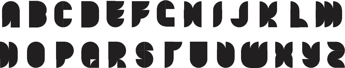
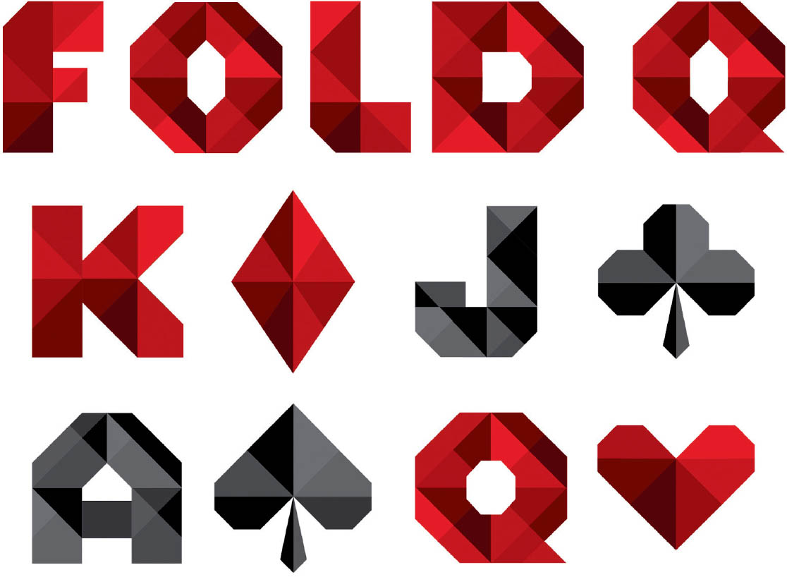
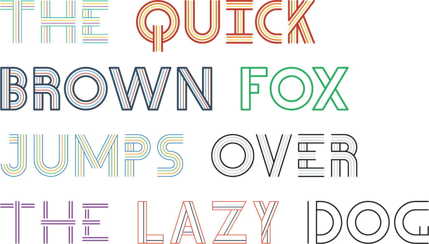
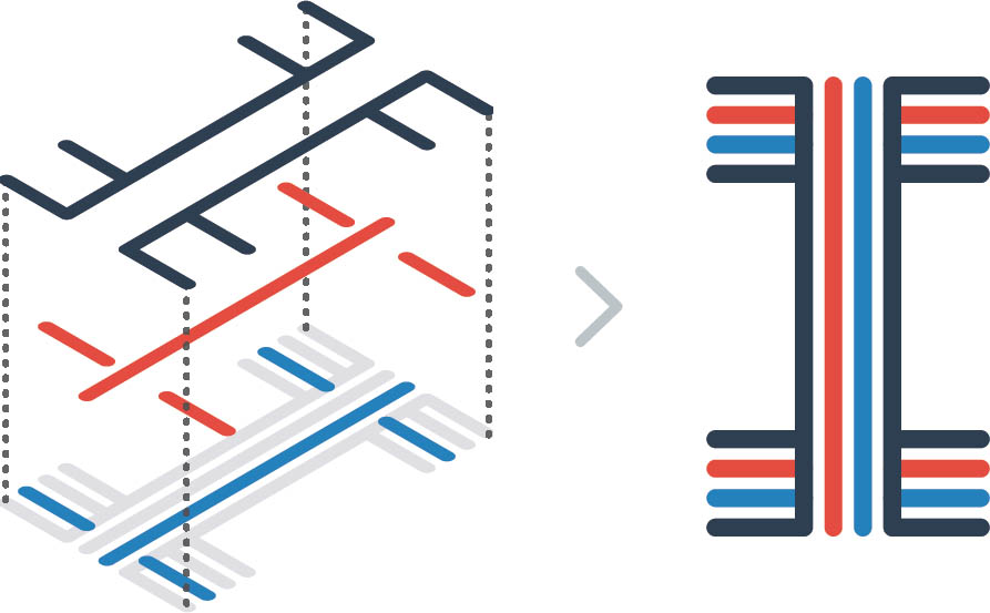
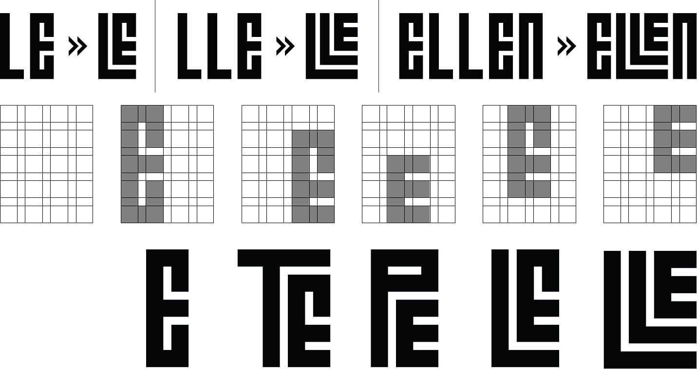
Modular Alphabet In these examples, designers created systems of characters using three basic shapes: a square (each side equals one unit), a rectangle (one unit by two units), and a quarter-circle (radius equals one unit). Shapes could be assembled in any way, but their relative scale could not change.
Some forms are dense and solid, while others are split apart. Some use the curved elements to shape the outer edge, while others use curves to cut away the interior. Most have a simple profile, but it is also possible to build a detailed texture out of smaller-scaled elements. Experimental Typography. Nolen Strals and Bruce Willen, faculty.
Architectural Alphabet The three-dimensional design software AutoCAD has been used to spell out the phrase “word book” in buildings. The rectilinear modules of architecture become the building blocks for letterforms. Johanna Barthmaier, Typography I. Ellen Lupton, faculty.
Jennifer Baghieri
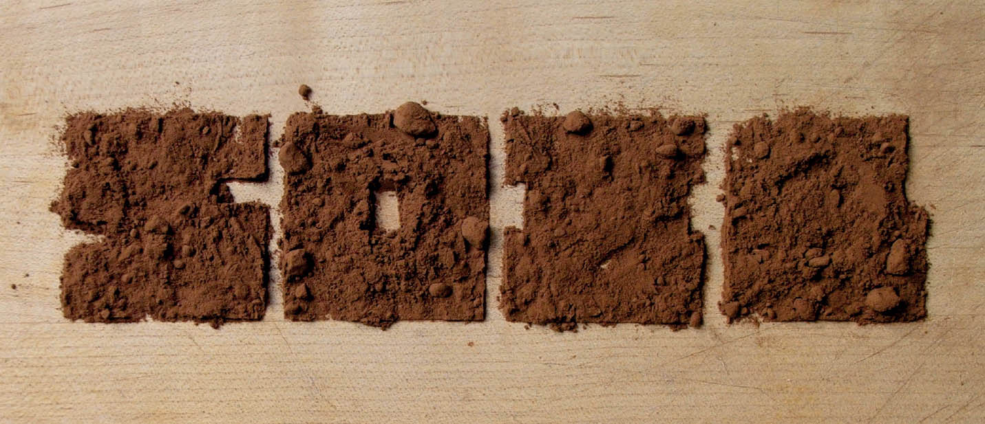
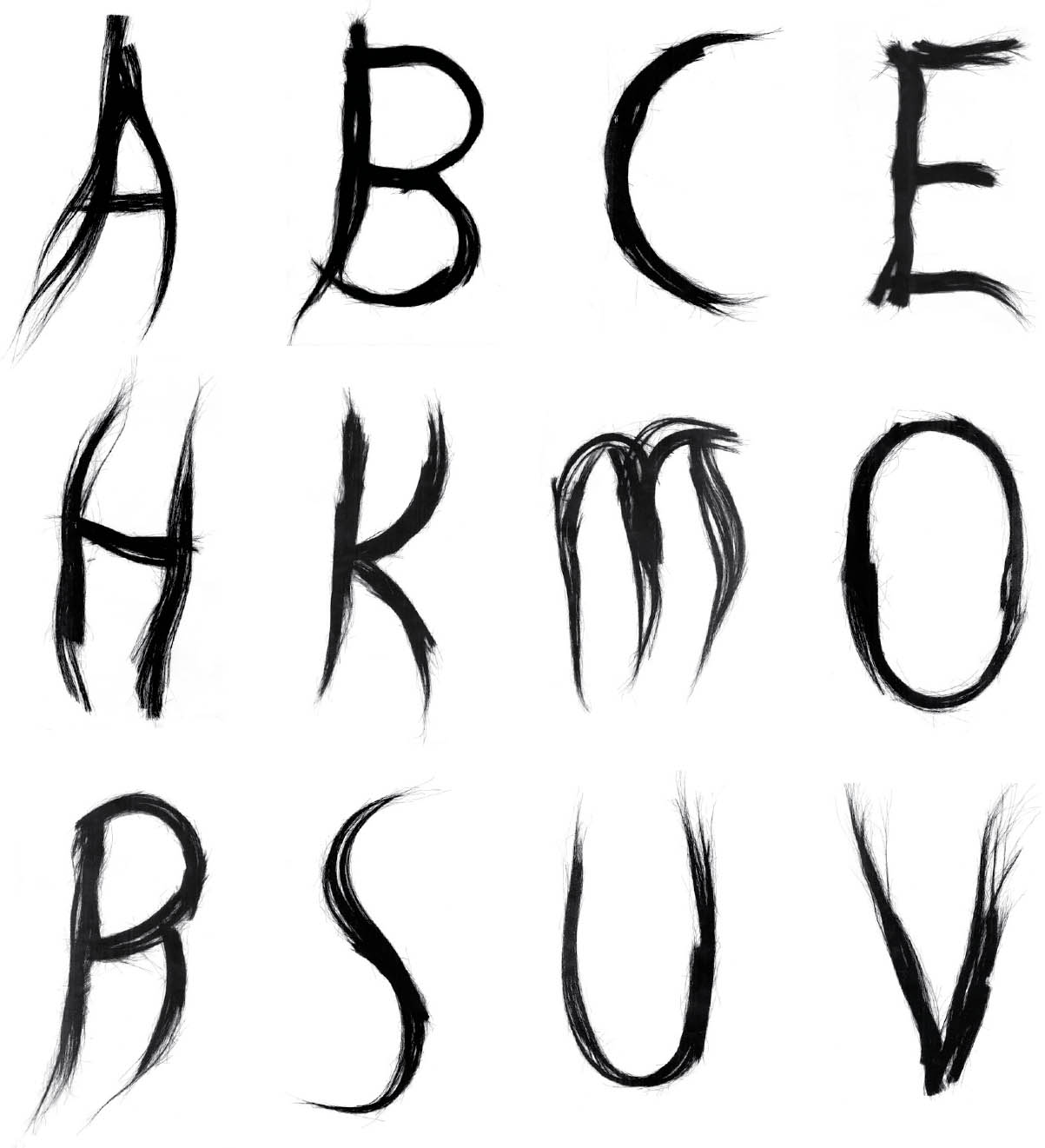
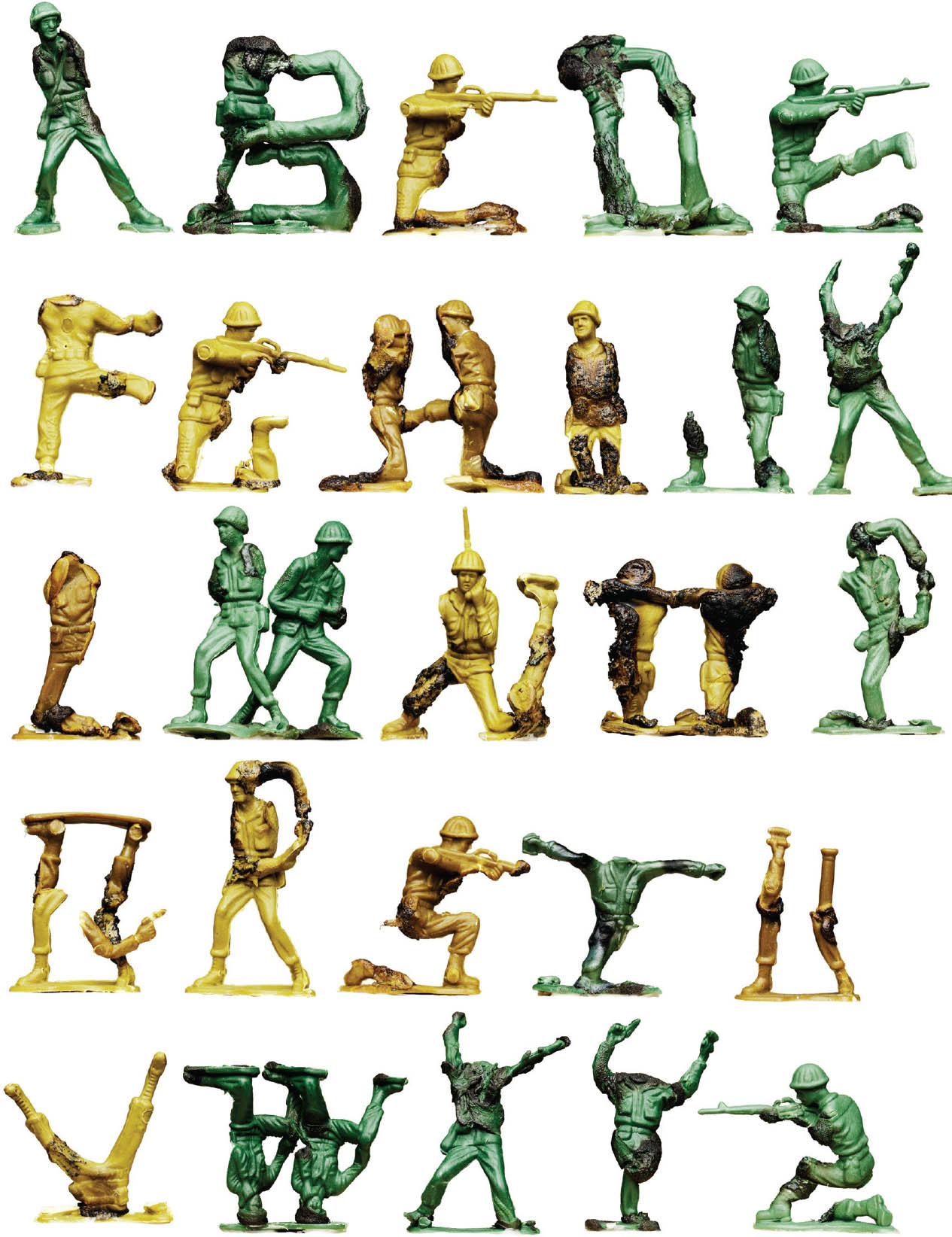
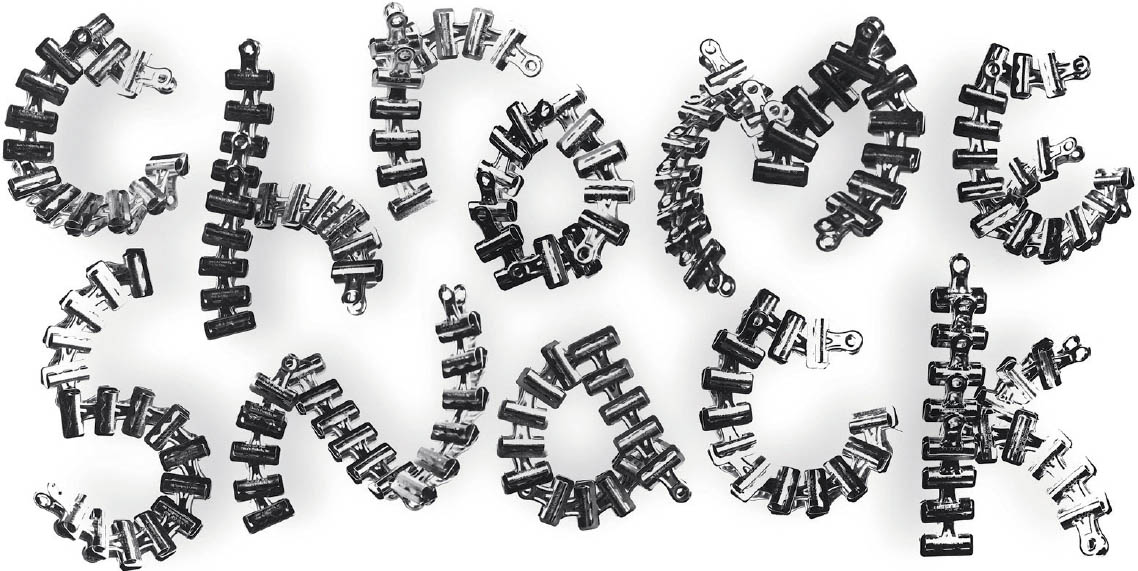
Ready-made Alphabet The challenge here was to create a set of characters using objects from the environment rather than drawing them digitally or by hand. The designers discovered letterforms hidden in the things around them. Experimental Typography. Nolen Strals and Bruce Willen, faculty.
Oliver Munday
Kirby Matherne

Kirsten Young
Rob McConnell
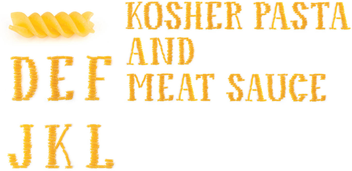
Rotini Type Modular type can be made from anything: from digital circles and squares, scraps of paper, even bits of pasta assembled by the dozens into familiar letter shapes. Alex Jacque, Lettering & Type. Bruce Willen and Nolen Strals, faculty.
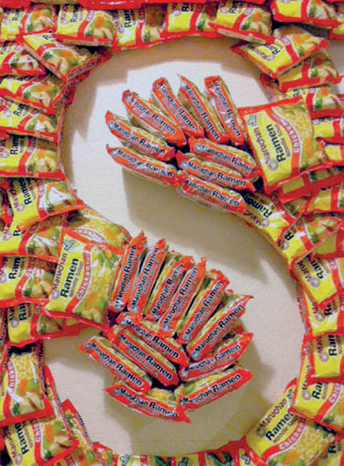
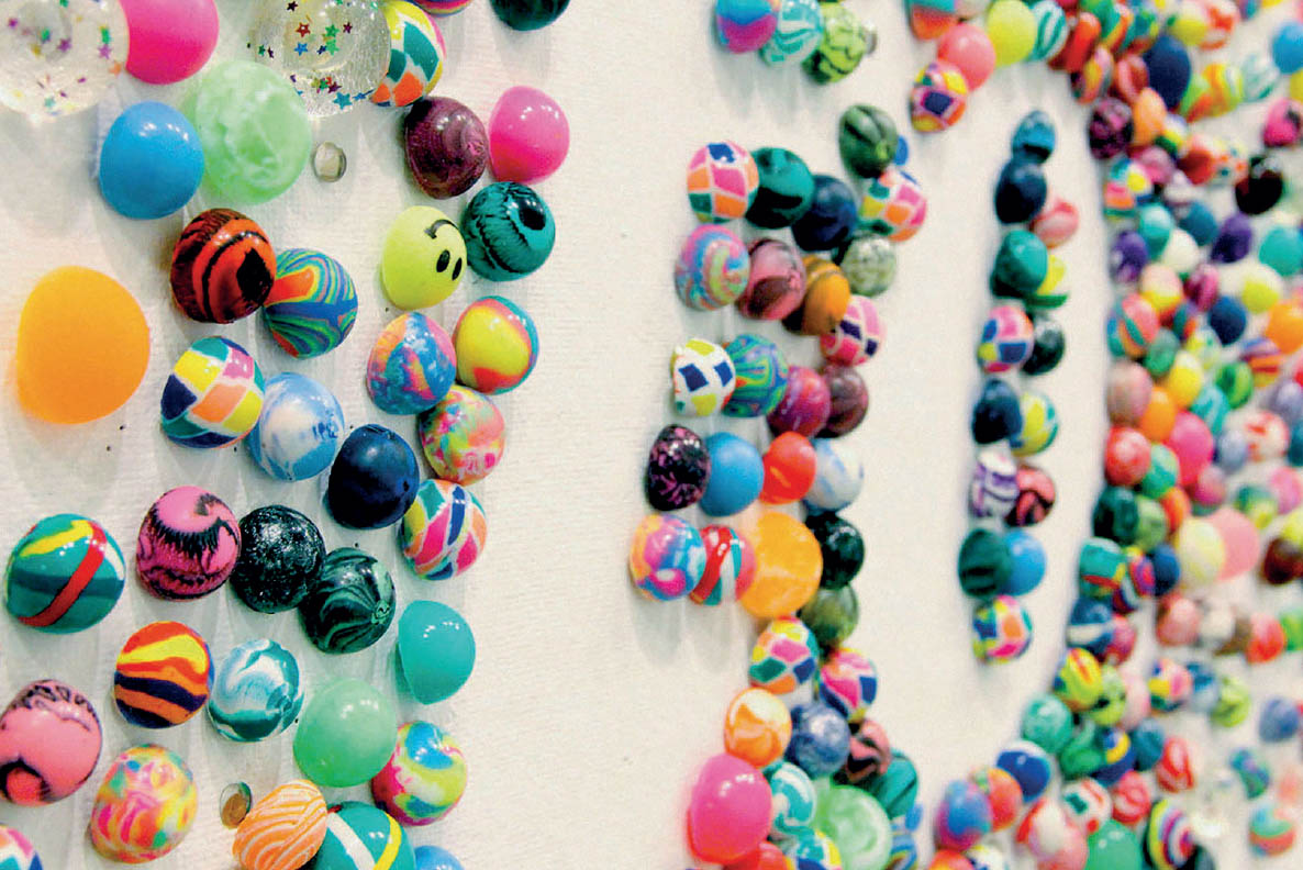
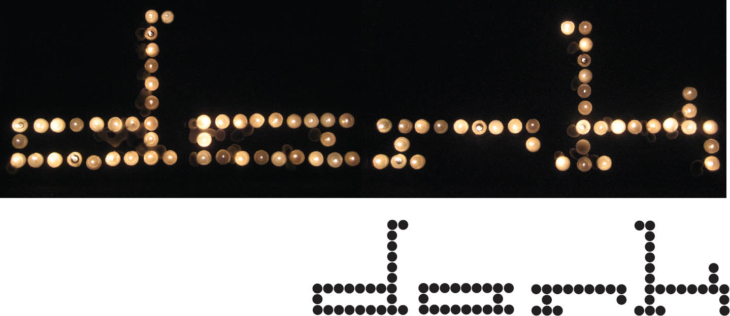
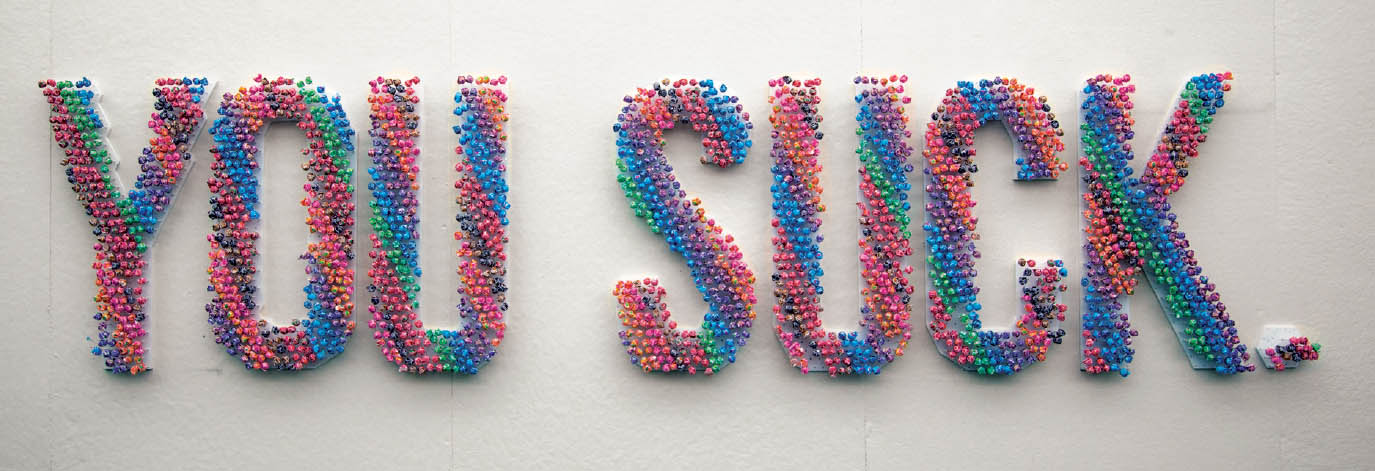
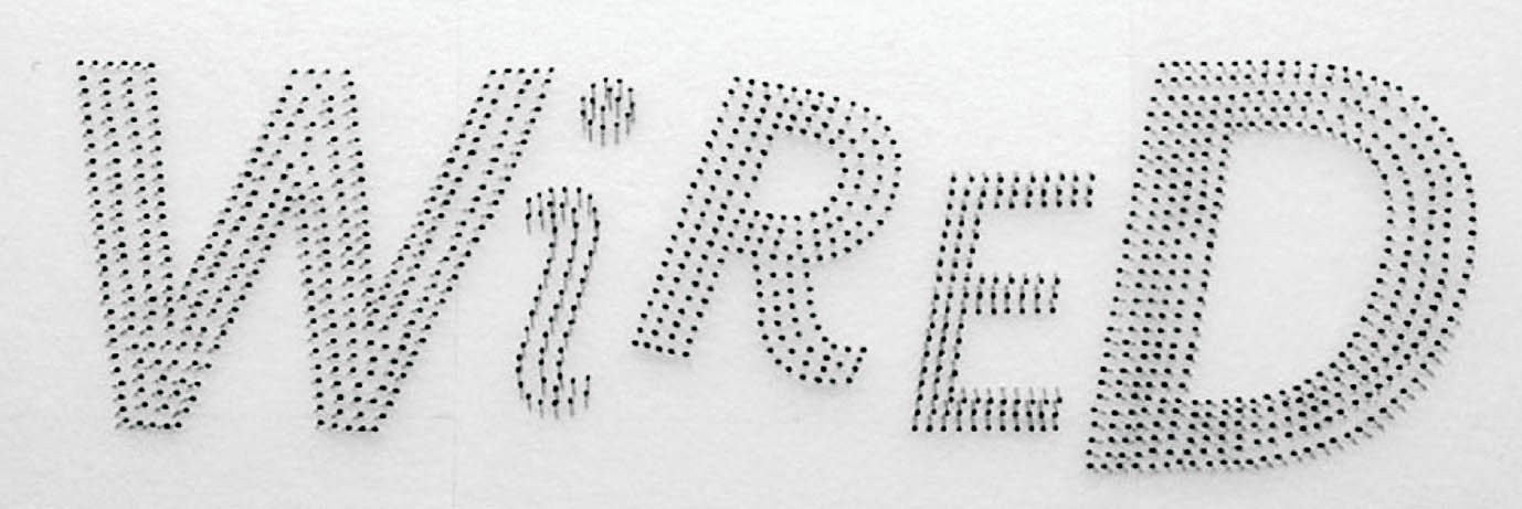
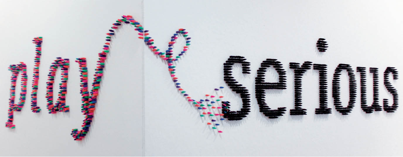
Manual Type In this project, designers use everyday objects, such as candy, nails, and hair pins, as modular units to build a word or phrase. Group cooperation yields large-scale results. Sarah Clement, Beth Cole, Kaveh Haerian, Jessica Pavone, Qianfei Wang (top); Teresa Bonaddio, Nikki Eastman, Chelsea Maymon, Storm Sebastian, Rachel Ventura (bottom), Post-Baccalaureate Studio. Jason Gottlieb, Ann Liu Alcasabas, and Sandra Maxa, faculty.
Sheena Crawley, Nick Emrich, Shuyi Meng, Kelly Nealon, Tiffany Small
Becca Friedman, Daniel Khang, Bonnie Silverberg, Mina Radojevic, Meena Yi
Min Bae, Shiraz Gallab, Anne Marie Jasinowski, Hadley Robin, Alejandro Salinas
Type as Tool This type family, called Teip, is designed with several styles and weights that users can remix into endless combinations. Elements appear to pass over and behind each other, creating a feeling of depth. Uppercase letters are stressed vertically, while lowercase letters are stressed horizontally. Alex Jacque, Graduate Type Design. Tal Leming, faculty.
Interlocking Forms Called Barin, this typeface was inspired by the geometric kufi calligraphy prevalent in Islamic culture, especially by the work of Persian calligraphers Hassan Massoudy and Emin. A calligrapher can freely adjust a character in relation to the marks coming before and after. In contrast, a typeface designer makes each glyph function with any other glyph in any order, compromising freedom in exchange for standardization. Barin explores the line between lettering and type design. Several alternates for every glyph allow letters to interlock. Barin has more than 5,800 glyphs. Open Type features created by Tal Leming enable Barin to automatically choose among thousands of ligatures based on context. This allows the typeface to interlock and maintain the balance between negative and positive space. Shiva Nallaperumal, Graduate Type Design. Tal Leming, faculty.
Symbol Systems
A symbol stands for or represents objects, functions, and processes. Many familiar symbols, such as McDonald’s golden arches, are highly distilled, stripped of extraneous detail, delivering just enough information to convey meaning. Symbol systems are often based on geometric modules that come together to create myriad forms and functions.
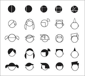
Modular Hairdos Geometrically derived forms combine to shape myriad hair styles. Yue Tuo, MFA Studio.
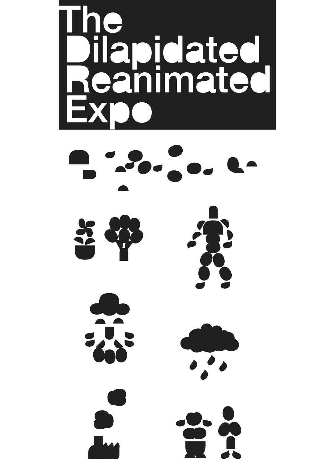
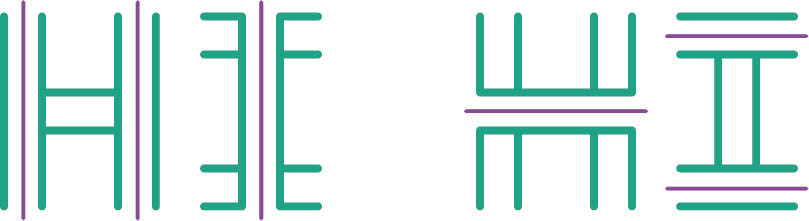
Counterform Pictures Counters extracted from letters in a title cohere into visual narratives. Nolen Strals and Bruce Willen, Post Typography.
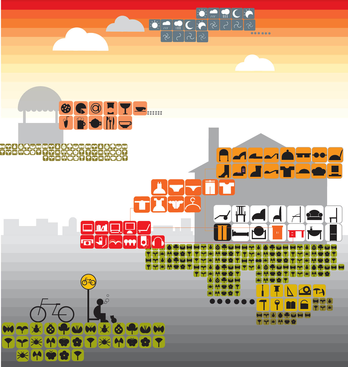
Symbolscape This landscape is built and described by a series of modularly structured symbols stacked and layered to denote fauna, flora, and form. Yue Tuo, MFA Studio.
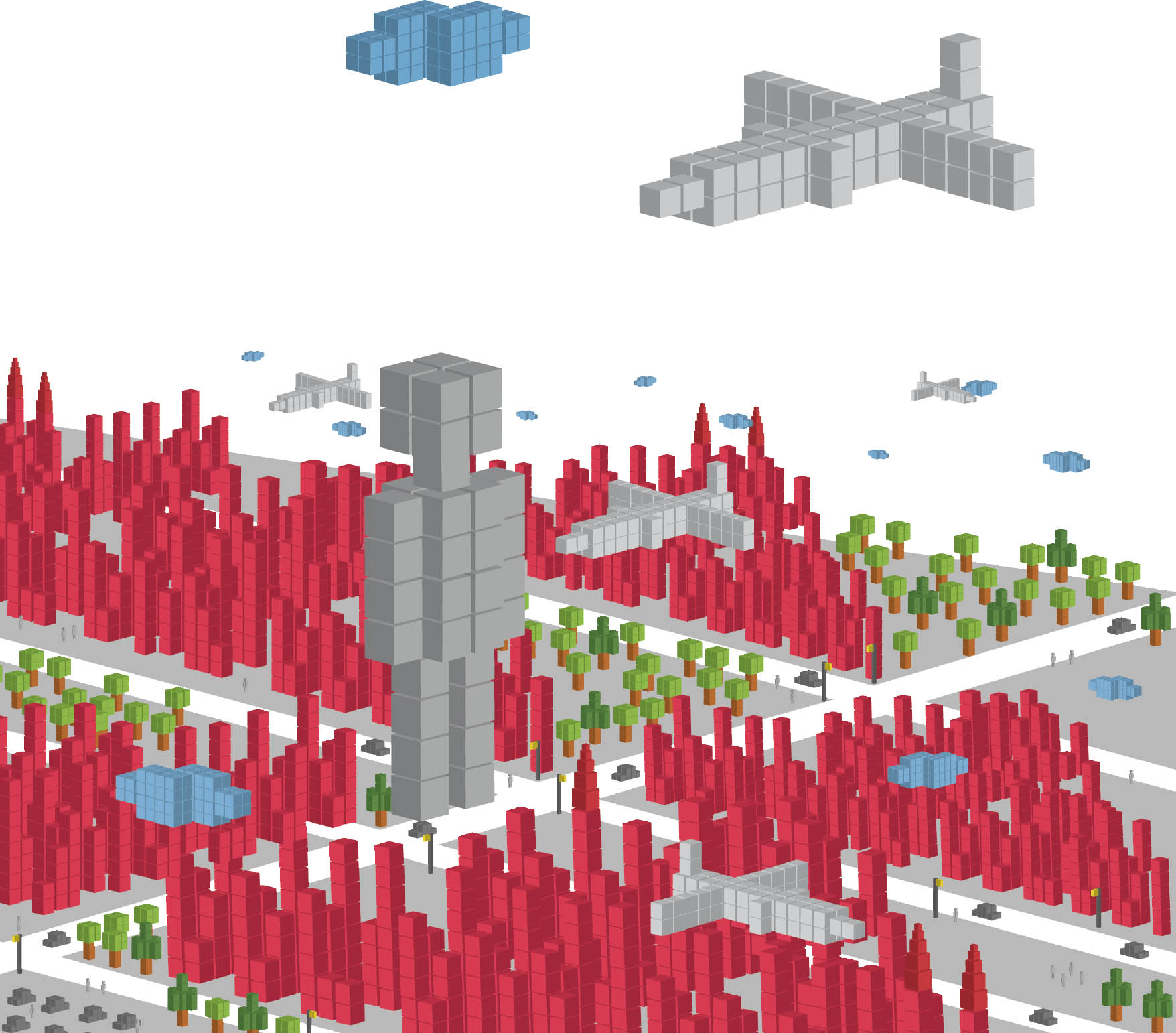
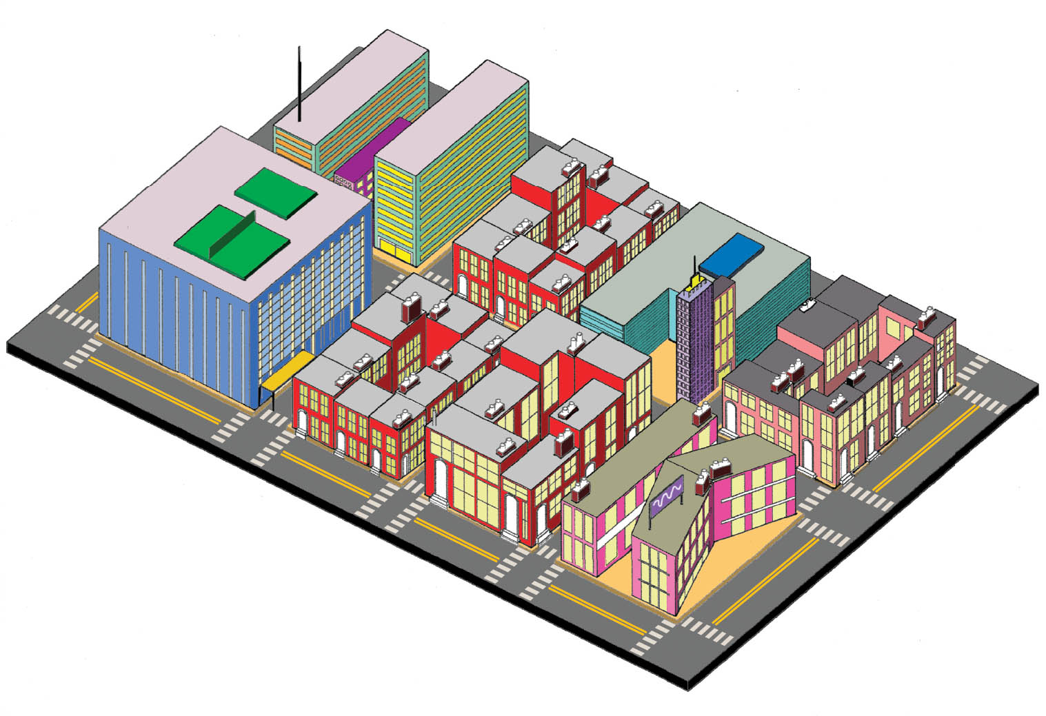
A City of Cubes An urban landscape teems with people, planes, clouds, automobiles, skyscrapers, and trees—all built from cubes in Adobe Illustrator. Yong Seuk Lee, MFA Studio.
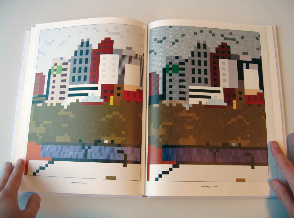
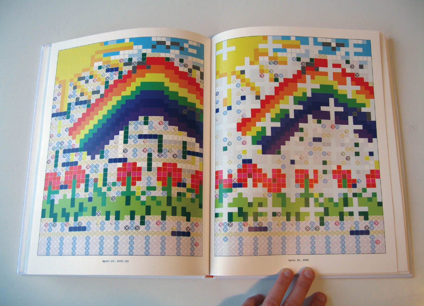
Extrapolations in Excel These elaborate drawings utilize the gridded compartments of an Excel spreadsheet as a catalyst and a constraint. Danielle Aubert, MFA thesis, Yale University School of Art.
1. The Ultimate LEGO Book (New York: DK Publishing, 1999).
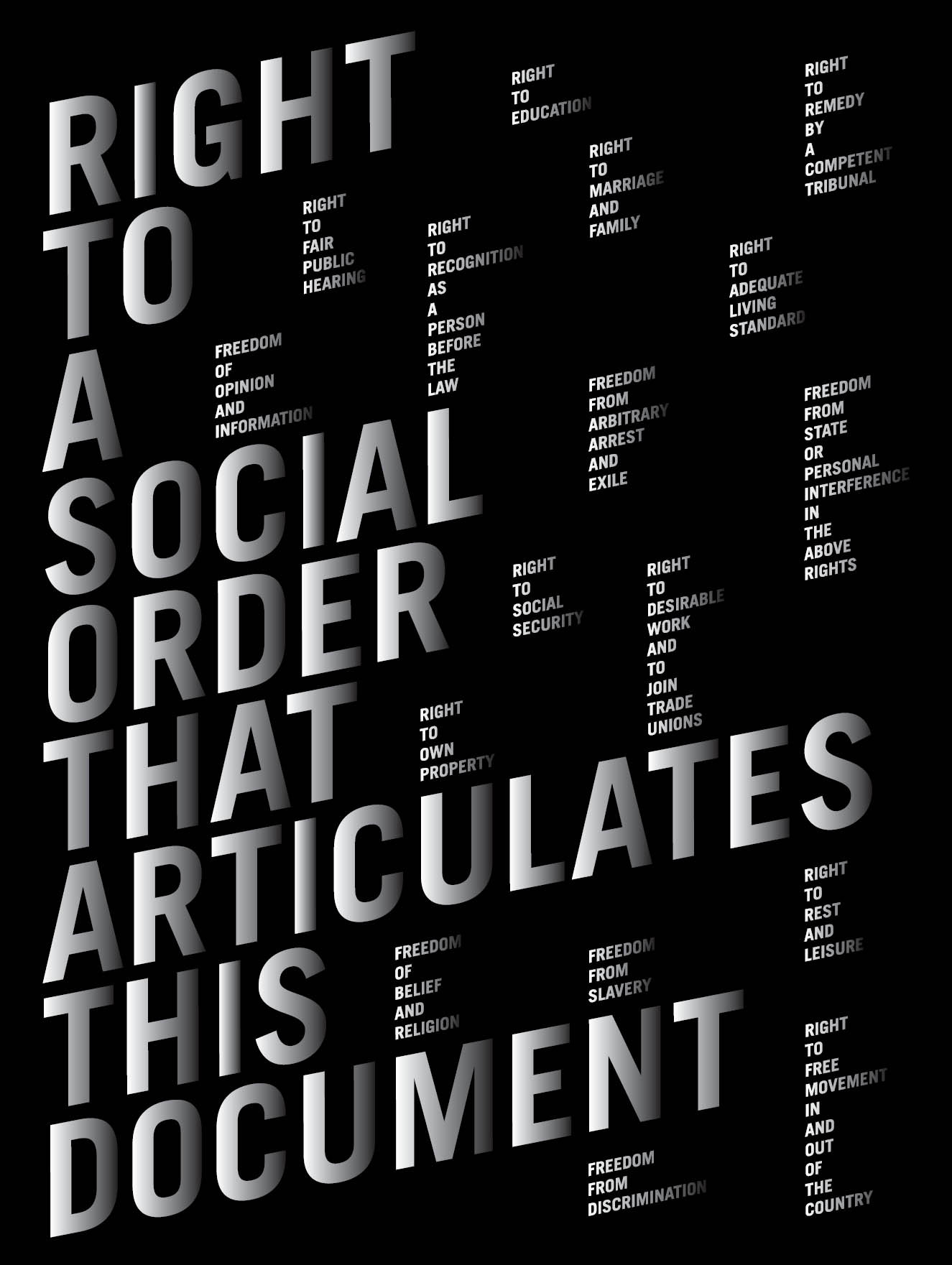
Social Order The designer has used a strict grid to organize the content, while employing a gradient tone and skewed geometry to give the piece motion. Chen Yu, Typography II.