B is for Bauhaus, Y is for YouTube: Designing the Modern World from A to Z (2015)
What you write inevitably is shaped by how you write it, or, perhaps, as anybody who has ever used predictive text will know, what you write it with. It is possible to write a book without the use of a keyboard, with a pen or a pencil, and by dictation, to a human or a mechanical recorder. The specific procedure will certainly be reflected in the result. Texts that have been dictated have qualities that are recognizably different to those written with a keyboard, just as telling the time through the analogue hands of a watch rather than a digital readout, or driving on the left-hand side of the road rather than the right, requires a different kind of response from the brain. It is not just the keyboard that is a tool in the communication process. It’s the alphabet, and it’s grammatical structure too. If the keyboard does eventually disappear, then the act of writing itself might follow. Voice recognition challenges the grip of a primarily literary culture. If there is no longer a need for us to write in order to communicate, then how much longer will we still need to read? Technology will have had the effect of pushing us back to a pre-literate culture in which the storytellers and the sagas would set the pattern for memory.
Linguistic theory suggests that language may shape us as much as we shape it. One American academic economist has drawn a correlation between those countries that save the most as a percentage of GDP, and the grammatical structure of their language. His theory is that the more sharply defined the use of future tense in a language, the less likely that culture is to save. He speculated that those languages which are more vague in their use of the future tense see planning ahead as much more a part of the present.
Jack Kerouac claimed that it took him just three weeks to write On the Road, using a single roll, 120 feet long, made of sheets of tracing paper that he had pasted together with Sellotape before starting. Clearly he believed that his raw materials, and the ways in which he used them, could shape his writing, and what he had to say, as much as a grammatical structure. He wanted to avoid the disruption of being forced to stop typing, even if only for long enough to feed a new sheet of paper into his typewriter after every 220 words. In much the same way, he wanted to avoid the conventional marks of paragraph and chapter breaks. In part, it’s what gave the book its grain and structure.
Kerouac treated writing as a kind of performance work that took its pace and rhythm not from the mechanical constraints of the medium but from the spontaneity of the flow of his words. He wanted to free his writing from the machinery on which it depended. Kerouac was redesigning the process of writing. For a designer too, the way in which a machine is controlled and understood is the crucial part of the design process.
Kerouac ended up with what looks like a contemporary version of the Dead Sea scrolls; each letter is very slightly indented into the surface of the manuscript, its outline smudged and blurred where ink from the typewriter ribbon has seeped into the imperceptibly torn fibres of the paper.
The indentations that mark the beginning of a paragraph, the commas and full stops that punctuate sentences, are the conventions of a literary form. Feeding sheets into the machine is an unintended consequence of the process of typing. It impacts on the content as well as the form of writing, just as recording technology shapes music. The six-tracks-a-side album was the product of wax pressing, and lost its power as a format when digital downloading took over from the record store.
But if Kerouac managed to sidestep one of the technical constraints of the format he worked in, he accepted a more fundamental intrusion between his mind as it formed words, and his attempts to record and crystallize them. He used the QWERTY keyboard as the route between his fingers and the paper, or rather between his brain and the paper. The relationship between the two is indirect. The skill with which his fingers manipulate the keyboard does not in itself reflect the quality of his words, in the way that a pianist’s musical performance would do.
Just as a steering wheel is not the only method of controlling a car, so the QWERTY keyboard is not the only kind of interface that allows a writer to work. Early automobiles used tillers. Contemporary Formula One cars have something more like the joystick of an aircraft studded with electrically operated buttons through which the driver can impose his will on the speed and course taken by his vehicle.
Before Apple got involved, Mobile phones had a different, and far less agile, keyboard that required a varying number of keystrokes to produce the desired result. And this in turn is very different from the dial of the traditional Bakelite telephone.
To be useful, every machine needs to be able to communicate. Some machines communicate only with their controllers and at just the most basic level, through the on/off switch. Others need to address a wider audience in more complex ways: a cash machine through its screen and its keyboard, or an airport through its arrival and departure boards. The dial, the rocker switch, even, in the case of the Bang & Olufsen Beolit 707 portable radio, a slide-rule-like tuning device on tiny ball bearings were the increasingly elegant means by which mankind could be encouraged to imagine itself in command of the mechanical and digital worlds.
Designers began to realize the scope that these routes into the soul of a machine had, either for equipping their users with a sense of just how much was at stake, or simply as playful gestures with which to amuse them. A pistol grip could be used not just to pull the trigger on a handgun, but also for a portable vacuum cleaner, or a watering can designed to appeal to users anxious about their virility.
Mario Bellini, the designer who did more than anybody to create the image of modern Italy in the 1960s, designed a bright-yellow plastic adding machine, the Divisumma, in which he went to infinite pains to maximize the tactile qualities of the keyboard. He made each key into a rounded button, stretching a soft rubber membrane over the whole surface. He somewhat coarsened the effect at his lectures by interspersing close-up photographs of the machine in profile, a single Michelangelo digit reaching out to depress one of the keys with the image of a nipple.
The QWERTY keyboard used to be the most effective way to communicate with and control a machine, until Steve Jobs teamed it with a screen and a mouse - what used to be called the graphic user interface. Jobs created not simply the window through which the computer could be coaxed, haltingly, to explain itself to the user, but the place in which the user could work directly with the machine. The click-and-point mouse was not Jobs’s idea, he took it from Xerox’s Paolo Alto research lab - which itself relied on earlier studies. Jobs saw a prototype, had his engineers tinker with it, and then made it cheaply enough for it to be both useful and usable.
I wrote my first book on a manual typewriter. It was an ancient upright Imperial, as heavy as a washing machine. Inside its glossy black frame, finished, like a grand piano, with the maker’s name picked out in gold foil, like the masthead of a newspaper, was the type basket. The gunmetal-grey keys were greased to allow them to slide easily across each other, but every so often they would stick anyway and had to be prised apart by hand, a procedure that left ink on your hands. The space bar had fractured, and was held together with a makeshift splint.
The move from journalistic sprinting to completing a 100,000-word marathon meant pushing through a barrier of pain. The Imperial made the experience seem like a special kind of torture, both physical and mental, one that left two of my fingers sore and sometimes a little bloody from the continual pounding that came from spending several months bashing circular keys on the end of mechanical levers.
The essential nature of a typewriter is that almost everything moves relative to everything else, the keys, the paper, the roller on which the paper is fed into the machine. It is only the spot at which the keys hit the paper that stays in the same place. And it is what shapes the act of writing using a typewriter.
Finishing each line required pushing the carriage back to the starting gate and twisting the roller to move the paper up by the requisite amount. There was a chrome-finished lever to allow you, when everything was working properly, to make the whole operation in one sweeping move back to the beginning of the next line, with the paper moved up enough to get the right spacing. Just in case you kept typing past the end of the paper, there was a bell to remind you when to stop.
It was a remarkably intricate, mechanically ingenious way of making marks on paper and it was easy to understand because it replicated almost exactly the act of making marks on paper, one letter at a time, with a pen. It was a machine that was manipulated in much the same way as the tool which it replaced. But it was also an utterly unforgiving process. The chances of an untrained typist hitting the wrong key were high, and it was equally likely that something would go wrong with the lever arm, and you would find yourself typing a new line far too close to the last one. With so much potential for getting things wrong, and just a bottle of correcting fluid, or the x key to put them right, it had the effect of making every stroke a carefully considered decision. It was not just a question of the physical process of transcribing thought. A manual keyboard was an essential aspect of the process of writing. It shaped and slowed the creative act. The process of marking out each word had to be approached with almost the same kind of caution exercised by a stone carver setting about cutting a letter with a chisel in a stone slab. There was a compulsion to make every line and every page perfect, annotating drafts by hand in ink, and constantly typing and retyping, to achieve a page untroubled by crossings-out or mistakes. Achieving this demanded a sustained bout of physical labour. And that made sustaining an idea or a creative flow difficult.
Writing long hand, with pen and ink, used to be physically easier, more fluent and, at least for me, quicker, but there never seemed to be enough objectivity. It’s a skill that has gradually atrophied. Until I can see the words with the distance that comes from having them typewritten in front of you, then it is hard to measure their impact. And there is little incentive to complete half-sentences and half-finished thoughts until they can be judged and weighed by print that has been removed from the subjectivity of handwriting.
My first job was at the Architectural Press in Queen Anne’s Gate, London, accommodated in a pair of eighteenth-century redbrick houses. There was a private pub in the basement, the Bride of Denmark, equipped with a stuffed lion, a bar and skittles salvaged from blitzed gin palaces during the Second World War by the staff of the Architectural Review, which had numbered John Betjeman and Nikolaus Pevsner. I was there at the end of the 1970s, and even then, assistant editors were still expected to produce their copy long hand, have it typed by the editorial secretary, send it to the printers for typesetting, and edit the copy on galley proofs. I was impertinent enough to insist on having a typewriter brought into the office so that, with my two-fingered typing skills, I could, hesitantly, cut out at least one stage in the process. It felt very contemporary even if the personal computer was already on the horizon.
When I wrote my first book the electric typewriter was already well established. IBM had launched the Selectric twenty years earlier which, with its golf ball and its transistorized circuitry, seemed the last word in technology as applied to the writer’s craft. In fact it was just the first halting step in what came to be known as word processing, an activity that sounded more applicable to the industrial scale of envelope addressing and invoice raising than writing a book people might actually want to read. The golf ball, when it became interchangeable, allowed a choice of fonts for the first time.
Eliot Noyes was trained as an architect by Walter Gropius at Harvard, then became a curator at the Museum of Modern Art before he moved to run the IBM design programme. He gave the electric typewriter a delicately sculpted form that seemed just as much of a glimpse of another world as the new Citroën DS 19 had in the 1950s. And he introduced colour to the world of the office machine. The Selectric came in taupe, dirty pink and avocado, colours that were as sharp as Noyes himself, with his brushcut hair and his mohair suits.
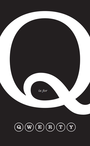
The Selectric did away with the mechanical levers that the typewriter had depended on ever since it was first patented in the 1870s, the last link to the underlying reason for the layout of the typewriter keyboard and its sequence of four top-row vowels. The QWERTY keyboard was not, as is often suggested, devised to slow down typists in case the early machines turned out to be too fragile to withstand the pounding that agile hands could give them. In fact the keys were positioned in such a way that typists could work quickly without the mechanical levers inside the machine jamming. Letters that were likely to be used in sequence, such as q and u or p and t, were placed as far apart as possible so as to keep the levers that connect the key with the letter from jamming together as one went down and the next came up. It’s a layout that produced a sequence of letters that has no apparent logic, and yet is based on what were impeccable functional principles. It was as if the machine were revealing an underlying personality, independent of its human designers.
The Selectric’s spinning golf ball did away with the need for all that. But its keyboard retained the same layout, and it still made for a far-from-seamless relationship between creative impulse and print. Once you switched the Selectric on, there was the continuous noise of the machine idling its gears, ready to spring into semi-robotic action like a swarm of mechanical cicadas. A less elaborate mechanical solution was the daisy wheel. It was a gradual sidestep towards the digital and away from analogue, and it began to allow for the production of cleaner, tidier, more polished finished pages. Correcting fluid and Tipp-Ex were supplanted by dry paper, and in the 1970s the typewriter took another hesitant step into the digital world. Typewriters began to acquire memories: a phrase, then a line, then a paragraph could be input to ensure that everything was letter-perfect before it was printed out with the daisy wheel.
For Kerouac all this tinkering would no doubt have seemed an even more frustrating delay than feeding his machine with a new sheet of paper every 220 words. In fact it was on the way towards the frictionless interaction between the intellect and the printed word that he had searched for.
The QWERTY keyboard is an archetype that, for all the attempts to dethrone it, remains firmly in command of the format. Its longevity is not simply a result of the difficulty of retraining everybody who has ever learned to touch-type. Despite the claims of superior performance and logic from alternative layouts, nothing has yet been devised that can deliver enough to justify such a massive change. Witness the halting efforts on smartphones, palm devices and voice recognition. Attempts to reconfigure the keyboard in supposedly more rational ways are as doomed to failure as attempts to substitute Esperanto for English as a universally understood language, and are equally cranky. As a control panel, which is what the keyboard in substance is, QWERTY has the enormous advantage of being intuitive. Hit the key, and you see what you are going to get. The only nuance on a typewriter was upper or lower case, a smattering of symbols and, in a few cases, colour. Multicoloured ribbons made it possible to choose between red and black. Copies were made by inserting an unpleasantly sticky sheet of carbon on to the roller between the regular pieces of paper and hammering the keys hard enough to make a legible impression through two or three layers. The first computer keyboard was a far less intuitive control mechanism, with its mysterious function keys and its control-shift options.
I wrote my second book on a machine that looked and sounded a lot more up to date than the Imperial. Olivetti had commissioned Mario Bellini to shape what the company claimed was the first portable golf ball in the world, the Lexikon 82. He worked on it in 1973, and it went into production at the company’s Glasgow factory in 1976. It looked great: Bellini gave it a sensuous, rounded form in injection-moulded ABS plastic. There was a two-tone cream version, mine however was a very dark anthracite grey, which came with a plastic golf ball picked out in vivid red. But at eleven kilogrammes it was too hefty to be really portable. Even though it came in a cool-looking moulded-plastic carrying case, moving it across the room felt like lugging an old cathode ray television set around.
The keyboard took some getting used to. The Imperial demanded considerable physical effort, with the full hand pressed down, fingers bouncing off one key to find the next, with the rhythm and force of running on the balls of your feet. It was a technique that took an effort to unlearn when I finally took to a laptop. With the Lexikon, touch one of its keys, no matter how gently, and it took off with startling speed, as if trying to escape, in a sudden detonation of energy. Whether from a defect in the design, or shortcomings in the quality-control standards in Glasgow, after ten minutes of continuous use the Lexikon became incapable of delivering a straight line of type.
It was the first time that I remember feeling a sense of hurt disappointment with a design that had failed to deliver. I had seen the Lexikon on the cover of Design magazine, moodily photographed as part of a story on the appeal of black for product design. This was the machine that was going to turn me into a writer, a fully equipped member of the modern world. The Lexikon was a machine that seemed to promise a direct line to the sophistication of contemporary Milan. It wasn’t cheap. But I had to have it, because I knew it would be worth it.
As I fiddled the off-switch up and down in a vain attempt to encourage it to return to aligning its output on straight lines rather than crooked rambles across the page, I came to curse it. And the body, while it aspired to formal perfection, simply could not match the quality of the finish of the IBM Selectric. The IBM machine represented the rigorous resolution of every physical, mechanical and technical problem. It was an achievement of industrial culture of the highest quality. It had done away with not just the levers that depressed the keys, but also the carriage that moved the paper. IBM’s golf ball bounced around like a fairground shooting-gallery pinball on an air jet, darting back and forth. The Lexikon was seductive to look at, but when you touched it, the allure dissipated. The Olivetti engineers delivered Bellini an intellectually slovenly half-solution to his formal brio. The Lexikon golf ball did not track the page, the typewriter still needed a carriage for the page to move back and forth. I put it back in its carrying case and hoisted it up on to a top shelf, where it quickly acquired a discouraging film of dust. The Lexikon had been my first serious love affair with Italian design, and it had ended unhappily. It has turned into a relic, but the layout of its keyboard followed that of all of its predecessors, and set the pattern for its successors too. Voice and handwriting recognition are still attempting to catch up with it. Either approach could one day finally kill off QWERTY, turning it from a universal portal back into the sign of a skill as specialized as shorthand.