Graphic Design: The New Basics: Second Edition, Revised and Expanded (2015)
Color
All colors are the friends of their neighbors and the lovers of their opposites. Marc Chagall
Color can convey a mood, describe reality, or codify information. Words like “gloomy,” “drab,” and “glittering” each bring to mind a general climate of colors, a palette of relationships. Designers use color to make some things stand out (warning signs) and to make other things disappear (camouflage). Color serves to differentiate and connect, to highlight and to hide.
Graphic design was once seen as a fundamentally black-and-white enterprise. This is no longer the case. Color has become integral to the design process. Color printing, once a luxury, has become routine. An infinite range of hues and intensities bring modern media to life, energizing the page, the screen, and the built environment with sensuality and significance. Graphics and color have converged.
According to the classical tradition, the essence of design lies in linear structures and tonal relationships (drawing and shading), not in fleeting optical effects (hue, intensity, luminosity). Design used to be understood as an abstract armature that underlies appearances. Color, in contrast, was seen as subjective and unstable.
And, indeed, it is. Color exists, literally, in the eye of the beholder. We cannot perceive color until light bounces off an object or is emitted from a source and enters the eye.
Our perception of color depends not solely on the pigmentation of physical surfaces, but also on the brightness and character of ambient light. We also perceive a given color in relation to the other colors around it. For example, a light tone looks lighter against a dark ground than against a pale one.
Likewise, color changes meaning from culture to culture. Colors carry different connotations in different societies. White signals virginity and purity in the West, but it is the color of death in Eastern cultures. Red, worn by brides in Japan, is considered racy and erotic in Europe and the United States. Colors go in and out of fashion, and an entire industry has emerged to guide and predict its course.
To say, however, that color is a shifting phenomenon—both physically and culturally—is not to say that it can’t be described or understood. A precise vocabulary has been established over time that makes it possible for designers, software systems, printers, and manufacturers to communicate to one another with some degree of clarity. This chapter outlines the basic terms of color theory and shows ways to build purposeful relationships among colors.
Basic Color Theory
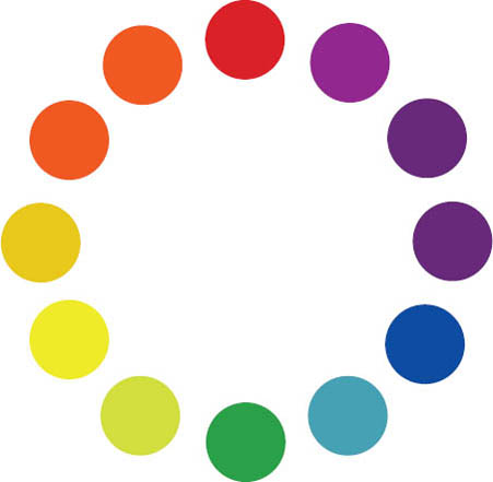
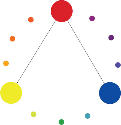
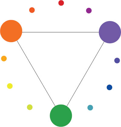
In 1665 Sir Isaac Newton discovered that a prism separates light into the spectrum of colors: red, orange, yellow, green, blue, indigo, and violet. He organized the colors around a wheel very much like the one artists use today to describe the relationships among colors.1
Why is the color wheel a useful design tool? Colors that sit near each other on the spectrum or close together on the color wheel are analogous. Using them together provides minimal color contrast and an innate harmony, because each color has some element in common with others in the sequence. Analogous colors also have a related color temperature. Two colors sitting opposite each other on the wheel are complements. Each color contains no element of the other, and they have opposing temperatures (warm versus cool). Deciding to use analogous or contrasting colors affects the visual energy and mood of any composition.
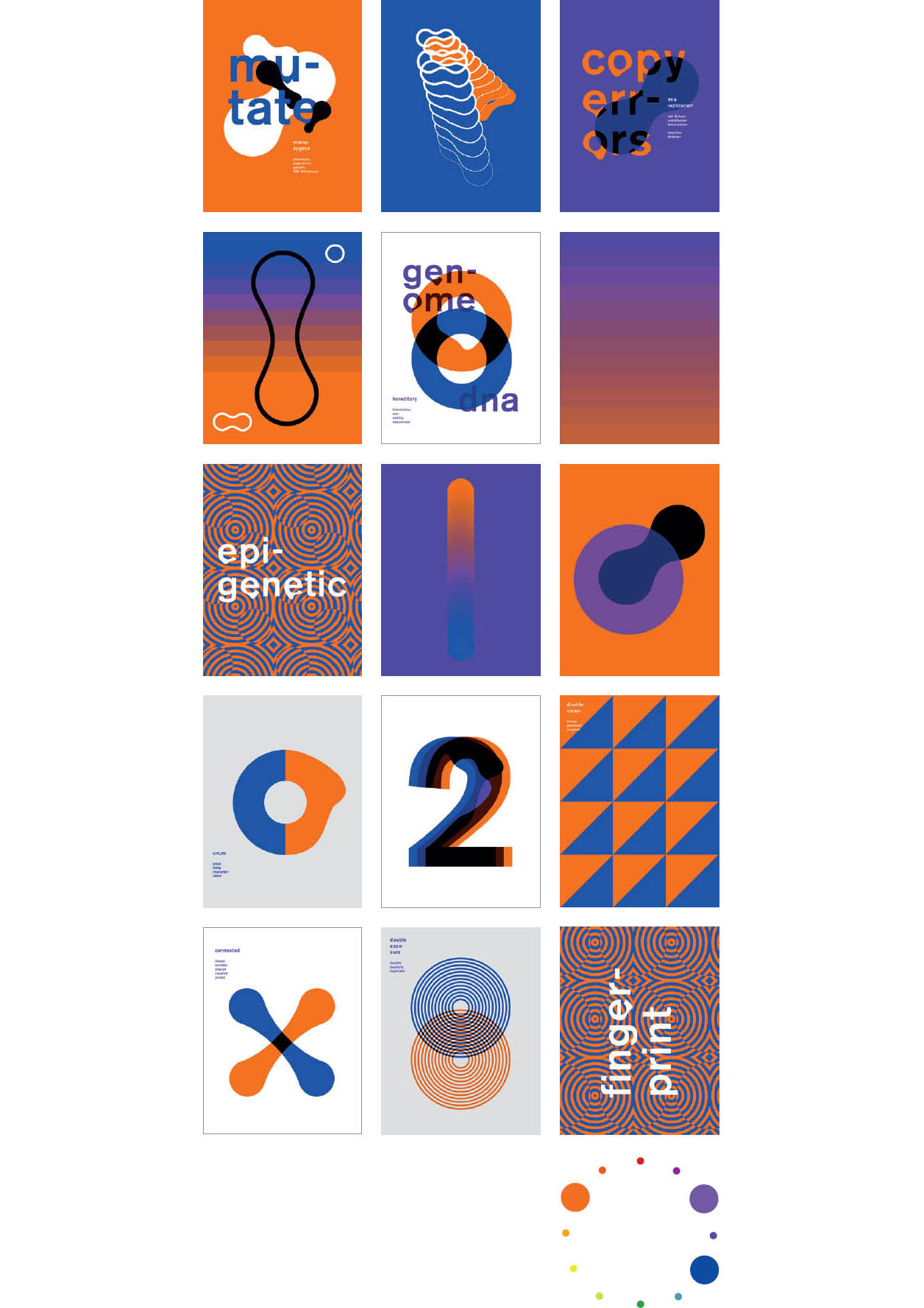
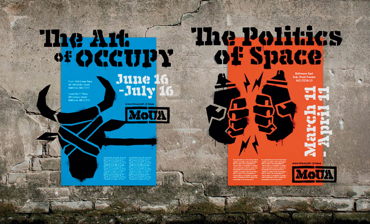
Secondaries and Complements This series of posters is produced with complements (orange + blue) and two secondary colors (orange + purple). Mixes and gradients provide the steps in between. Richard Blake, MFA Studio.
The Color Wheel
This basic map shows relationships among colors. Children learn to mix colors according to this model, and artists use it for working with pigments (oil paint, watercolor, gouache, and so on).
Primary Colors
Red, yellow, and blue are pure; they can’t be mixed from other colors. All of the other colors on the wheel are created by mixing primary colors.
Secondary Colors
Orange, purple, and green each consist of two primaries mixed together.
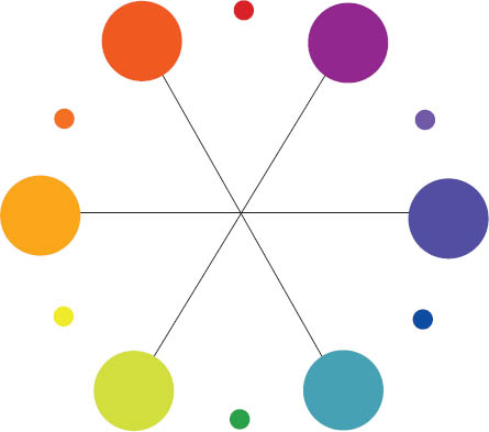
Tertiary Colors
Colors such as red orange and yellow green are mixed from one primary and one secondary color.
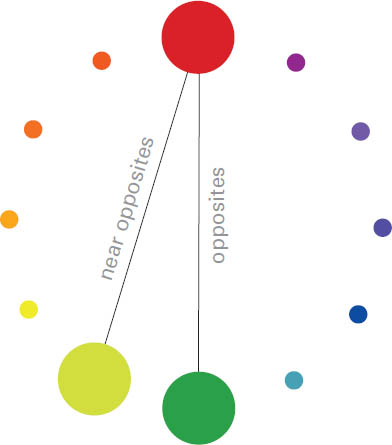
Complements Red/green, blue/orange, and yellow/purple sit opposite each other on the color wheel. For more subtle combinations, choose near opposites, such as red plus a tertiary green, or a tertiary blue and a tertiary orange.
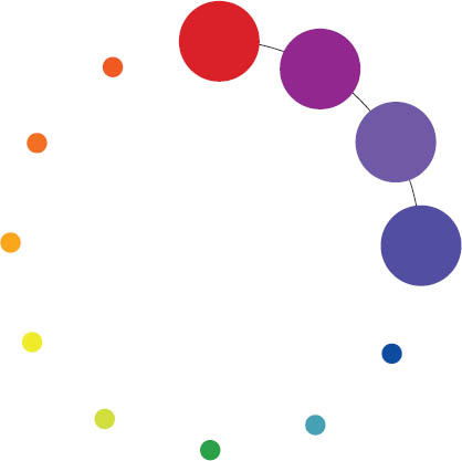
Analogous Colors Color schemes built from hues that sit near to each other on the color wheel (analogous colors) have minimal chromatic differences.
Aspects of Color
Every color can be described in relation to a range of attributes. Understanding these characteristics can help you make color choices and build color combinations. Using colors with contrasting values tends to bring forms into sharp focus, while combining colors that are close in value softens the distinction between elements.

Hue is the place of the color within the spectrum. A red hue can look brown at a low saturation, or pink at a pale value.
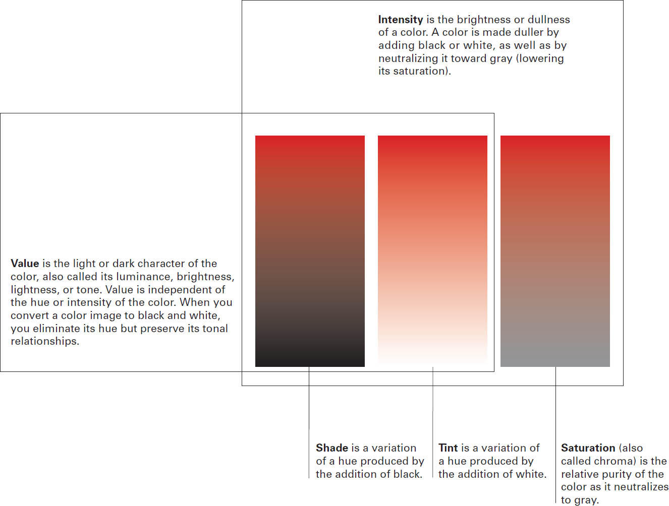

These colors are close in value and intensity, and just slightly different in hue.
These colors are close in hue and value but different in intensity.
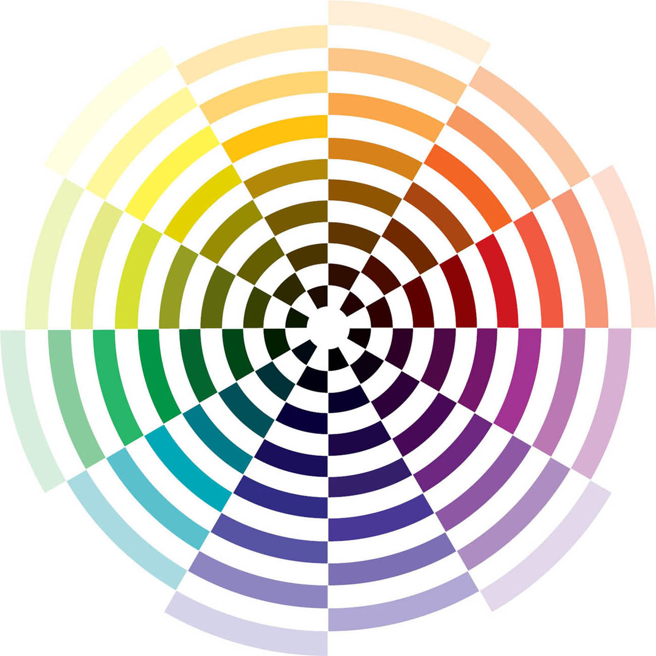
Graduated Color Wheel Each hue on the color wheel is shown here in a progressive series of values (shades and tints). Note that the point of greatest saturation is not the same for each hue. Yellow is of greatest intensity toward the lighter end of the value scale, while blue is more intense in the darker zone.
Use the graduated color wheel to look for combinations of colors that are similar in value or saturation, or use it to build contrasting relationships. Robert Lewis, MFA Studio.
Color Models
Surfaces absorb certain light waves and reflect back others onto the color receptors (cones) in our eyes. The light reflected back is the light we see. The true primaries of visible light are red, green, and blue. The light system is called “additive” because the three primaries together create all the hues in the spectrum.
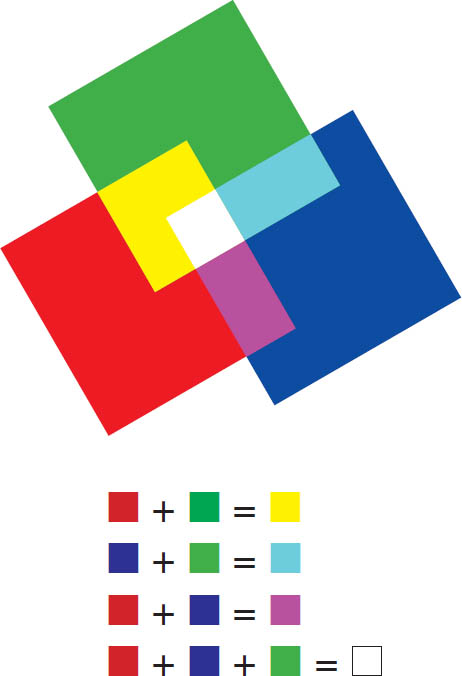
In theory, combining red and green paint should produce yellow. In practice, however, these pigments combine into a blackish brown. This is because pigments absorb more light than they reflect, making any mix of pigments darker than its source colors. As more colors are mixed, less light is reflected. Thus pigment-based color systems are called “subtractive.”
Offset and desktop printing methods use CMYK, a subtractive system. Nonstandard colors are used because the light reflected off cyan and magenta pigments mixes more purely into new hues than the light reflected off of blue and red pigments.
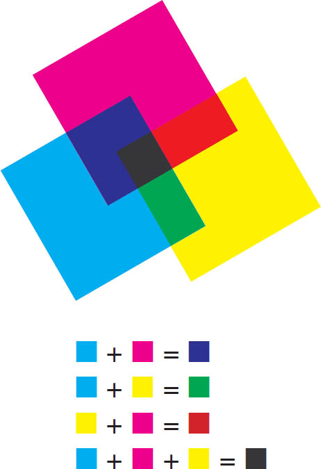
CYMK is used in the printing process. While painters use the basic color wheel as a guide for mixing paint, printing ink uses a different set of colors: cyan, magenta, yellow, and black, which are ideal for reproducing the range of colors found in color photographs. C, M, Y, and K are known as the “process colors,” and full-color printing is called “four-color process.” Ink-jet and color laser printers use CMYK, as does the commercial offset printing equipment used to print books such as this one.
In principle, C, M, and Y should produce black, but the resulting mix is not rich enough to reproduce color images with a full tonal range. Thus black is needed to complete the four-color process.
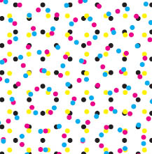
Transparent Ink Printer’s inks are transparent, so color mixing occurs as colors show through each other. Color mixing is also performed optically when the image is broken down into tiny dots of varying size. The resulting colors are mixed by the eye.
RGB is the additive system used for designing on screen. Different percentages of red, green, and blue light combine to generate the colors of the spectrum. White occurs when all three colors are at full strength. Black occurs when zero light (and thus zero color) is emitted.
Any given color can be described with both CMYK and RGB values, as well as with other color models. Each model (called a “color space”) uses numbers to convey color information uniformly around the globe and across media. Different monitors, printing conditions, and paper stocks all affect the appearance of the final color, as does the light in the environment where the color is viewed. Colors look different under fluorescent, incandescent, and natural light. Colors rarely translate perfectly from one space to another.
Transparent Light The medium of light is also transparent. The colors of an emitted image are generated when different colors of light mix directly, as well as when tiny adjacent pixels combine optically.
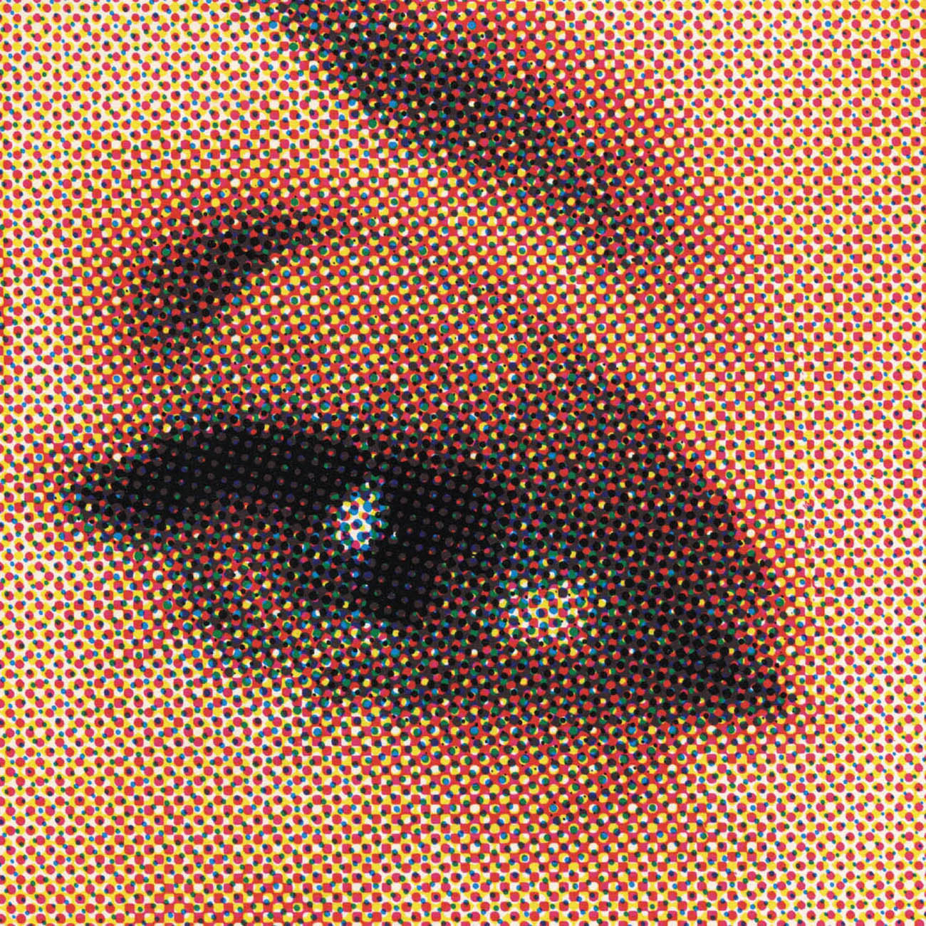
Optical Color Mixing This detail from a printed paper billboard shows the principle of four-color process printing (CMYK). Viewed from a distance, the flecks of color mix together optically. Seen up close, the pattern of dots is strongly evident. Whatever color model your software is using, if you are viewing it on screen, it is RGB. If you are viewing it in print, it is CMYK.
Interaction of Color
Josef Albers, a painter and designer who worked at the Bauhaus before emigrating to the United States, studied color in a rigorous manner that influenced generations of art educators.2 Giving his students preprinted sheets of colored paper with which to work, he led them to analyze and experience how the perception of color changes in relation to how any given color is juxtaposed with others.
Colors are mixed in the eye as well as directly on the painter’s palette or the printing press. This fact affects how designers create patterns and textures, and it is exploited in digital and mechanical printing methods, which use small flecks of pure hue to build up countless color variations.
Designers juxtapose colors to create specific climates and qualities, using one color to diminish or intensify another. Understanding how colors interact helps designers control the power of color and systematically test variations of an idea.
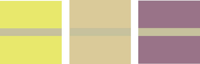
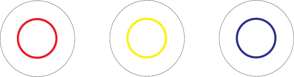
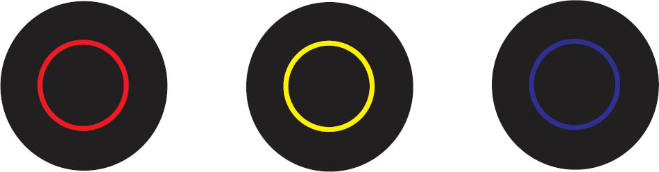
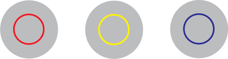
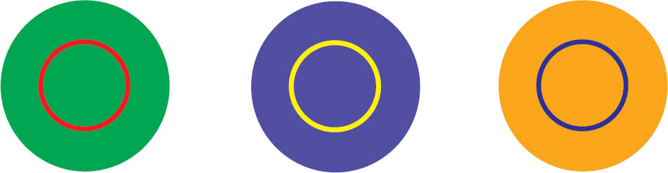
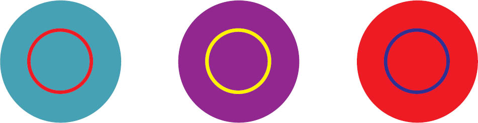
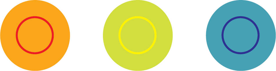
One Color, Different Effects The neutral tone passing through these three squares of color is the same in each instance. It takes on a slightly different hue or value depending on its context.
Bezold Effect Johann Friedrich Wilhelm von Bezold was a German physicist working in the nineteenth century. Fascinated with light and color, he also was an amateur rug maker. He noticed that by changing a color that interwove with other colors in a rug, he could create entirely different results. Adding a darker color to the carpet would create an overall darker effect, while adding a lighter one yielded a lighter carpet. This effect is known as optical mixing.
Vibration and Value When two colors are very close in value, a glowing effect occurs; on the left, the green appears luminous and unstable. With a strong value difference, as seen on the right, the green appears darker.
Color + White
Color + Black
Color + Gray
Complements
Near Complements
Analogous Colors
Designing with Color
Whereas a painter often produces dozens of colors in a spontaneous manner, designers work with color more systematically. Rather than mix colors on the fly, they often select them from libraries of swatches and define colors as global values across a project. Colors take on specific functions within a design project. Many brand campaigns, websites, posters, signage, and other graphics employ a limited number of colors that cover a range of values and color temperatures. A palette might consist of black, white, and one or two accent colors. By occupying a middle ground between black and white, an accent color can allow type to appear in both black and white, adding to a piece’s typographic range. Including both warm and cool hues in a color palette creates a sense of visual completeness, like a salad with a full range of flavors and textures. Even though digital media enable designers to use numerous colors at no additional cost, creating color systems still supports strong communication.
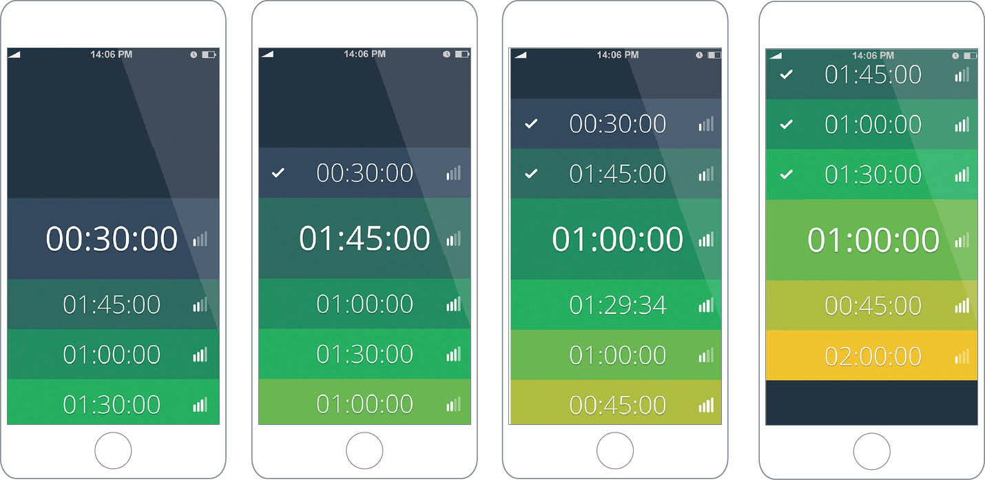
Blue + Yellow = Green This design for an app that tracks the duration and intensity of cardio workouts uses a stepped range of colors to communicate information in a direct and understandable way. Alex Jacque, MFA Studio.
Black + One The yellow is deep enough to allow the white type to read against it.
Black + Two The warm salmon red and cool greenish blue bring a satisfying sense of completeness to the palette. Michael Shillingburg, Typography II. Ellen Lupton, faculty.


Black Is a Color This interface uses a minimal color range to convey simple actions. Used richly and forcefully, the black and gray tones become full-fledged actors within the color palette. Michael Bonfiglio, MFA Studio.


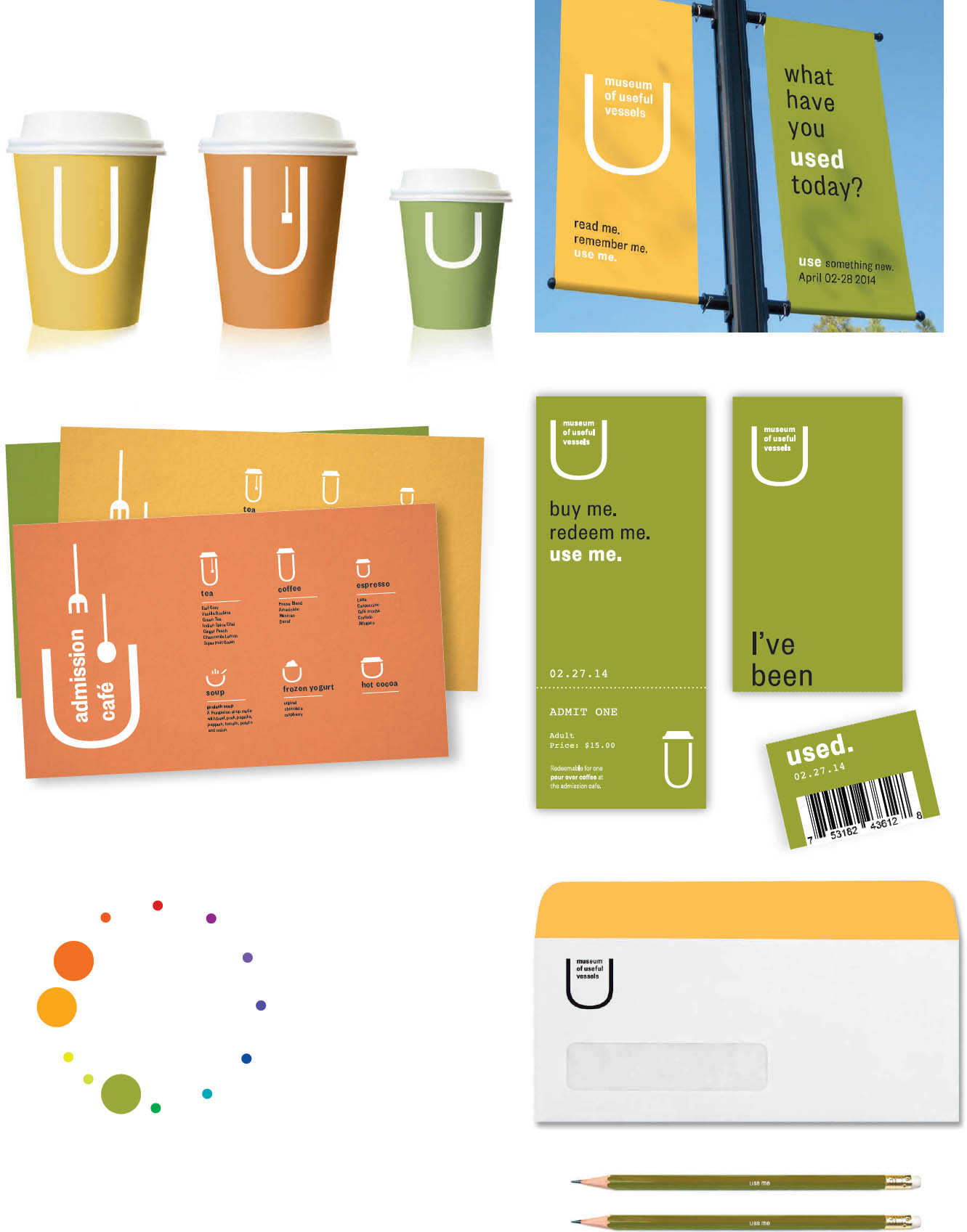
Monochrome A single shade of blue expresses a no-nonsense attitude in this branding project. Lighter shades of blue and mixtures of blue and black express a broad range of tonality within a limited spectrum. Amanda Buck, MFA Studio.
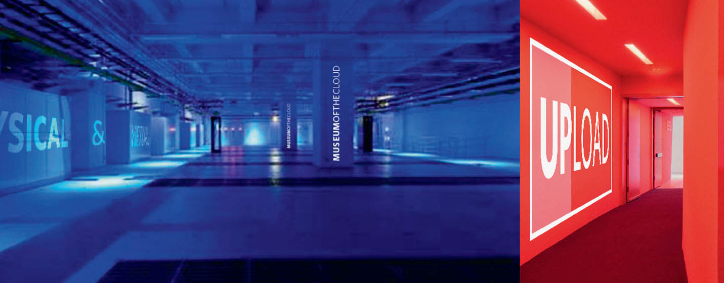
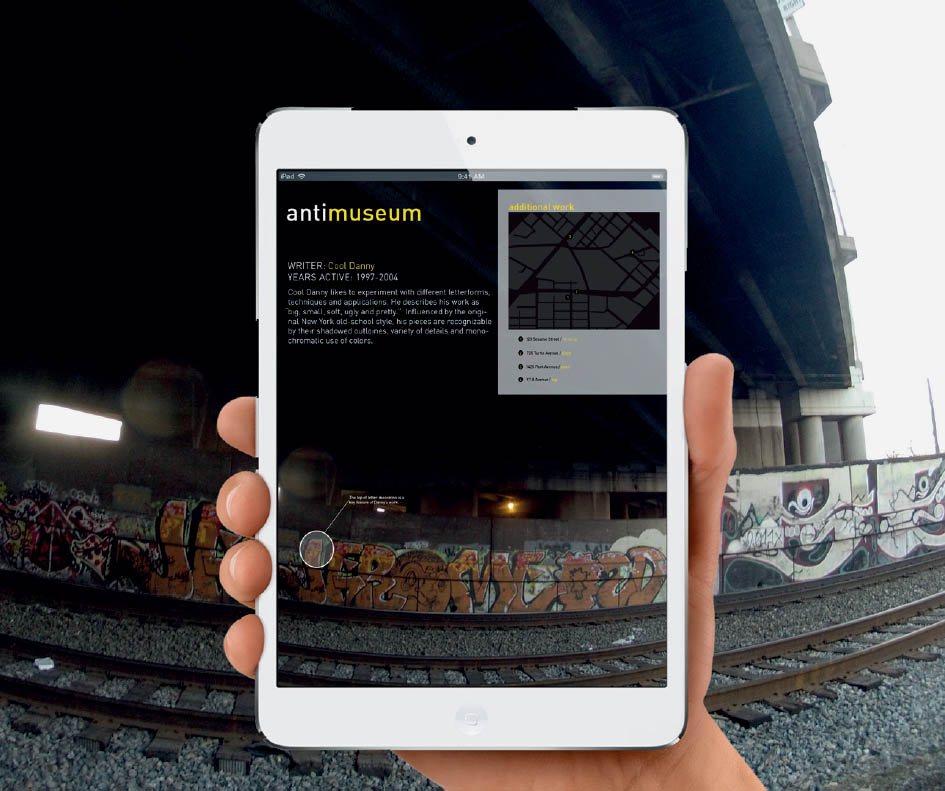
Hard Light This museum identity contrasts an intense, cold blue with pure red to reference the RGB color space. Katrina Keane, MFA Studio.
Hot and Cold Simple primary colors serve as a background for black-and-white typography. Shiva Nallaperumal, MFA Studio.
Analogous Naturals The three colors that make up the palette of this museum branding project come from positions located near each other on the color wheel. The gently muted, desaturated hues convey an organic quality. Iris Sprague, MFA Studio.
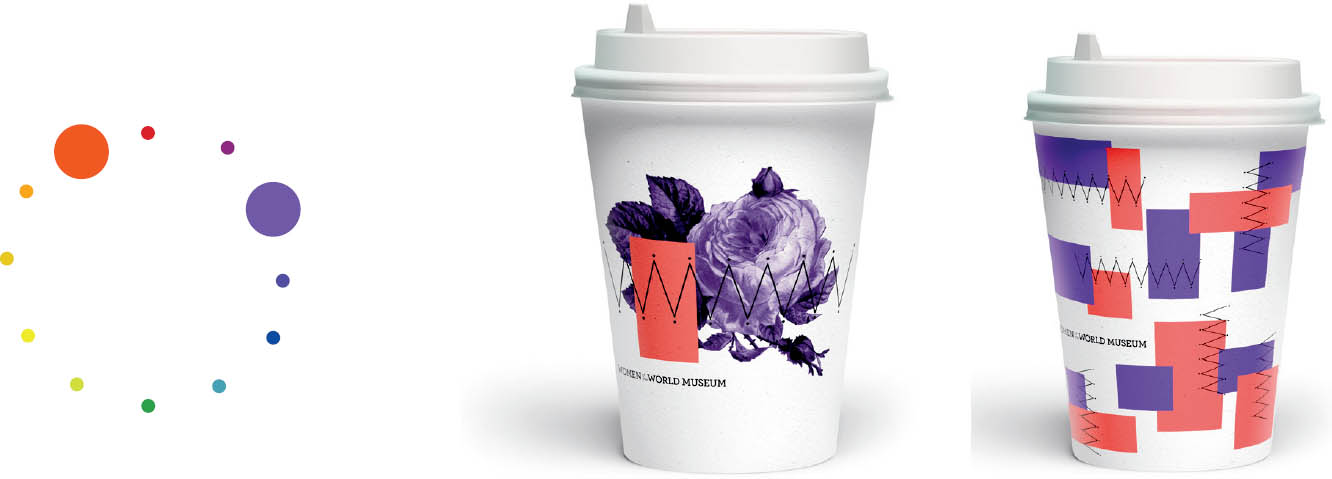
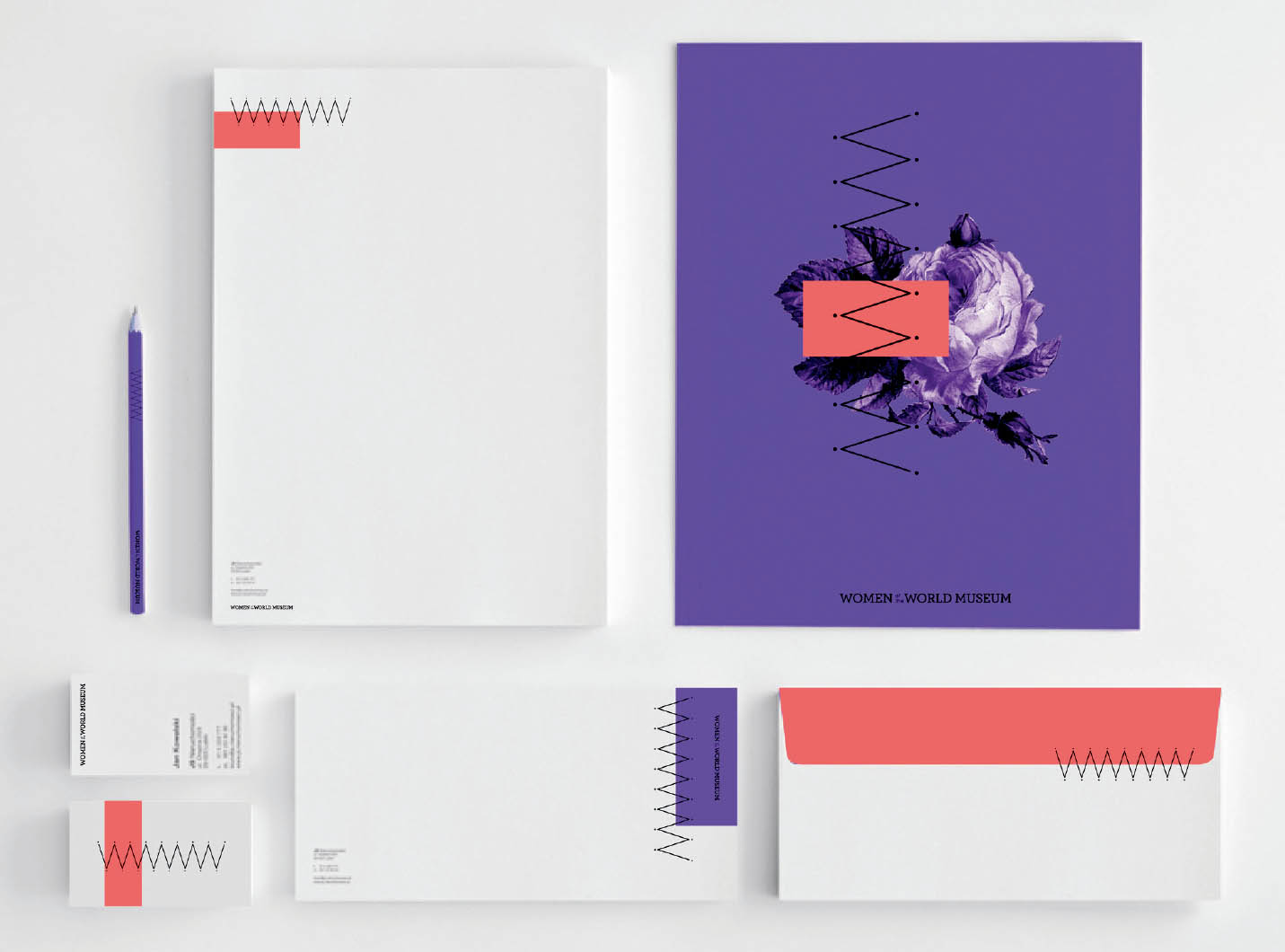
Near Complements The rosy orange and deep violet featured in this brand identity sit near each other on the color wheel, creating harmony within a range of warm and cool. Louis Luo, MFA Studio.
Selective Emphasis These studies use typographic patterns to explore how color alters not just the mood of a pattern, but the way its shapes and figures are perceived. Color affects both the parts and the whole. Each study begins with a black and white pattern built from a single font and letterform.
Experiments with hue, value, and saturation, as well as with analogous, complementary, and near complementary color juxtapositions, affect the way the patterns feel and behave. Through selective emphasis, some elements pull forward and others recede. Typography I. Jennifer Cole Phillips, faculty.
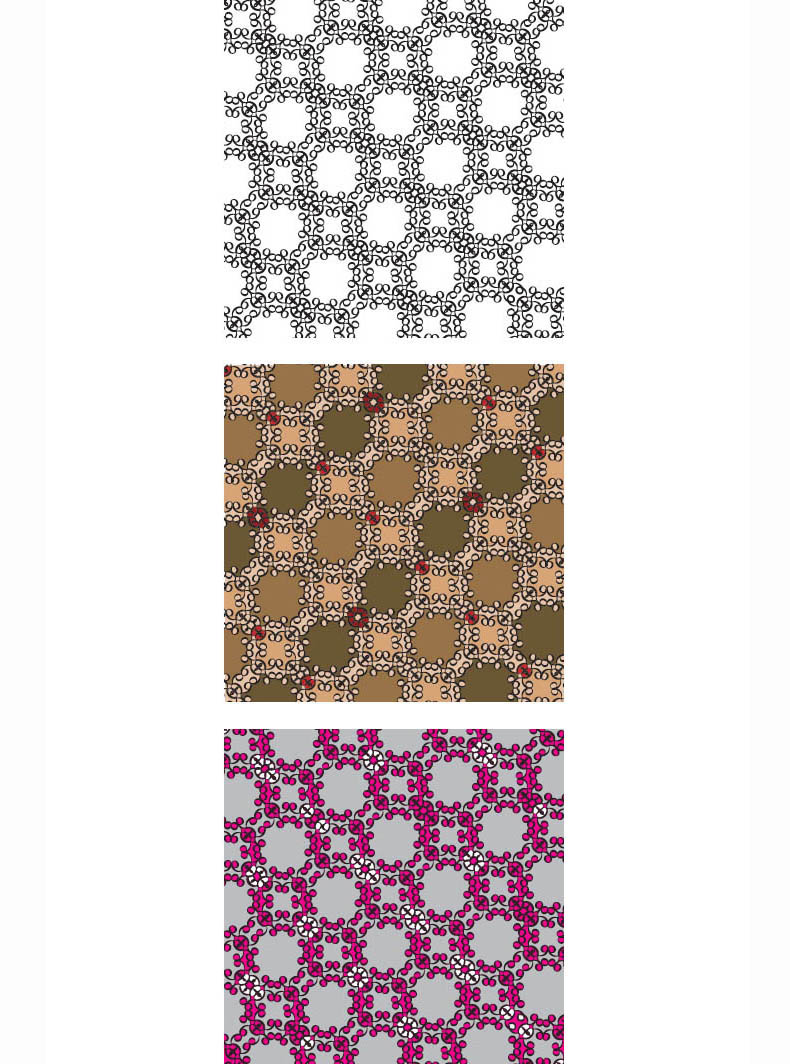
Joanna Marshall
Neutral earth tones combine to make a quiet overall pattern, while a palette with strong contrasts of value and hue yields a more linear effect.
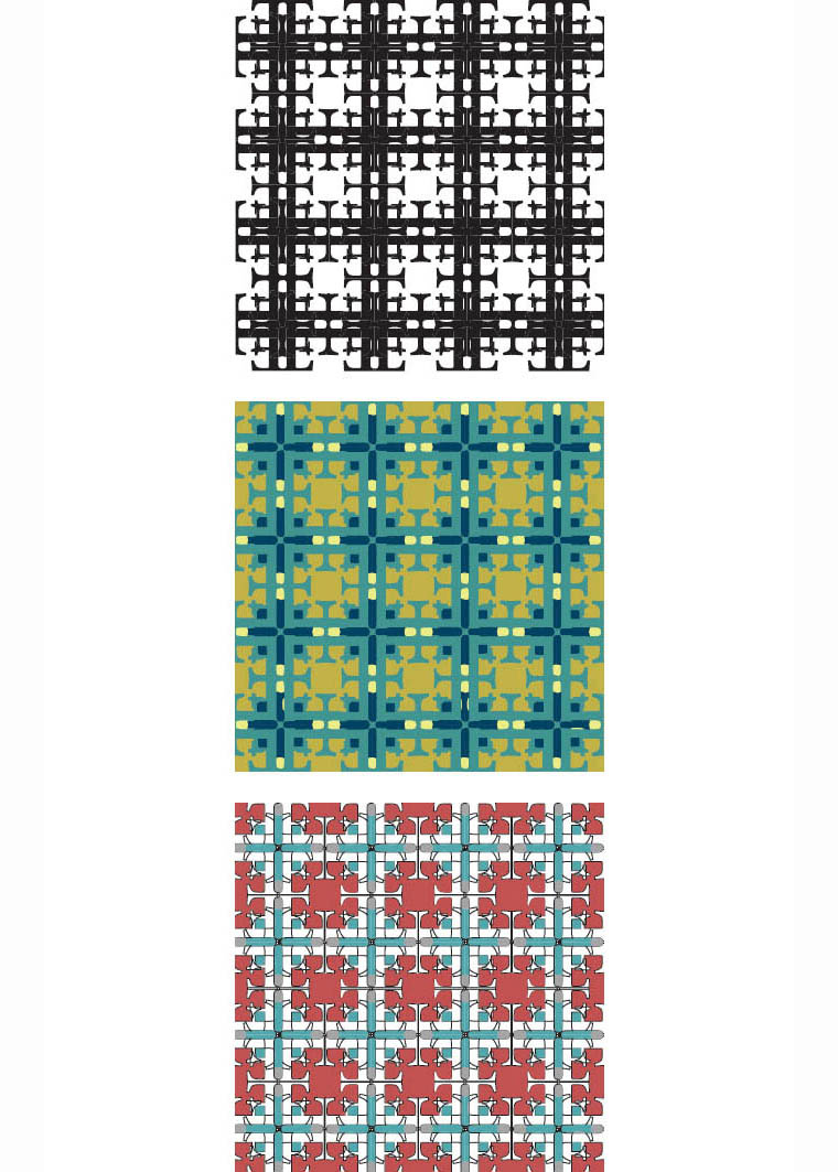
Katie Evans
By changing the colors of background and foreground elements, completely new forms appear and disappear.
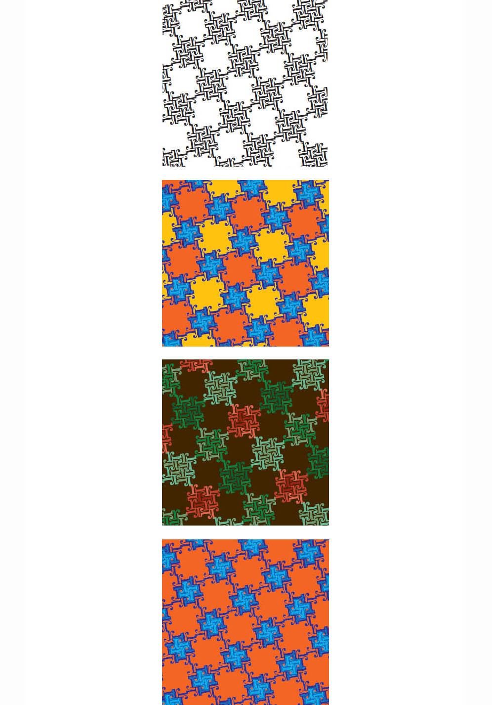
Elizabeth Tipson
Ellen Kling
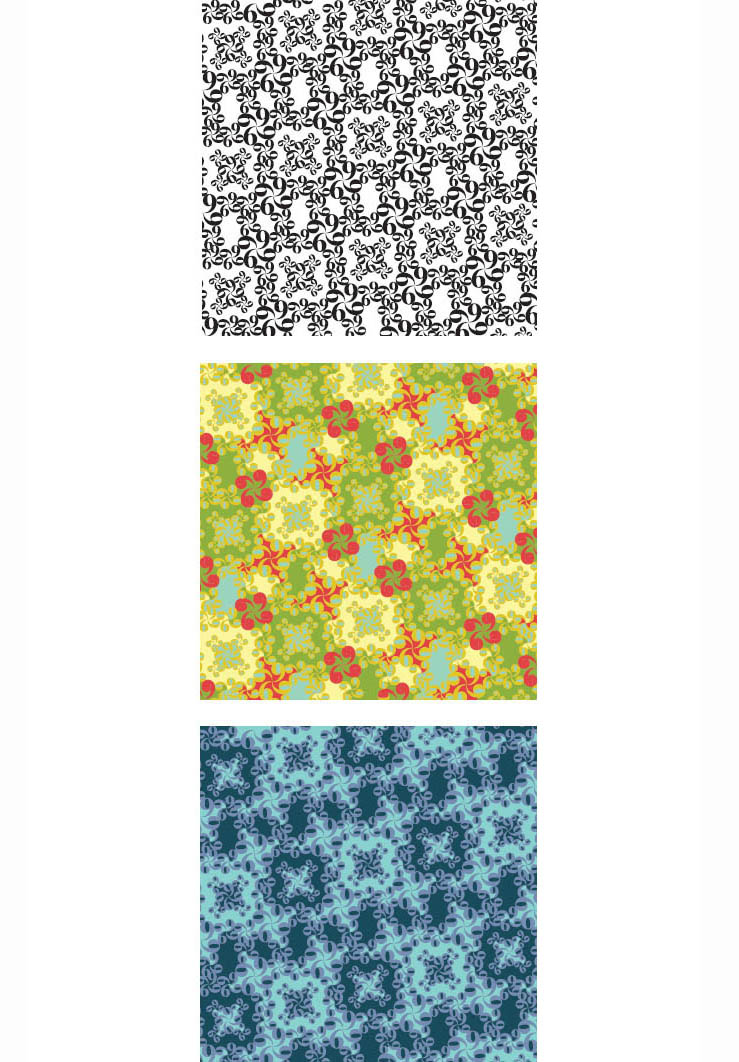
Colors close in value but different in hue create a vibrant yet soft effect. The pattern becomes even softer when analogous colors are used.
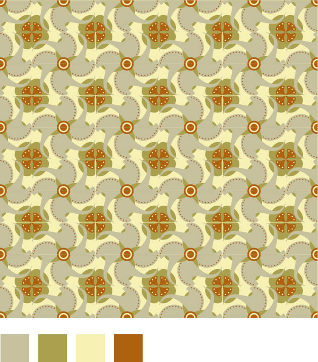
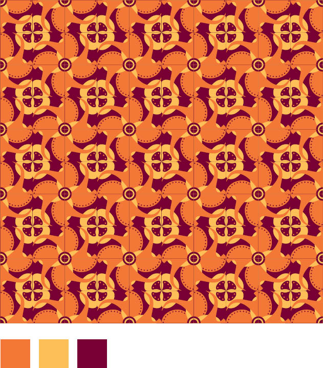
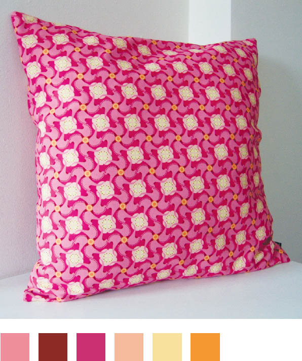
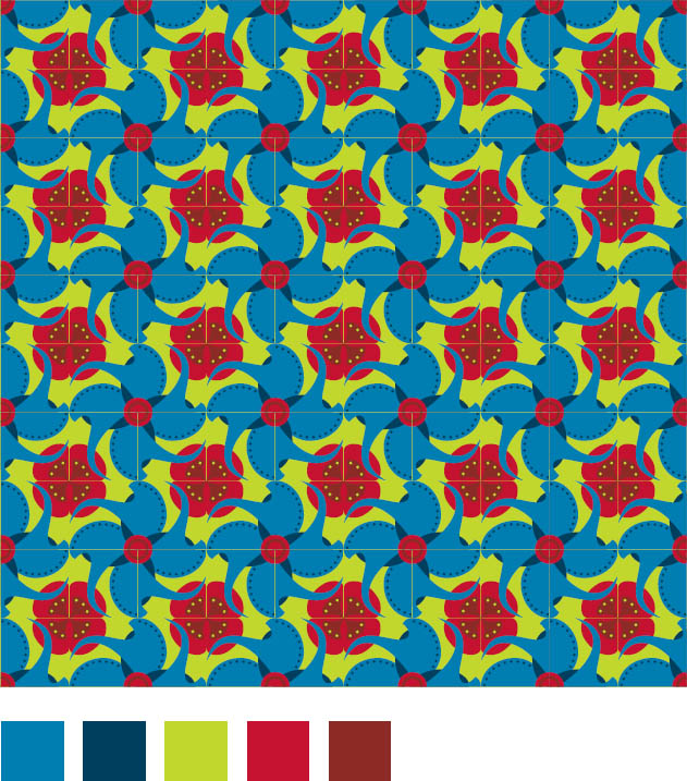
Passion, Palettes, and Products What began as a love for Portuguese tile patterns on a trip to Lisbon evolved into an intensive investigation into pattern, form, and color, manifesting itself in an MFA thesis project and now an online business.
Textile designers often create numerous colorways for a single pattern, allowing the same printing plates or weaving templates to generate diverse patterns. Different color palettes make different elements of the pattern come forward or recede. Jessica Pilar, MFA Studio.
1. On basic color theory and practice, see Tom Fraser and Adam Banks, Designer’s Color Manual (San Francisco: Chronicle Books, 2004).
2. See Josef Albers, Interaction of Color (1963; repr., New Haven: Yale University Press, 2006).
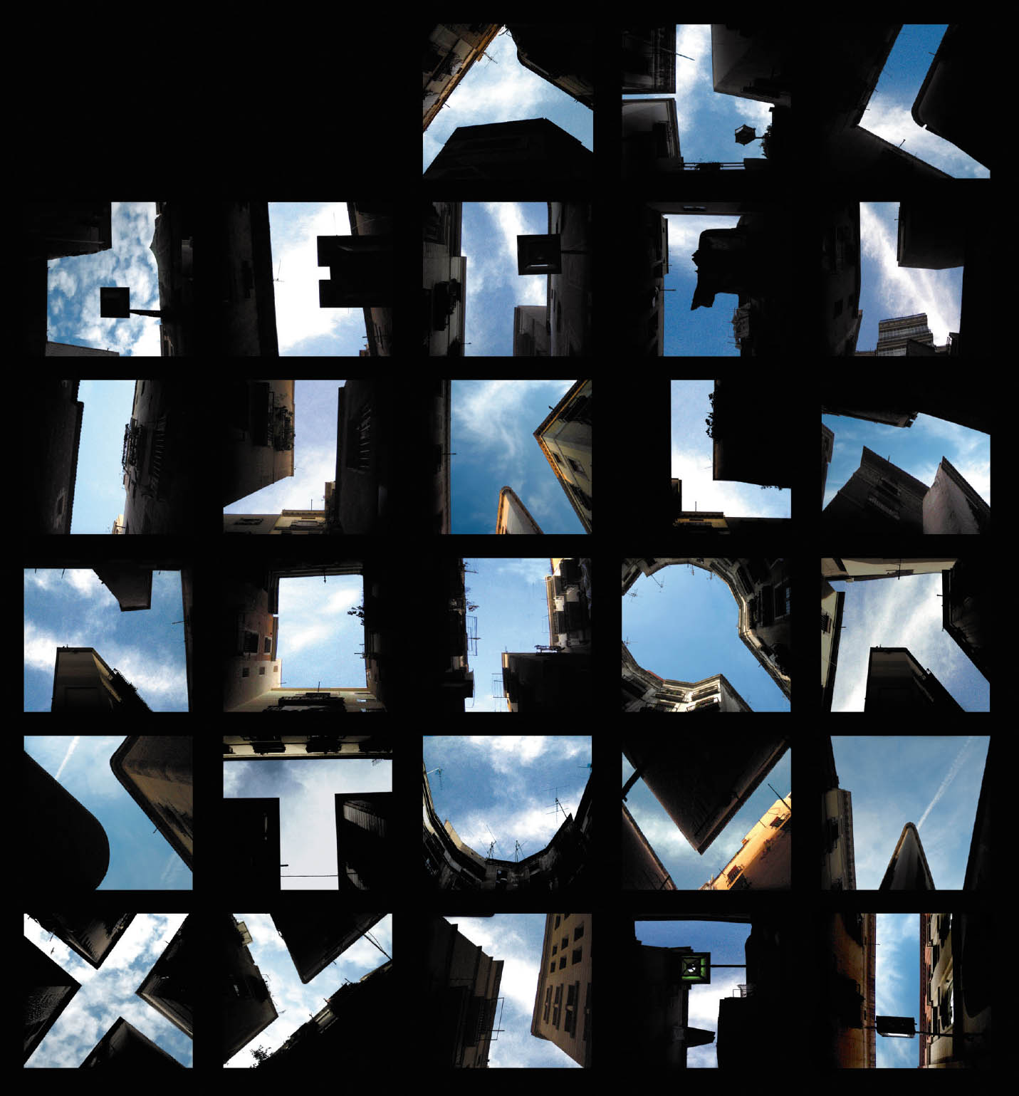
Figure Sky These photographs use urban buildings to frame letterforms. The empty sky becomes the dominant figure, and the buildings become the background that makes them visible. Lisa Rienermann, University of Essen, Germany.