Graphic Design: The New Basics: Second Edition, Revised and Expanded (2015)
Grid
Typography is mostly an act of
dividing a limited surface. Willi Baumeister
A grid is a network of lines. The lines in a grid typically run horizontally and vertically in evenly spaced increments, but grids can be angled, irregular, or even circular as well.
When you write notes on a pad of lined paper, or sketch out a floor plan on graph paper, or practice handwriting or calligraphy on ruled pages, the lines serve to guide the hand and eye as you work.
Grids function similarly in the design of printed matter. Guidelines help the designer align elements in relation to each other. Consistent margins and columns create an underlying structure that unifies the pages of a document and makes the layout process more efficient. In addition to organizing the active content of the page (text and images), the grid lends structure to the white spaces, which cease to be merely blank and passive voids but participate in the rhythm of the overall system.
A well-made grid encourages the designer to vary the scale and placement of elements without relying wholly on arbitrary or whimsical judgments. The grid offers a rationale and a starting point for each composition, converting a blank area into a structured field.
Many artists have embraced the grid as a rational, universal form that exists outside of the individual producer. At the same time, the grid is culturally associated with modern urbanism, architecture, and technology. The facades of many glass high rises and other modern buildings consist of uniform ribbons of metal and glass that wrap the building’s volume in a continuous skin. In contrast with the symmetrical hierarchy of a classical building, with its strong entranceway and tiered pattern of windows, a gridded facade expresses a democracy of elements.
Grids function throughout society. The street grids used in many modern cities around the globe promote circulation among neighborhoods and the flow of traffic, in contrast with the suburban cul-de-sac, a dead-end road that keeps neighborhoods closed off and private.
The grid imparts a similarly democratic character to page and screen. By marking space into numerous equal units, the grid makes the entire surface available for use; the edges become as important as the center. Grids help designers create active, asymmetrical compositions in place of static, centered ones. By breaking down space into units, grids encourage designers to leave some areas open rather than filling up the whole page.
Software interfaces encourage the use of grids by making it easy to establish margins, columns, and page templates. Guidelines can be quickly dragged, dropped, and deleted and made visible or invisible at will. (Indeed, it is a good idea when working on screen to switch off the guidelines from time to time, as they can create a false sense of fullness and structure as well as clutter one’s view.)
This chapter looks at the grid as a means of generating form, arranging images, and organizing information. The grid can work quietly in the background, or it can assert itself as an active element. The grid becomes visible as objects come into alignment with it. Some designers use grids in a strict, absolute way, while others see them as a starting point in an evolving process. This book is designed with a strong grid, but when an image or layout needs to break step with the regiment, it is allowed to do so.
Form and Content
The grid has a long history within modern art and design as a means for generating form. You can construct compositions, layouts, and patterns by dividing a space into fields and filling in or delineating its cells in different ways. Try building irregular and asymmetric compositions against the neutral, ready-made backdrop of a grid. The same formal principles apply to organizing text and images in a publication design.
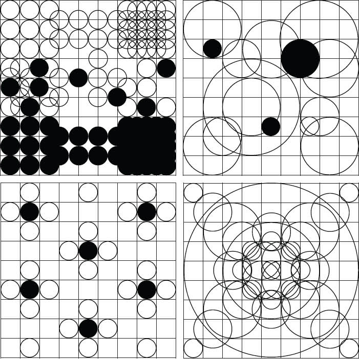
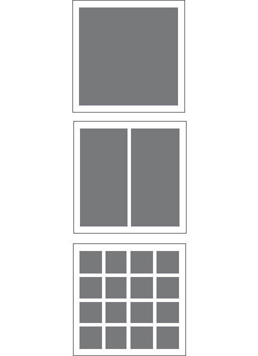
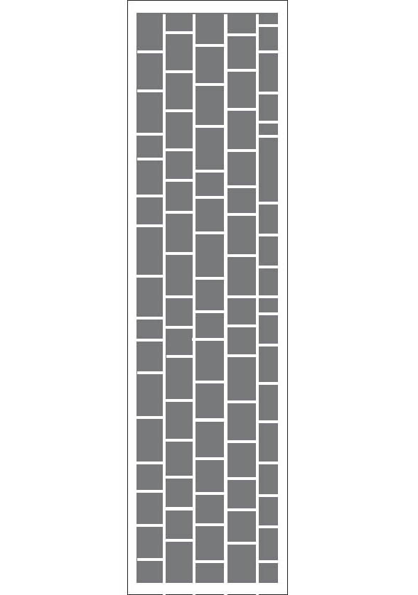
Grids Generate Form The cells and nodes of a grid can be used to generate complex pattern designs as well as simple rectangles. Dividing a square into nine identical units is a classic design problem. Numerous simple forms and relationships can be built against this simple matrix. Jason Okutake and John P. Corrigan, MFA Studio.
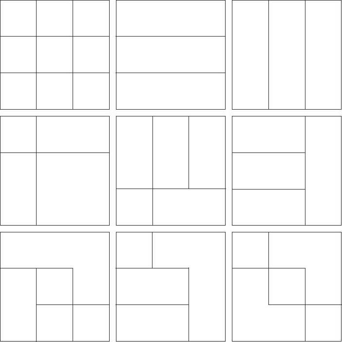
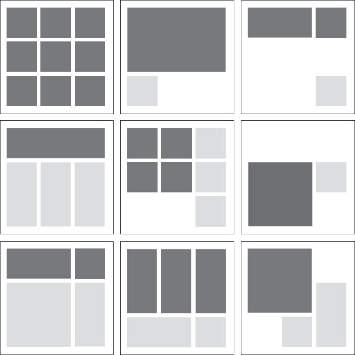
Grids Organize Content The nine-square grid divides the page into spaces for images and text. Although each layout has its own rhythm and scale, the pages are unified by the grid’s underlying structure. The book you are reading is built around a similar nine-square grid. John P. Corrigan, MFA Studio.
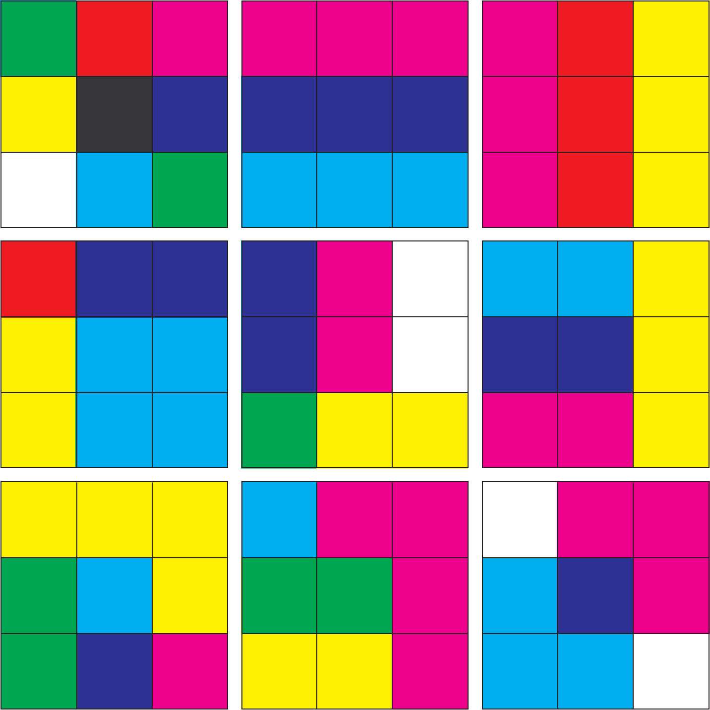
Nine-square Grid: Color Fields The grid provides a structure for organizing fields of color that frame and overlap each other. Complexity emerges against a simple armature. John P. Corrigan, MFA Studio.
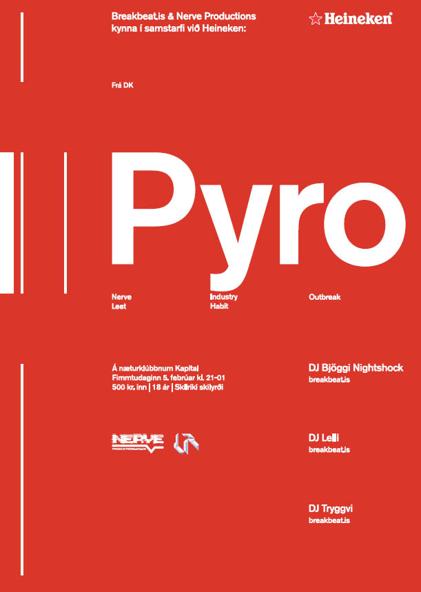
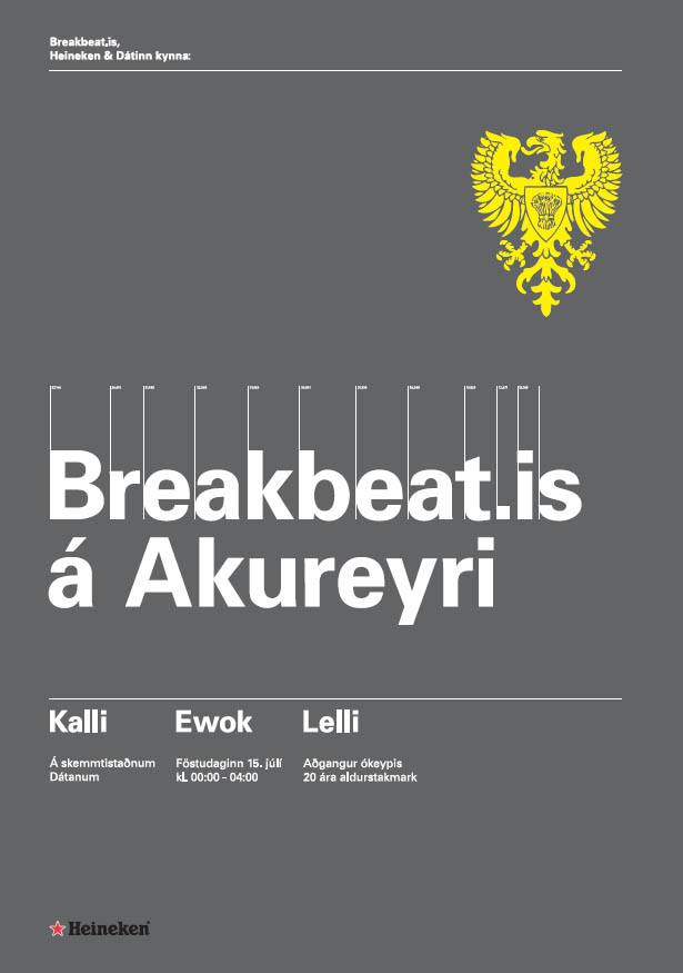
Ragnar Freyr
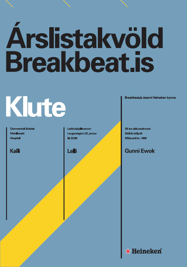
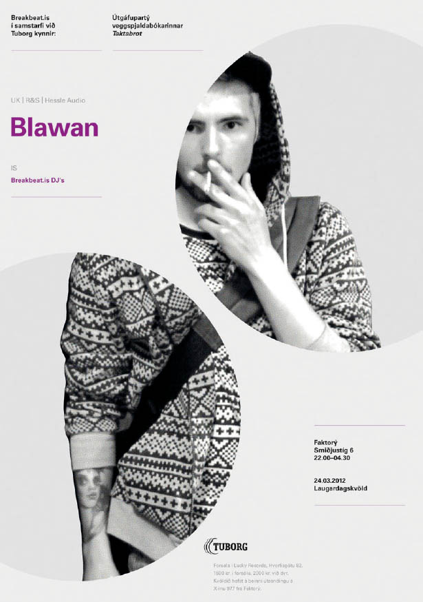
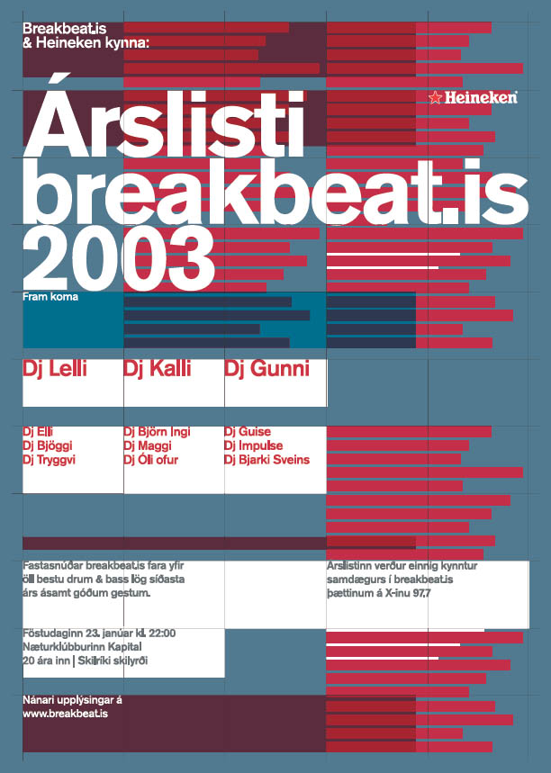
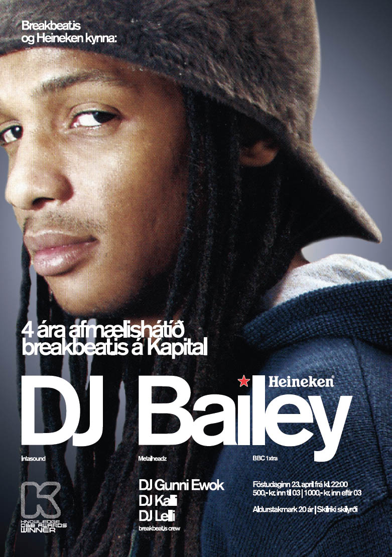
Rhythm, Form, Frame Iceland-based designer Ragnar Freyr creates posters, identities, websites, and publications. In the posters shown here, Freyr has used the grid to establish simple rhythms and hierarchies as well as to frame images and generate complex forms. Design: Ragnar Freyr. Photography (left): Kevin McAuley. Photography (below): Cleveland Aaron/Knowledge Mag.
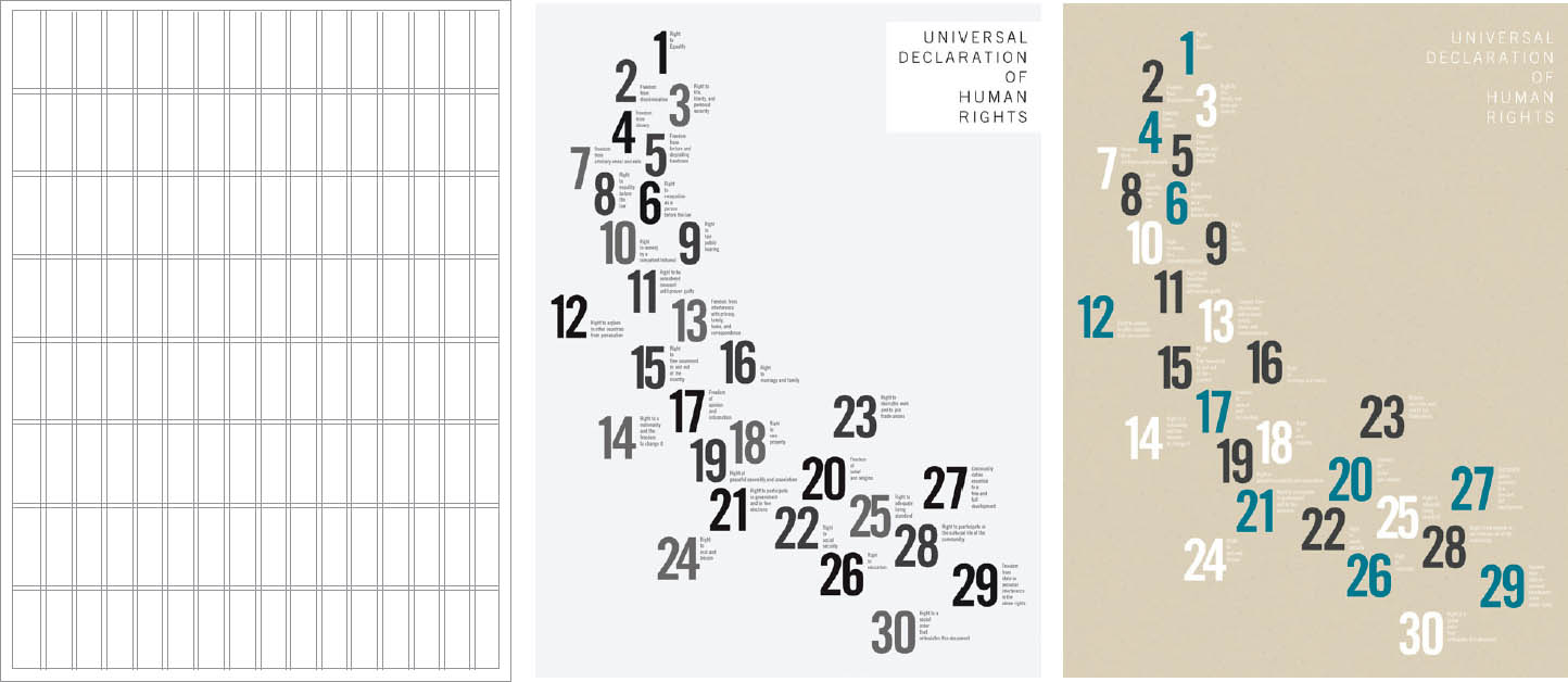
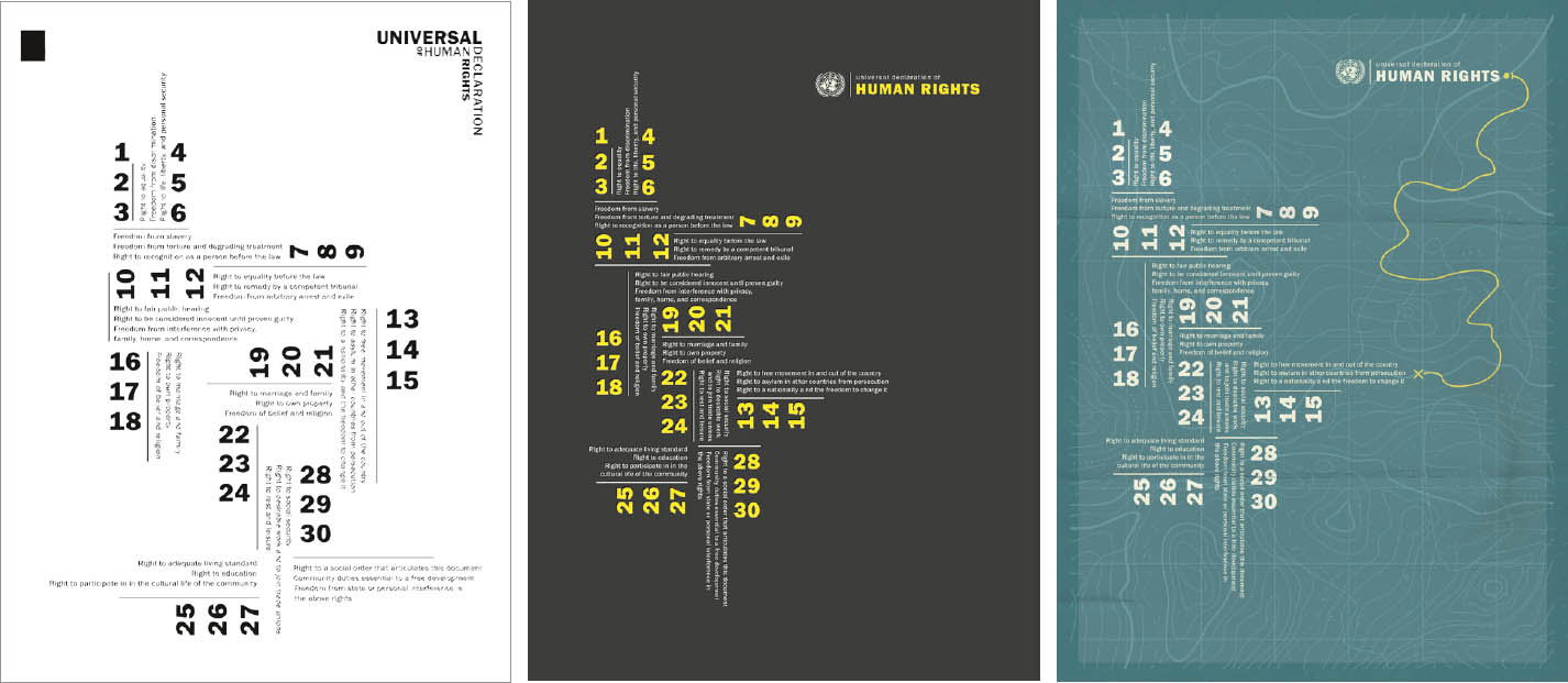
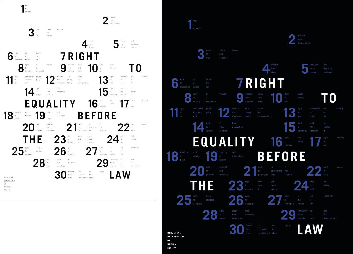
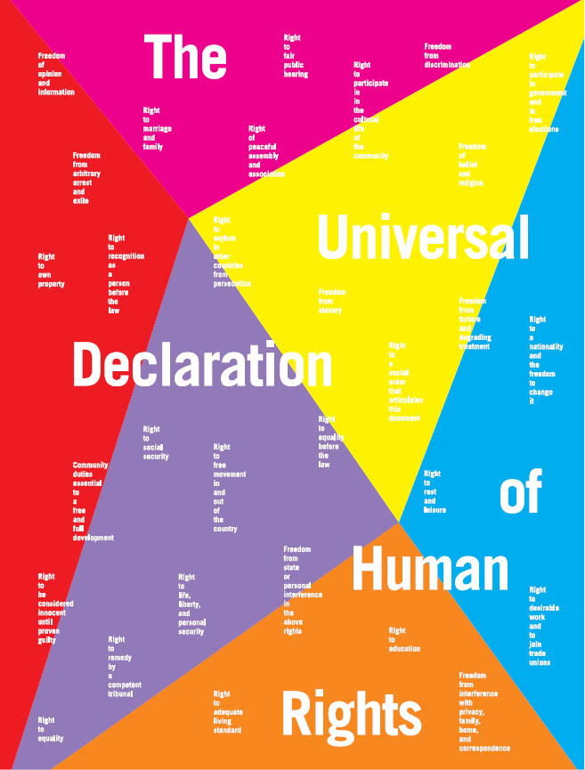
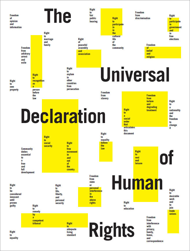
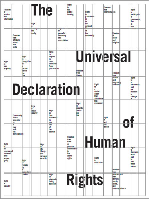
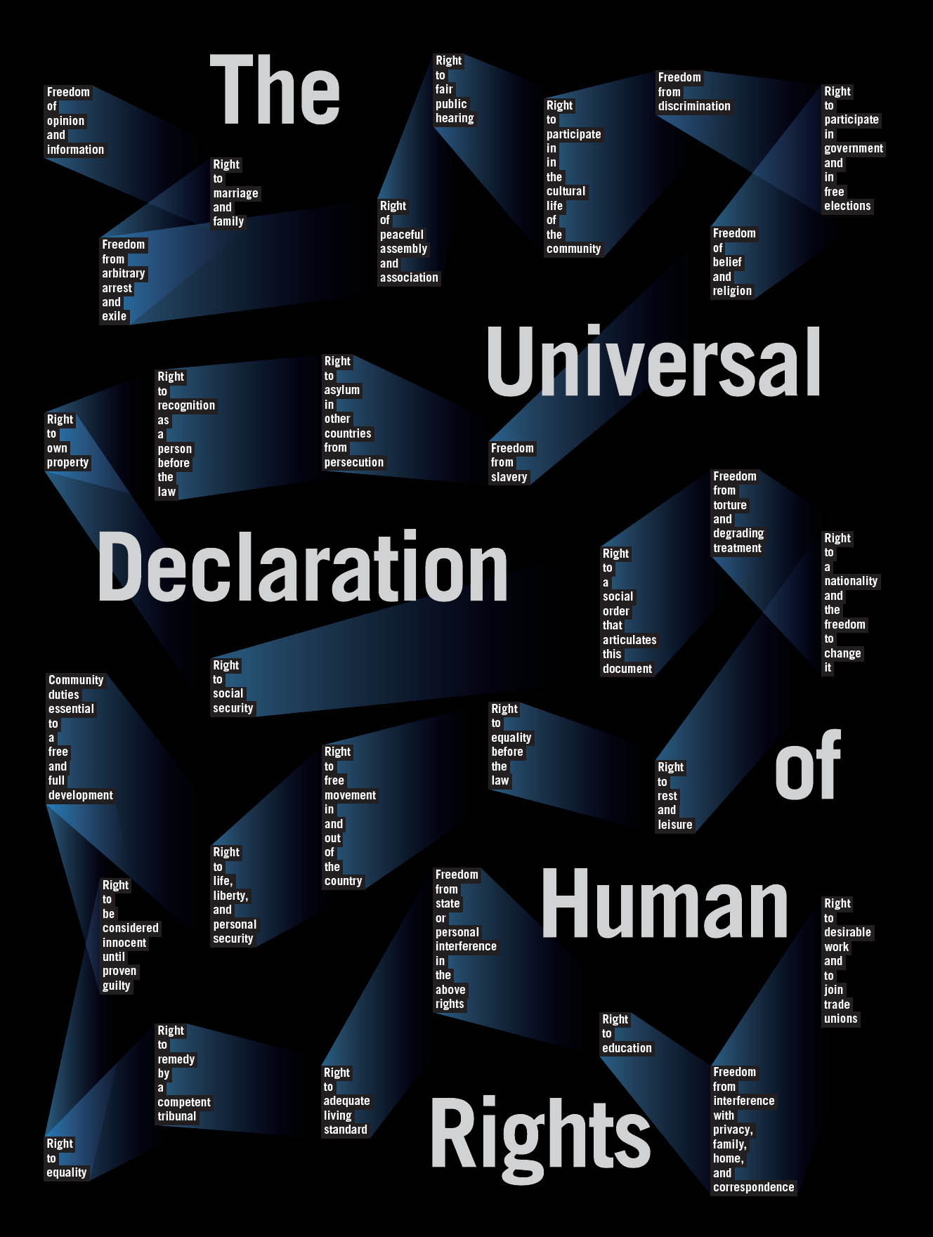
Structure and Color In this project, designers explore the grid as a tool for organizing content and generating form. The text is the United Nations’ Universal Declaration of Human Rights (abbreviated version). With sixteen vertical columns and eight horizontal rows, the grid provides a flexible scaffold for organizing content. Typefaces are limited to the Univers family. After designers arrive at a solid black-and-white concept, they use color to emphasize or counteract the underlying structure. Typography II. Ellen Lupton, faculty.
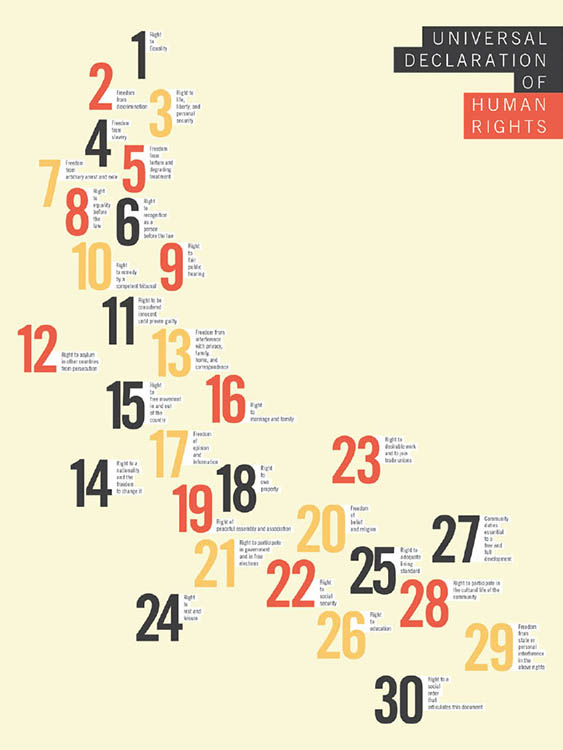
Diane Yang
Trace Byrd
Devon Burgoyne
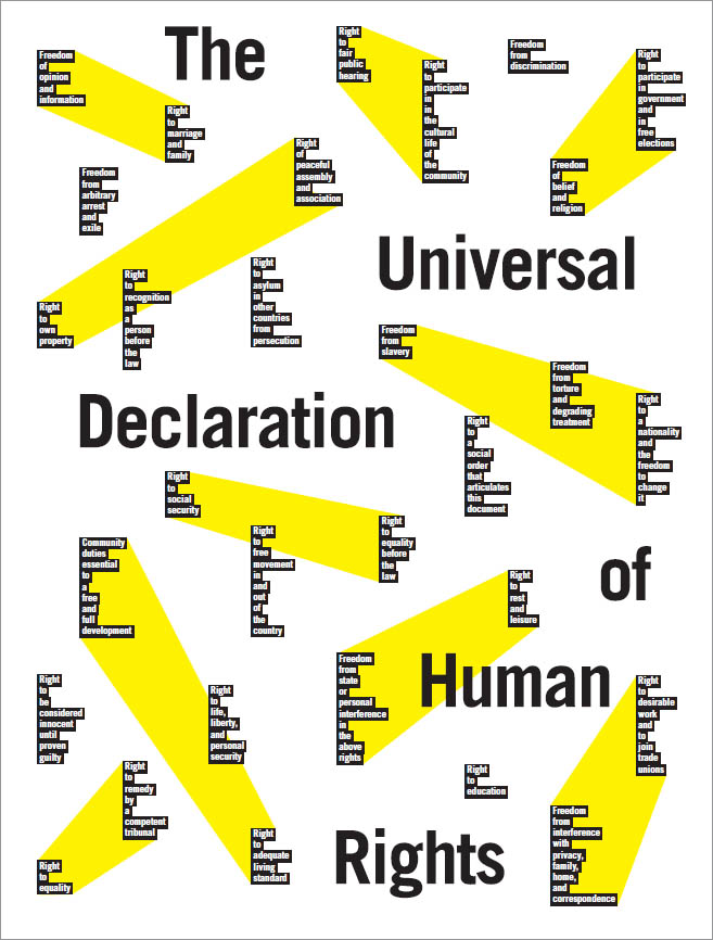
Co-Design: Generate Form After using the 16-column grid to organize the text, the designer exchanged his InDesign file with classmates and asked them to add elements based on the grid. He created the final poster at right in response to the designs he collected. Chen Yu, Typography II.
Content Management
A standard narrative book is designed with a single-column grid: one block of body copy is surrounded by margins that function as a simple frame for the content. For hundreds of years, Bibles have been designed with pages divided into two columns. Textbooks, dictionaries, reference manuals, and other books containing large amounts of text often use a two-column grid, breaking up space and making the pages less overwhelming for readers.
Magazines typically use grids with three or more vertical divisions. Multiple columns guide the placement of text, headlines, captions, images, and other page elements. One or more horizontal “hang lines” provide additional structure. A skilled designer uses a grid actively, not passively, allowing the modules to suggest intriguing shapes and surprising placements for elements.
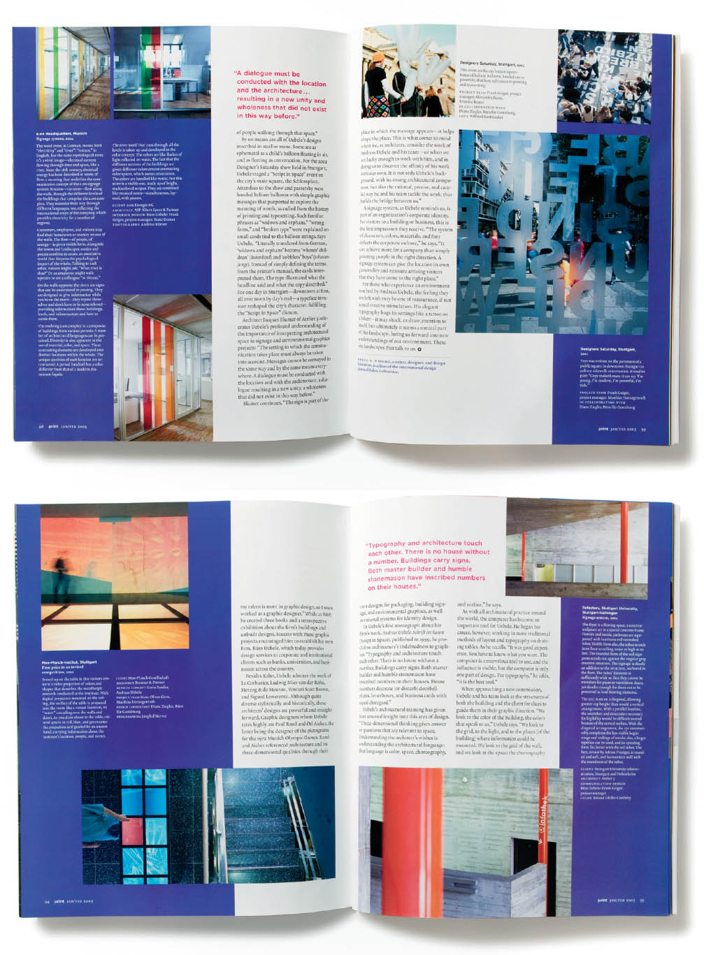
Many Columns, Many Choices The page layouts shown here from Print magazine, designed by Pentagram, employ a complex, multicolumn grid. The column structure gives the pages their vertical grain, while horizontal hang lines anchor each spread, bringing elements into taut alignment. The grid helps the layout designer create active, varied pages that are held together by an underlying structure. The grid accommodates a mix of sizes and proportions in both image and text blocks. And, where appropriate, the designer breaks the grid altogether. Abbott Miller and John Kudos, Pentagram. Print magazine.
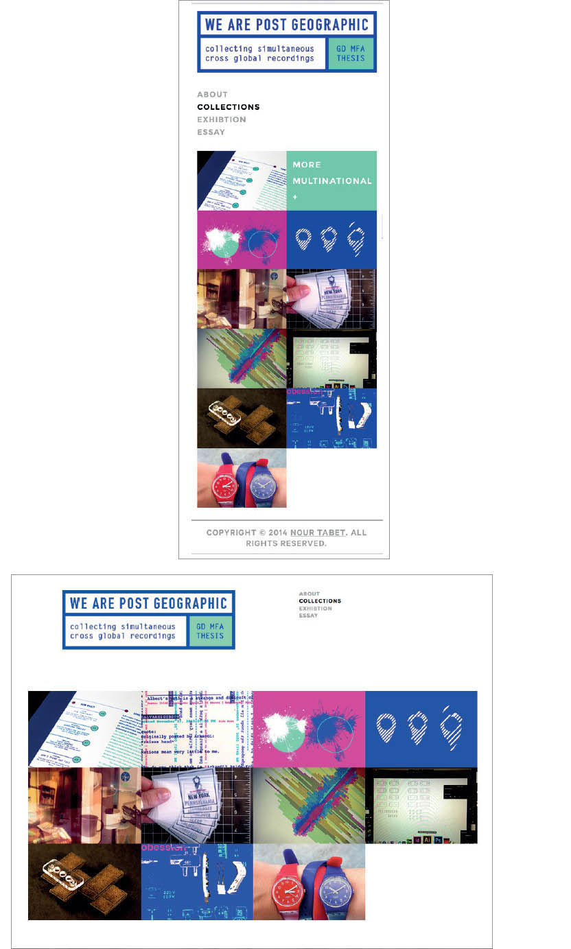
Digital Grids The webpage at left features a single column of text edged with reference images; users can click on an image for an enlarged view. This simple structure is similar to that of many online newspapers. The pages above are examples of responsive layout; the grid changes depending on the output device. Emma Sherwood-Forbes and Nour Tabet, MFA Studio.
Automated Grids
Grids for digital media are often built on the fly to organize chunks of content into collections of data that users can quickly scan. Google searches and Pinterest boards present images in grids whose irregular heartbeat reflects the diverse shapes and sizes of content. Pinterest accommodates the long, skinny graphics made popular by vertically scrolling websites, while Google image searches favor horizontal images. The web’s random sense of overflow has also inspired designers to create new grids for print.
Pinterest Grid
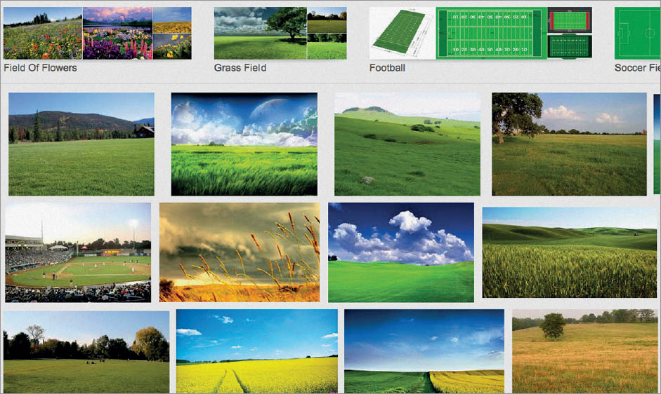
Google Image Search: Field
New Realities of the Page The utilitarian density of the web has influenced design for print, as seen in the book Making Design, published by Cooper Hewitt, Smithsonian Design Museum (2015). Irma Boom.
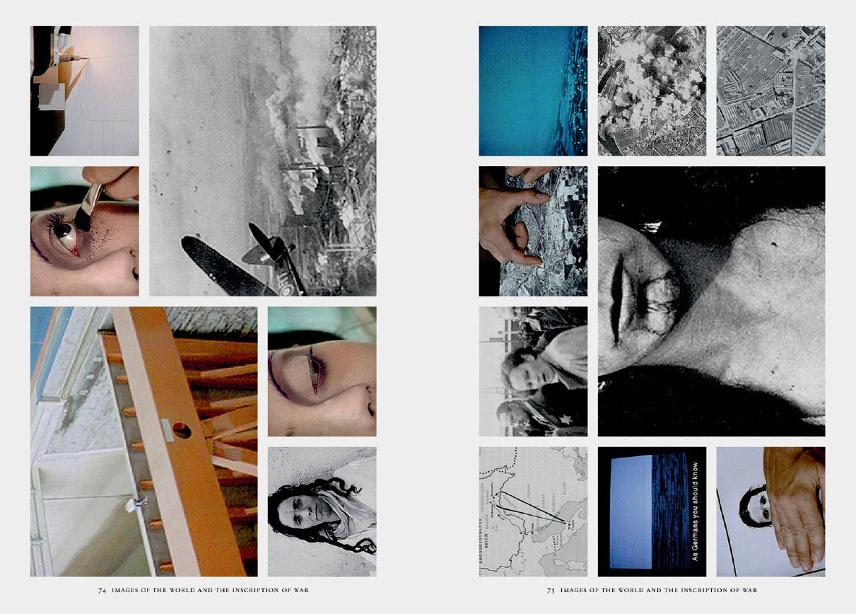
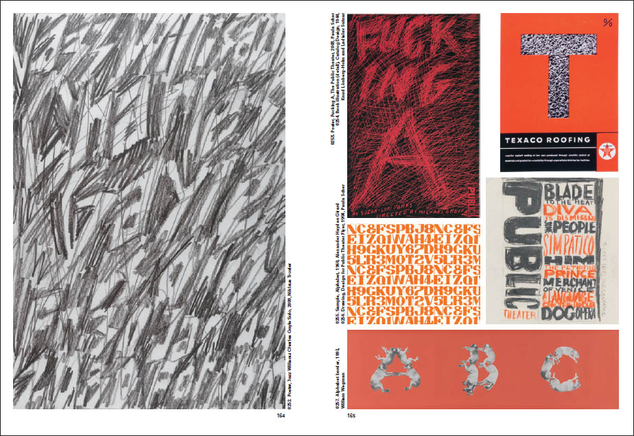
The End of White Space Images lock together in a compact geometry in the pages of Harun Farocki Diagrams, edited and designed by Benedikt Reichenbach, Verlag der Buchhandlung Walther König (2014).
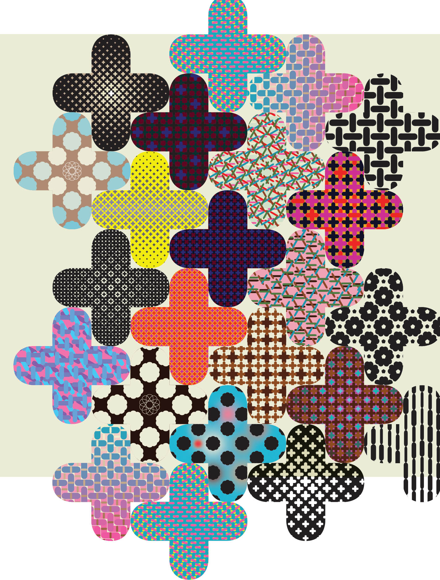
Crazy Quilt Mixing and matching patterns is an ancient enterprise. Here, a mix is made with a palette of digital elements that communicate with each other. Jeremy Botts, MFA Studio