Graphic Design: The New Basics: Second Edition, Revised and Expanded (2015)
Hierarchy
Design is the conscious effort to impose a meaningful order. Victor Papanek
Hierarchy is the order of importance within a social group (such as the regiments of an army) or in a body of text (such as the sections and subsections of a book). Hierarchical order exists in nearly everything we know, including the family unit, the workplace, politics, and religion. Rankings of power and position define who we are as a culture.
Hierarchy is expressed through naming systems: general, colonel, corporal, private, and so on. Hierarchy is also conveyed visually, through variations in scale, value, color, spacing, placement, and other signals. Expressing order is a central task of the graphic designer. Visual hierarchy controls the delivery and impact of a message. Without hierarchy, graphic communication is dull and difficult to navigate.
Like fashion, graphic design cycles through periods of structure and chaos, ornament and austerity. A designer’s approach to visual hierarchy reflects his or her personal style, methodology, and training as well as the zeitgeist of the period. Hierarchy can be simple or complex, rigorous or loose, flat or highly articulated. Regardless of approach, hierarchy employs clear marks of separation to signal a change from one level to another. As in music, the ability to articulate variation in tone, pitch, and melody in design requires careful delineation.
In interaction design, menus, texts, and images can be given visual order through placement and consistent styling, but the user often controls the order in which information is accessed. Unlike a linear book, interactive spaces feature multiple links and navigation options that parcel content according to the user’s actions. Cascading Style Sheets (CSS) articulate the structure of a document separately from its presentation so that information can be automatically reconfigured for different output devices, from desktop computer screens to mobile phones, PDAs, kiosks, and more. A slightly different visual hierarchy might be used in each instance.
The average computer desktop supports a complex hierarchy of icons, applications, folders, menus, images, and palettes—empowering users, as never before, to arrange, access, edit, and order vast amounts of information—all managed through a flexible hierarchy controlled and customized by the user.
As technology allows ever greater access to information, the ability of the designer to distill and make sense of the data glut gains increasing value.
Basic Typographic Hierarchy
The table of contents of a printed book—especially one with many parts—provides a structural picture of the text to follow. When books are marketed online, the table of contents is often reproduced to allow potential buyers to preview the book. A well-designed table of contents is thus not only functional but also visually exciting and memorable.
The basic function of a table of contents is to help readers locate relevant information and provide an image of how the book is organized. Does the text fall into a few main parts with various subdivisions, or does it consist of numerous small, parallel entries? The designer uses alignment, leading, indents, and type sizes and styles to construct a clear and descriptive hierarchy.
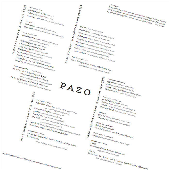
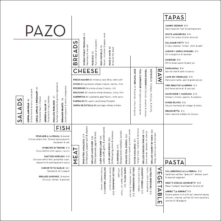
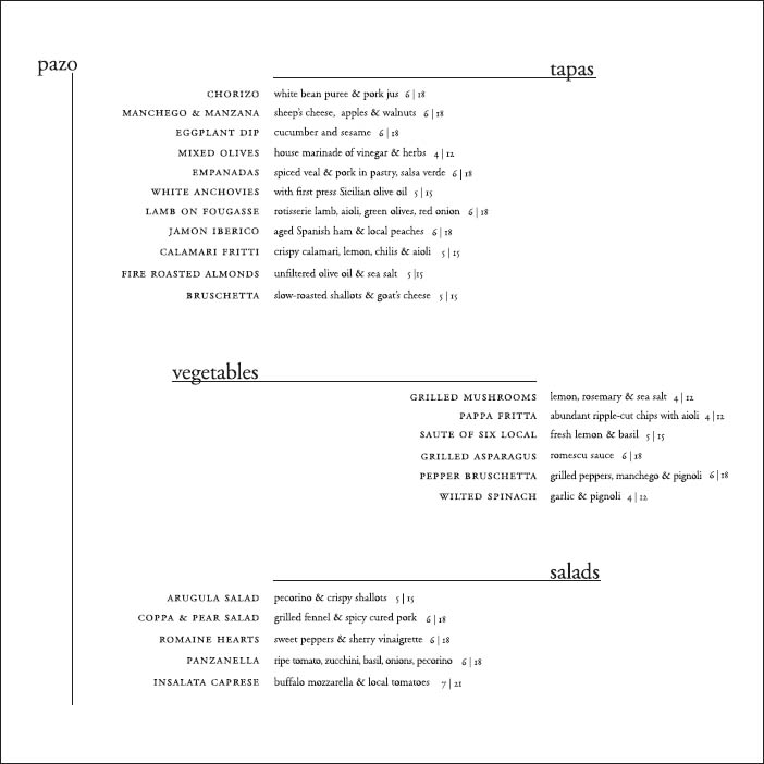
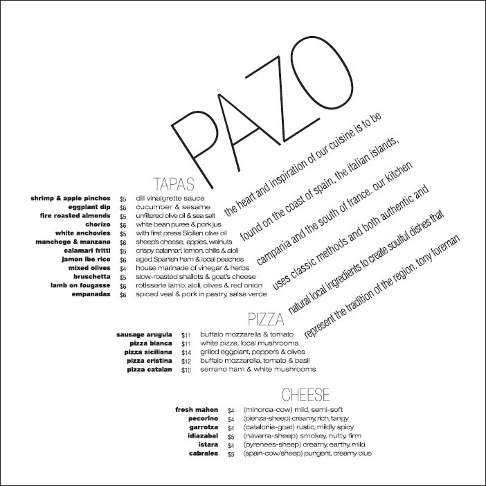
A poorly designed table of contents often employs conflicting and contradictory alignments, redundant numbering systems, and a clutter of graphic elements. Analyzing tables of contents—as well as restaurant menus and commercial catalogs—is a valuable exercise.
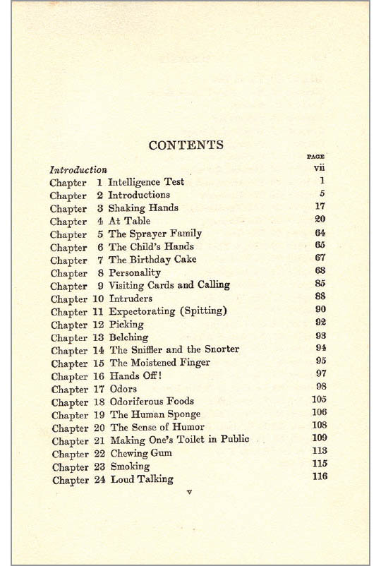
What’s Wrong with this Picture? The function of a table of contents is to list the elements of a book and help readers locate them. In the table of contents shown here, the page numbers are stretched across the page from the chapter titles, and the word “Chapter” has been repeated twenty-four times. Manners for the Millions, 1932.
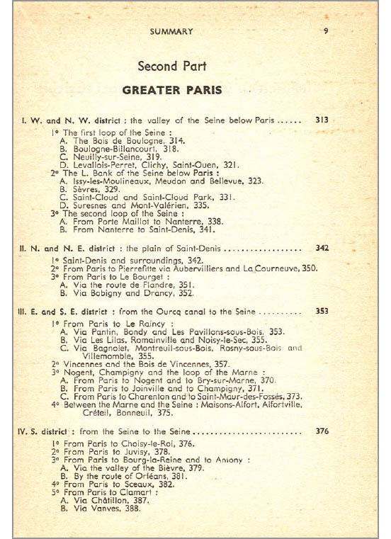
Lost in Paris In this table of contents for a travel guide, the designer has used a muddled mix of centered, justified, and flush-left alignments. The desire to create an overall justified setting dominates the logic of the page—hence the long first lines and rows of dots at the top level of information. The three titling lines at the head of the page are centered (a traditional solution), but the result is awkward in relation to the irregular mass of subheads, which weight the page to the left. The whole affair is further confused by the elaborate system of indents, numerals, and letters used to outline the book’s subsections. Blue Guide to Paris, 1957.
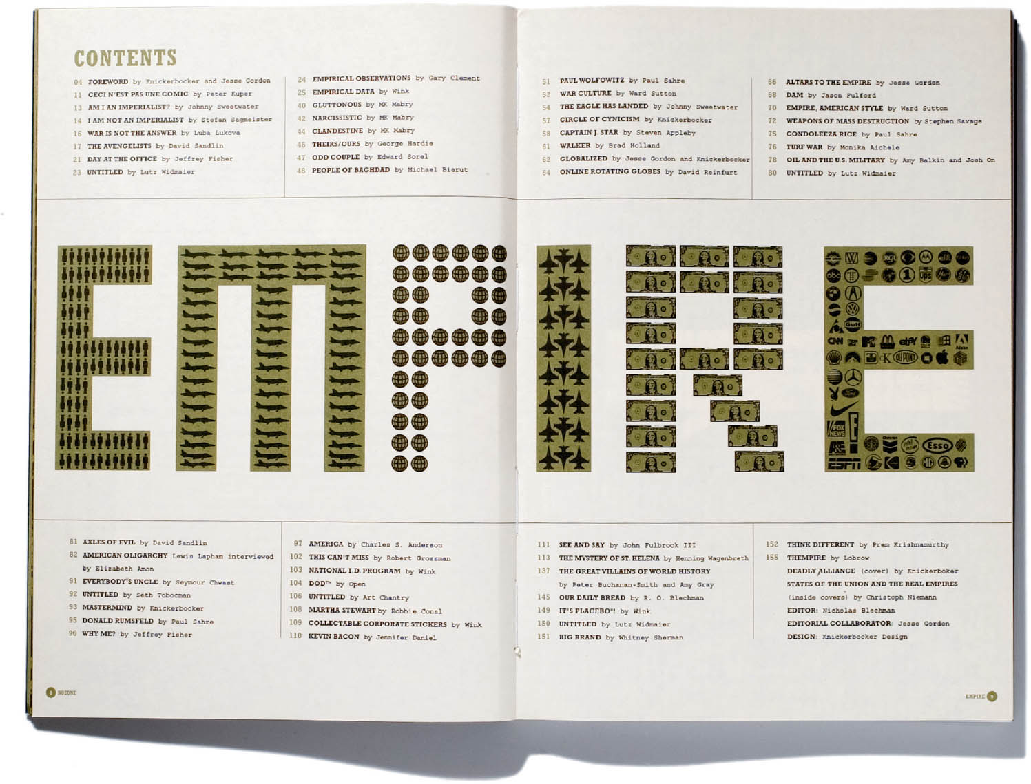
Book as Billboard This table of contents serves as a billboard for the book as well as a functional guide to its elements. The designer has approached the spread as a whole, with content stretching across it horizontally. The page numbers are aligned in columns next to the article titles, making it easy for readers to connect content with location. (No old-fashioned leader lines needed!) Chapter numbers aren’t necessary because the sequential page numbers are sufficient to indicate the order of the pieces. The book has many contributors, a point made clear through the type styling. Nicholas Blechman, Empire, 2004.
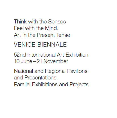
No hierarchy
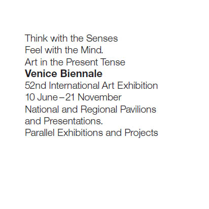
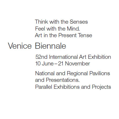
Contrasting weight
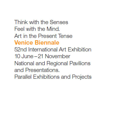
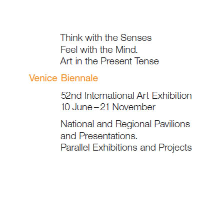
Contrasting color
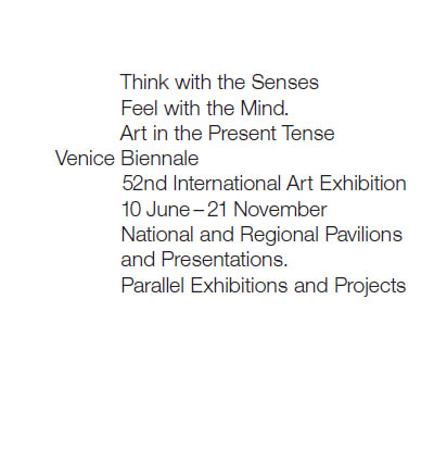
Alignment
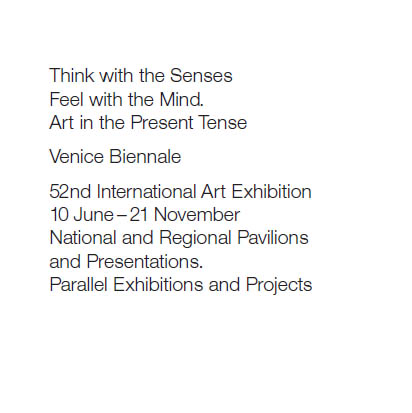
Spatial intervals
Uppercase and spatial intervals
Weight, color, space, alignment
Scale, space, alignment
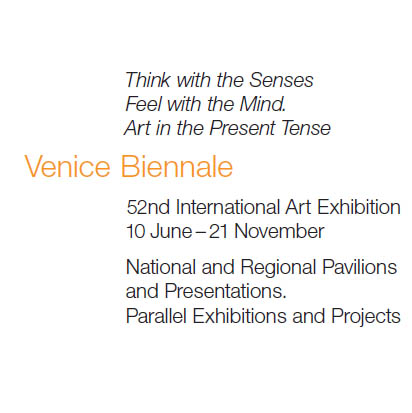
Italic, scale, color, alignment
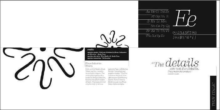
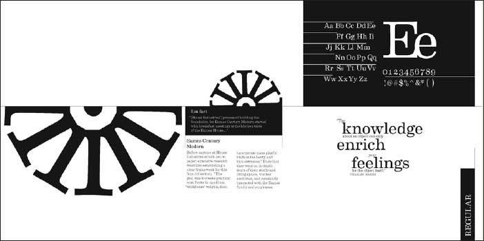
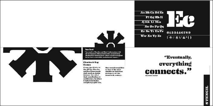
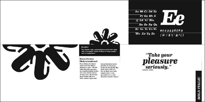
Hierarchy 101 A classic exercise is to work with a basic chunk of information and explore numerous simple variations, using just one type family. The parts of a typographic hierarchy can be signaled with one or more cues: line break, type style, type size, rules, and so on.
HyunSoo Lim
Katie MacLachlan
Claire Smalley
Anna Eshelman
Menu of Options Designers use scale, placement, alignment, type style, and other cues to bring visual order to a body of content. Expressing hierarchy is an active, inquisitive process that can yield dynamic visual results. Typography I. Jennifer Cole Phillips, faculty.
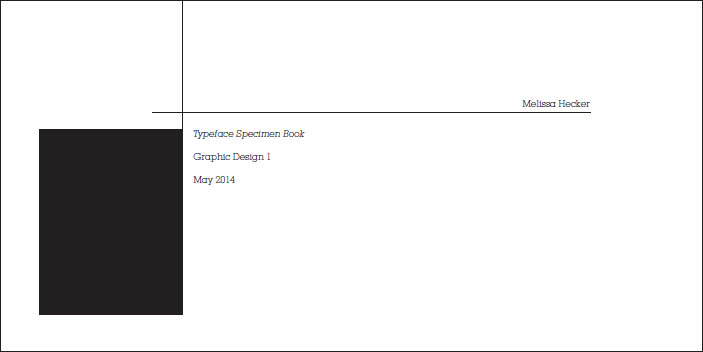
Melissa Hecker
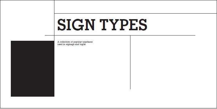
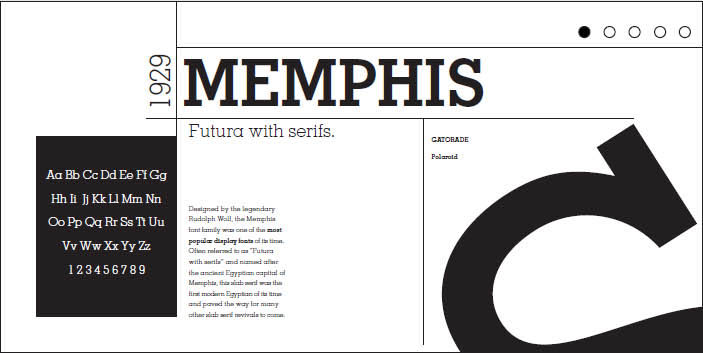
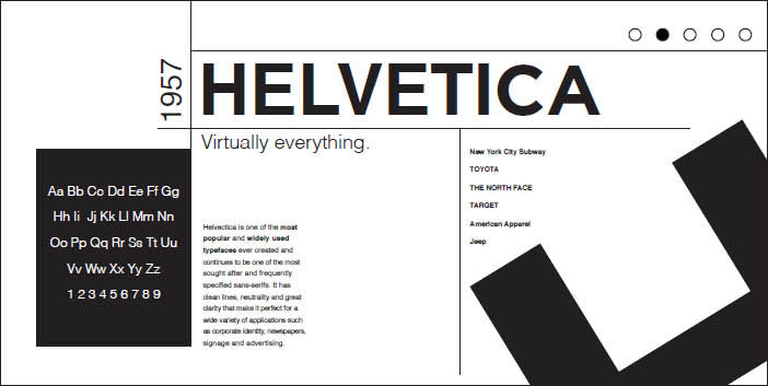
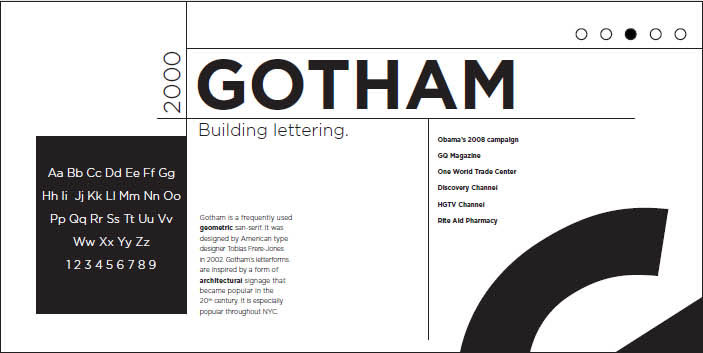
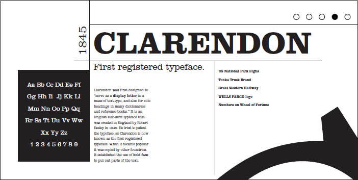
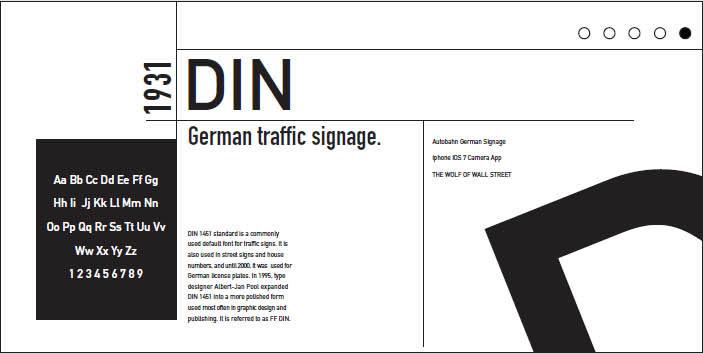
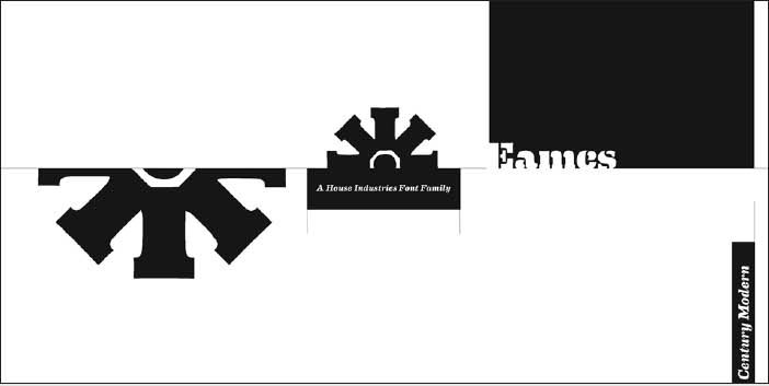
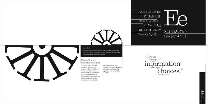
Five Fonts In this twist on the classic type specimen book, designers curate a collection of five typefaces and design a typographic hierarchy. Key content includes the typeface name, designer, year created, and descriptive or historical text. The compositional landscapes also contain a character set and some visual element focusing attention on the typeface’s expressive or formal qualities. In structuring multiple pages, students consider continuity and pacing. Covers and colophons become graceful extensions of the interior. Typography I. Jennifer Cole Phillips, faculty.
Theresa Bonaddio
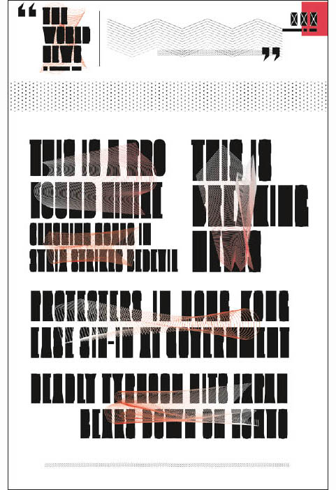
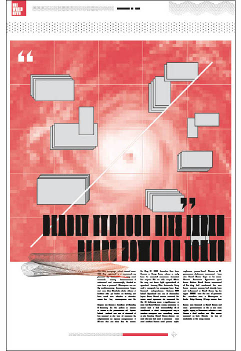
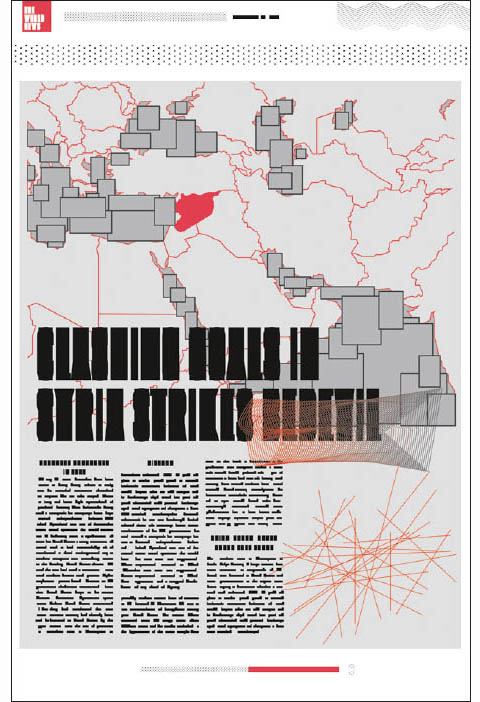
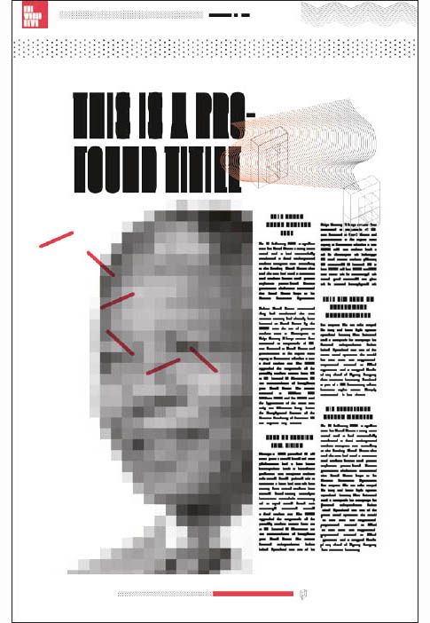
Content Vacuum In this project the designer purposefully abstracted the content of newspaper pages, thereby drawing attention to the visual hierarchy. Chen Zui, MFA Studio.
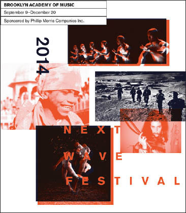
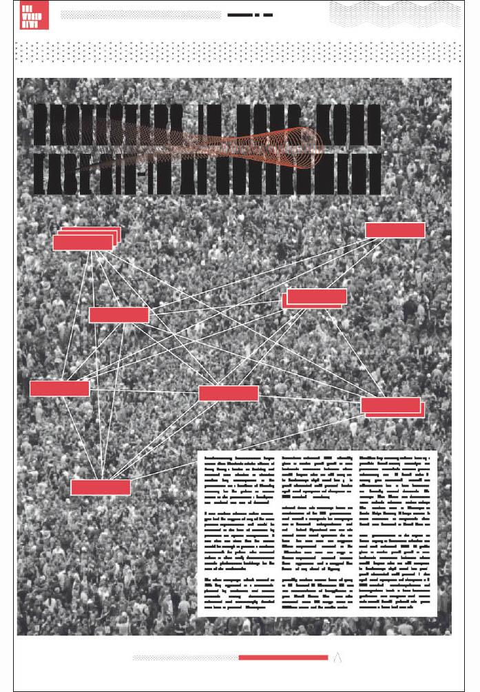
Content Glut This program for an arts festival contains multiple levels of typographic and photographic information, requiring the designer to establish clear and consistent visual signals of separation across all hierarchical levels. Amy Hushen, Advanced Graphic Design. Jennifer Cole Phillips, faculty.
Dimensional Hierarchy
Messages applied to three-dimensional form have the added challenge of legibility across and around planes. Objects sitting in an environment are bathed in shadow and light. Unlike books that can conceal elaborate worlds inside their covers—automatically separated from exterior contexts—environmental messages must interact beyond their boundaries and become either a harmonious or poignant counterpoint to their neighbors.
Notice in these examples how type, color fields, and graphic elements carry the viewer’s eye around the dimensional form, often making a visual if not verbal connection with neighboring packages when stacked side by side or vertically.

Inverted Hierarchy The designer has placed suggestions for food compatibility at the top of the hierarchy on these spice bottles, subordinating the product name. Amy Lee Walton, Post Baccalaureate Workshop.
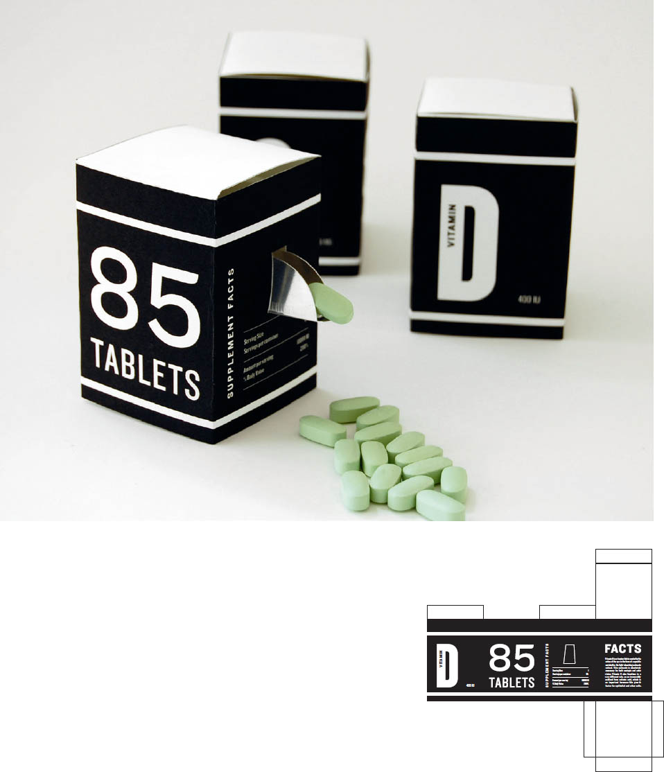
Dynamic Dosage A visual hierarchy is often necessary for objects in a series. This bold design for vitamin packaging magnifies unexpected product details and provides a surprising spout for dispensing tablets. James Anderson, Typography II. Jennifer Cole Phillips, faculty
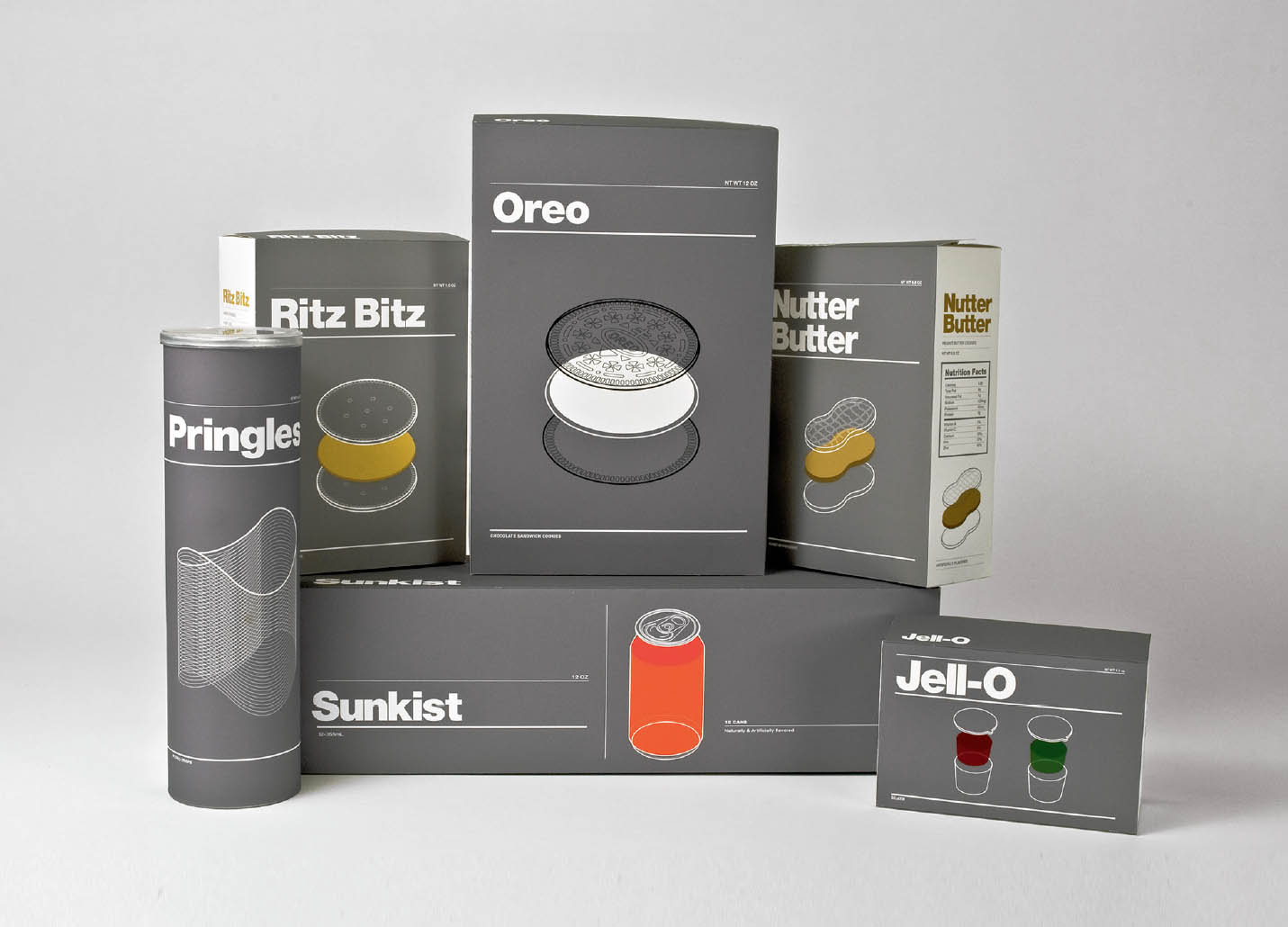
Architecture of Snacks This design series for iconic snacks discards the usual overt cacophony of branding language in favor of a clear, stripped-down information hierarchy that situates the brand name neutrally with typography that sits back, while the celebrated ingredient takes center stage in exploded axonometric renderings. James Anderson, Advanced Graphic Design. Jennifer Cole Phillips, faculty
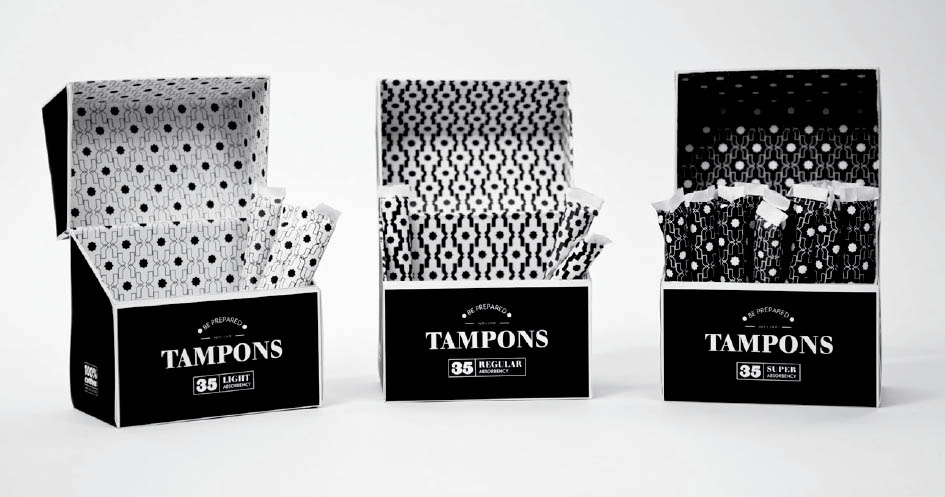
Going with the Flow The designer has built a visual language for a line of tampons that elevates the aesthetics for a more welcome place in the medicine cabinet. Visual pattern density signifies relative absorbency. Heda Hokschirr, Advanced Graphic Design. Jennifer Cole Phillips, faculty
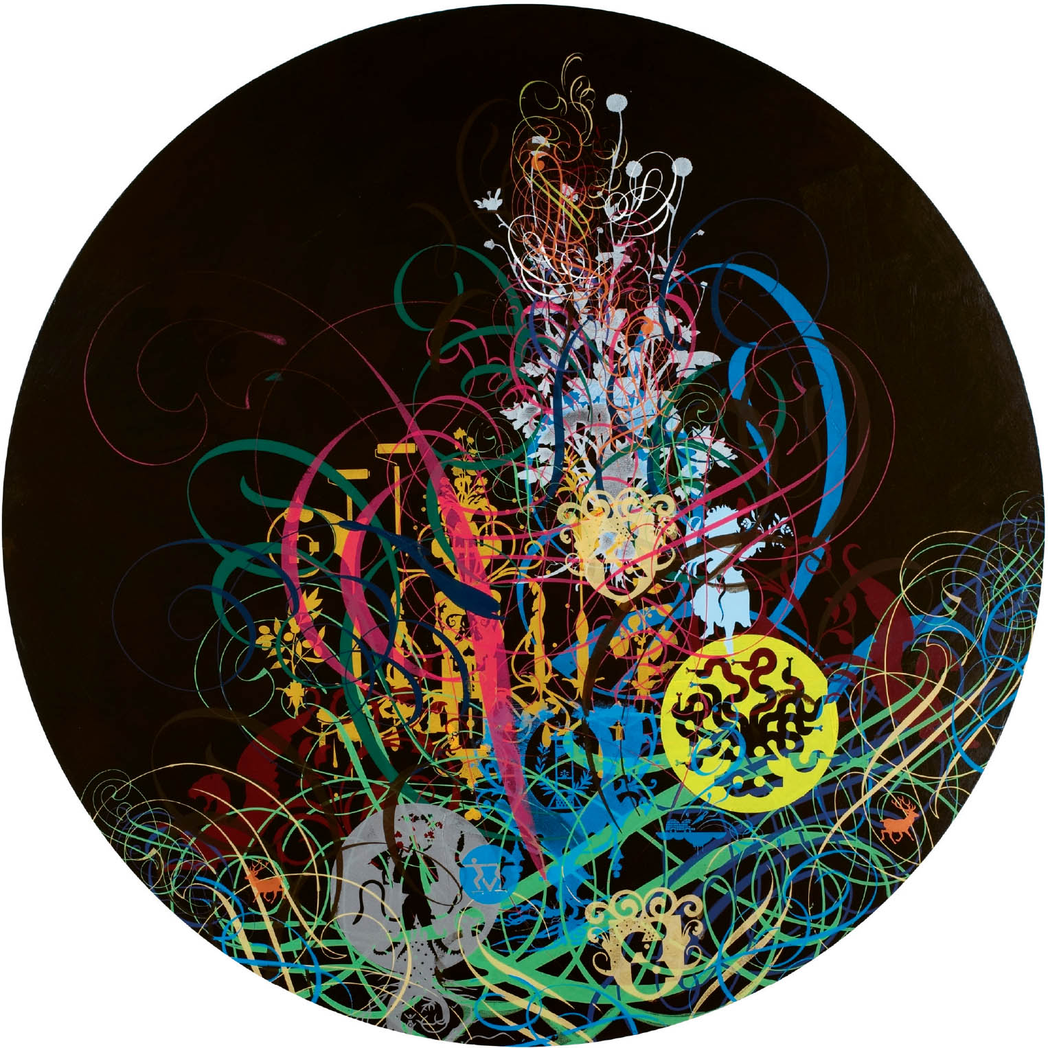
Printed Layers Artist and designer Ryan McGinness piles numerous layers on top of each other to yield composite images that celebrate both flatness and depth. Ryan McGinness, Arab Cadillac Generator, 2006. Acrylic on wood panel, 48 inches diameter. Collection of Charles Saatchi. Courtesy Deitch Projects, New York. Photo: Tom Powel Imaging, Inc.