Apartment Therapy Complete and Happy Home (2015)
PART ONE
setting up your home

walls
NEW YORK CITY
Michele Varian + Brad Roberts
Shop Owner, Michele Varian + Musician
Walls are one of the hardest-working elements in a home.
They define your floor plan, divvying up the footprint of your space into multiple rooms. Walls support artwork, bookshelves, coat hooks, mirrors, and lighting. And on top of all that heavy lifting, they play a key role in punctuating the design of your space.
Think of your walls as large canvases. With the right treatment, they can enhance light and color and greatly contract or expand a room. In fact, walls play just as much of a role in making your home feel big or small as its actual square footage.
While we’ve talked about flow as a function of furniture placement, good flow can also be established by alternating the colors of your walls from one room to the next. Bright walls reflect more light and have an expansive visual impact. Dark walls absorb light and feel closer to you visually. Put this lesson to use, and you have the opportunity to vary the experience in your home, from wall to wall to wall.
paint
Paint is much more than a decorative tool. You can use it to alter the perception of a room: make ceilings seem higher, walls longer, and open spaces cozier. Try these foolproof tricks when picking paint, and get the most from every wall in your house.
BALANCE SOARING CEILINGS If ceilings are so high that your room feels uncomfortably vast, consider painting them a darker shade. It gives the impression of closeness, which, in turn, is cozier.
ADD HEIGHT TO LOW CEILINGS White ceilings are what make most rooms feel higher than they actually are. You can increase the illusion, though, by adding a chair rail to your walls and painting the top half of the wall a lighter shade than the bottom.
MAKE A SMALL ROOM FEEL LARGER We’ve all heard that lighter colors help small rooms seem spacious. This is true, but an even more helpful trick is to paint your walls and ceiling the same color. It allows your eye to flow uninterrupted through the space, blurring the boundaries of the room.
MAKE AN AWKWARDLY LONG SPACE MORE PROPORTIONATE Painting the shorter “end” walls a few shades darker than the others can make a long, narrow space look slightly more square. Again, this is because the dark color creates the illusion of closeness.
HIGHLIGHT (OR HIDE) ARCHITECTURAL DETAILS Charming details like decorative molding should be showcased (when they’re in good shape), so paint them a contrasting color to your walls. If, however, you want to hide eyesores (air-conditioning vents, radiators, exposed pipes), paint them the same color as your walls, and they’ll blend right in.
PAINT
cheat sheet:
common paint finishes, defined
flat: Matte finish; reflects minimal light. Great for bumpy walls, because it hides flaws. The downside: it marks easily, so only use it in low-traffic areas.
eggshell: Semimatte finish with a very subtle sheen. The best option if you want the look of flat paint but need something more durable that can be cleaned—for, say, a dining room.
satin: A smooth and slightly glossy finish. Good for walls in high-traffic areas, such as living rooms, because it wipes clean without damaging the paint.
semigloss: Glossy without being shiny. It’s highly durable, making it the right choice for bathrooms and trim, which take a lot of abuse.
gloss: High-shine and ultradurable. It stands up to grease and water stains, which means it’s great for kitchens, doors, and attention-grabbing pops of color. One drawback: it shows every bump and flaw in the wall.
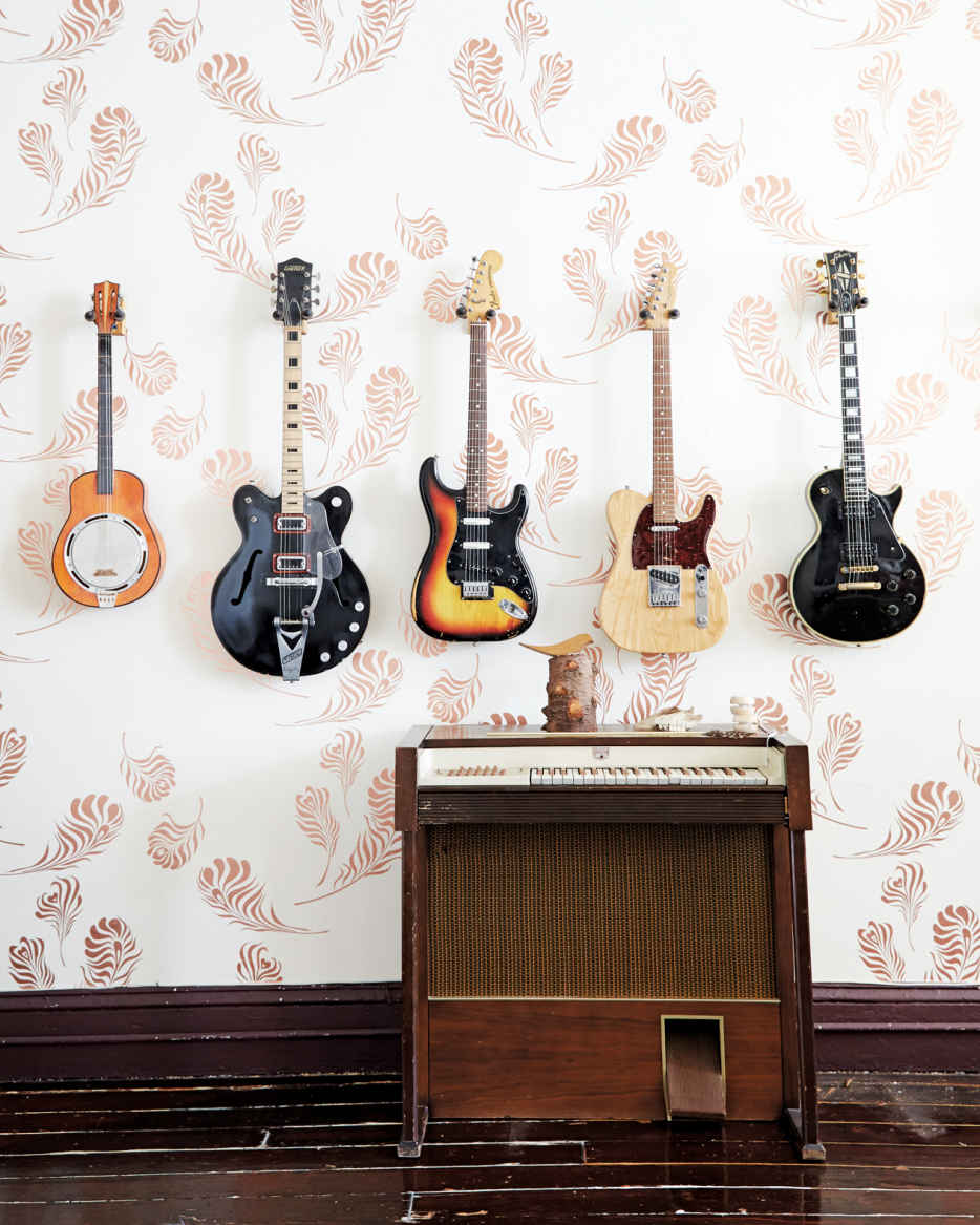
wallpaper
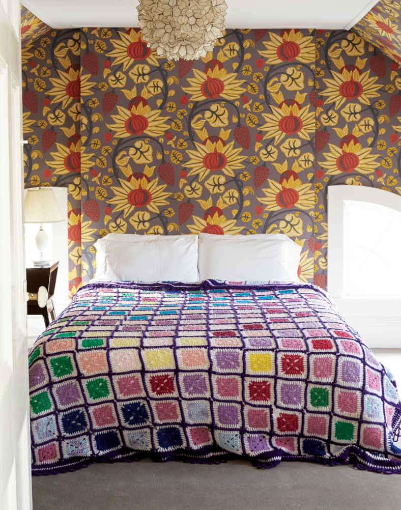
Wallpaper is a commitment. Putting it up is a lot of work. Taking it down is even harder. But as with all big commitments, you can expect big returns. Think of wallpaper as art on a very grand scale—and use these tips for choosing (and hanging) it wisely.
LARGE PRINTS Busy or oversize prints sing in small rooms (bathrooms, entryways) or on one statement wall in a bigger space (above a fireplace, behind a media center). If you’ve decided to use a large-scale print, then make this the starting point of your design vision, and build the rest of the room’s decor and color scheme around it.
SMALL PRINTS Almost any room can handle a smaller print. Use it to offset a stronger pattern in something you already own, like a rug or piece of furniture. Or hang it as a way to highlight an architectural detail (a kitchen nook or arched ceiling).
REMOVABLE WALLPAPER Loads of big-name companies and new designers (Tempaper, for instance) offer hundreds of design options. If you’re renting (or a commitment-phobe), removable wallpaper is the perfect solution. With a little elbow grease, it pulls right off the wall when you’re ready to move—or when you get tired of it.
PAINTING PATTERNS If you like the idea of pattern on your walls but don’t want to spend the money on wallpaper, you can always create your own design using painter’s tape and paint. Taping off the pattern is time-consuming. But the added bonus of having something totally unique (that you made) in your home is immeasurable.
WALLPAPER
tile
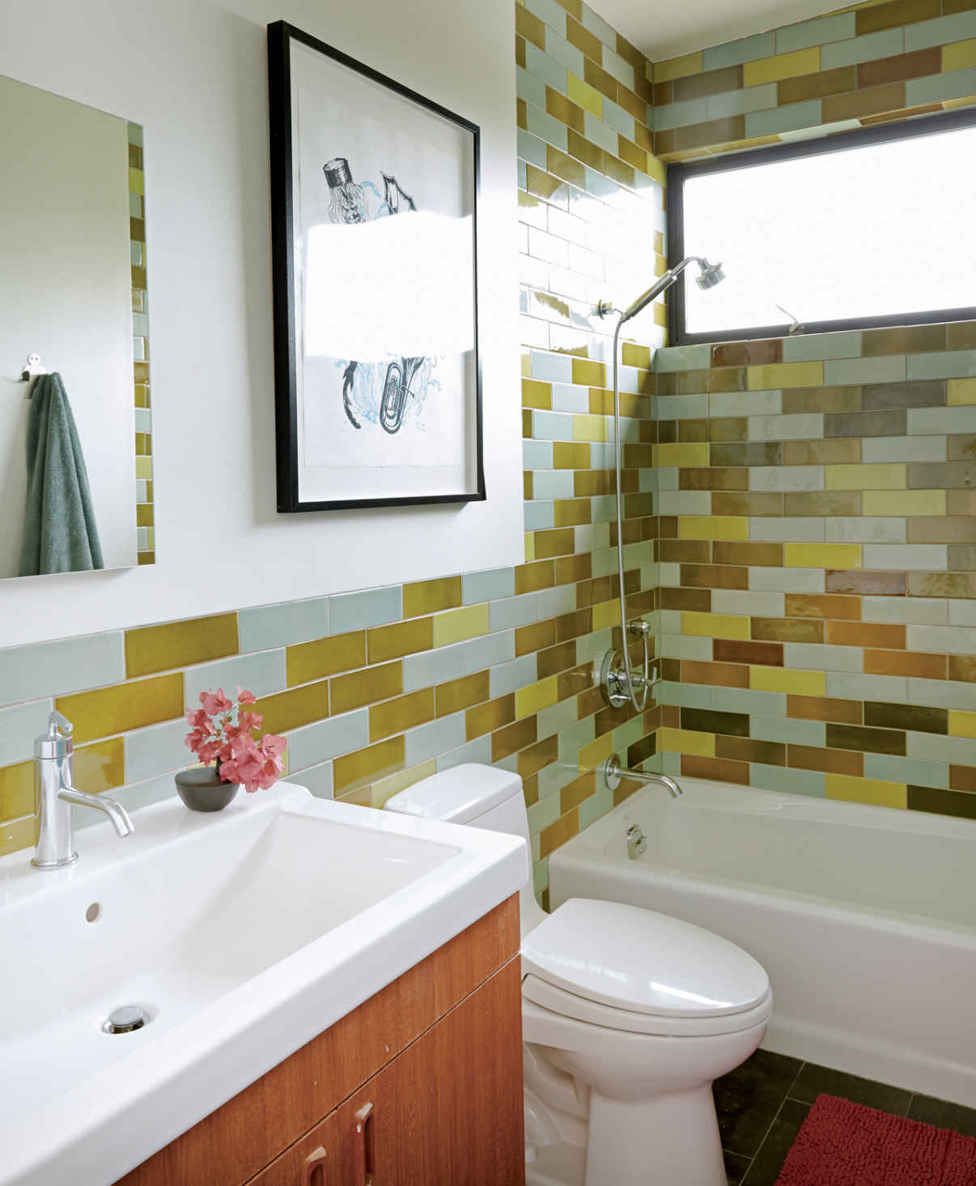
Decorative Turkish, Moroccan, and Mexican tiles have changed the game when it comes to tile and where it’s used in the home. Once reserved for bathrooms and kitchens, decorative tile work is now popping up on statement walls in living rooms and outdoor spaces. As with wallpaper, the commitment level is high, but the payoff is big. A good compromise: tile a small area first, then add more if you decide you love it.
TILE